Analysis of plant scRNA-Seq Data with Scanpy
| Author(s) |
|
| Reviewers |
|
OverviewQuestions:
Objectives:
Can we reclaim cell markers using a different analysis method?
Are highly variable genes paramount to the analysis?
Requirements:
Perform filtering, dimensionality reduction, and clustering
Generate a DotPlot emulating the original paper using a different analysis tool
Determine robust clusters across scRNA-seq pipelines
- Introduction to Galaxy Analyses
- slides Slides: Clustering 3K PBMCs with Scanpy
- tutorial Hands-on: Clustering 3K PBMCs with Scanpy
Time estimation: 2 hoursSupporting Materials:
- Datasets
- Workflows
- galaxy-history-answer Answer Histories
- FAQs
- video Recordings
- instances Available on these Galaxies
Published: Apr 8, 2021Last modification: Jun 25, 2026License: Tutorial Content is licensed under Creative Commons Attribution 4.0 International License. The GTN Framework is licensed under MITpurl PURL: https://gxy.io/GTN:T00250rating Rating: 1.0 (0 recent ratings, 1 all time)version Revision: 8
Single cell RNA-seq analysis is a cornerstone of developmental research and provides a great level of detail in understanding the underlying dynamic processes within tissues. In the context of plants, this highlights some of the key differentiation pathways that root cells undergo.
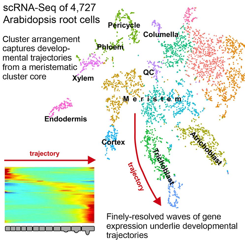
This tutorial replicates the paper “Spatiotemporal Developmental Trajectories in the Arabidopsis Root Revealed Using High-Throughput Single-Cell RNA Sequencing” (Denyer et al. 2019), where the major plant cell types are recovered in the data as well as distinguishing between QC and meristematic cells. The original paper used the Seurat analysis suite (Satija et al. 2015), but here we will use the ScanPy analysis suite (Wolf et al. 2018) integrated within the single-cell resources in Galaxy (Tekman et al. 2020).
AgendaIn this tutorial, we will cover:
CommentPlease familiarise yourself with the “Clustering 3K PBMCs with ScanPy” tutorial first, as much of the process is the same, and the accompanying slide deck better explains some of the methods and concepts better.
Data
The Arabidopsis root cells come from two biological replicates which were isolated and profiles using droplet-based scRNA-seq (please see: “Pre-processing of 10X Single-Cell RNA Datasets”); a “short root” mutant (labelled: shr) and a wild-type (labelled: wt):
- GSE123818_Root_single_cell_shr_datamatrix.fixednames.transposed.csv.gz
- GSE123818_Root_single_cell_wt_datamatrix.fixednames.transposed.csv.gz
As explained in the Zenodo link, the datasets have been modified to use more common gene names (hence the “fixednames” suffix) and the datasets have been transposed to better suit the AnnData format (hence the “transposed” suffix). The datasets are CSV tabular files which have been compressed using gunzip. We will now import these for analysis.
Data upload
Hands On: Data upload
- Create a new history for this tutorial
Import the two datasets from Zenodo or from the shared data library
https://zenodo.org/record/4597857/files/GSE123818_Root_single_cell_shr_datamatrix.fixednames.transposed.csv.gz
https://zenodo.org/record/4597857/files/GSE123818_Root_single_cell_wt_datamatrix.fixednames.transposed.csv.gz
- Copy the link location
Click galaxy-upload Upload at the top of the activity panel
- Select galaxy-wf-edit Paste/Fetch Data
Paste the link(s) into the text field
Press Start
- Close the window
As an alternative to uploading the data from a URL or your computer, the files may also have been made available from a shared data library:
- Go into Libraries (left panel)
- Navigate to the correct folder as indicated by your instructor.
- On most Galaxies tutorial data will be provided in a folder named GTN - Material –> Topic Name -> Tutorial Name.
- Select the desired files
- Click on Add to History galaxy-dropdown near the top and select as Datasets from the dropdown menu
In the pop-up window, choose
- “Select history”: the history you want to import the data to (or create a new one)
- Click on Import
Apply the tags
#shrand#wtto each of the datasets, with respect to the initial labels. These tags will be inherited for each task that the dataset undergoes.Datasets can be tagged. This simplifies the tracking of datasets across the Galaxy interface. Tags can contain any combination of letters or numbers but cannot contain spaces.
To tag a dataset:
- Click on the dataset to expand it
- Click on Add Tags galaxy-tags
- Add tag text. Tags starting with
#will be automatically propagated to the outputs of tools using this dataset (see below).- Press Enter
- Check that the tag appears below the dataset name
Tags beginning with
#are special!They are called Name tags. The unique feature of these tags is that they propagate: if a dataset is labelled with a name tag, all derivatives (children) of this dataset will automatically inherit this tag (see below). The figure below explains why this is so useful. Consider the following analysis (numbers in parenthesis correspond to dataset numbers in the figure below):
- a set of forward and reverse reads (datasets 1 and 2) is mapped against a reference using Bowtie2 generating dataset 3;
- dataset 3 is used to calculate read coverage using BedTools Genome Coverage separately for
+and-strands. This generates two datasets (4 and 5 for plus and minus, respectively);- datasets 4 and 5 are used as inputs to Macs2 broadCall datasets generating datasets 6 and 8;
- datasets 6 and 8 are intersected with coordinates of genes (dataset 9) using BedTools Intersect generating datasets 10 and 11.
Now consider that this analysis is done without name tags. This is shown on the left side of the figure. It is hard to trace which datasets contain “plus” data versus “minus” data. For example, does dataset 10 contain “plus” data or “minus” data? Probably “minus” but are you sure? In the case of a small history like the one shown here, it is possible to trace this manually but as the size of a history grows it will become very challenging.
The right side of the figure shows exactly the same analysis, but using name tags. When the analysis was conducted datasets 4 and 5 were tagged with
#plusand#minus, respectively. When they were used as inputs to Macs2 resulting datasets 6 and 8 automatically inherited them and so on… As a result it is straightforward to trace both branches (plus and minus) of this analysis.More information is in a dedicated #nametag tutorial.

QuestionWe can peek at the
#shrfile, and determine the dimensionality and naming scheme of the data. The rows and the columns depict different variables.
- Which are the cell barcodes? Rows or Columns?
- Which are the gene names? Rows or Columns?
- How many cells in the dataset?
- How many genes in the dataset?
- Rows, notice the long A-C-T-G based names.
- Columns, “ATXG” are the gene prefixes commonly used by the Arabidopsis genomes.
- There are 1 099 lines and therefore 1 099 cells
- If we scroll the preview window all the way to the right we see 27 630 as the last number. Given that the first column are the cell names, we must subtract by 1 to get 27 629 cells.
If the above feels like a convoluted way to get the dimensionality, that’s because we haven’t imported the data into the right format. For this we need to import both datasets into a single AnnData object (see the AnnData section in the previous tutorial).
CSV to AnnData
Hands On: Converting the Data
- Import Anndata and loom ( Galaxy version 0.7.5+galaxy0) with the following parameters:
- “hd5 format to be created”:
Anndata file
- “Format for the annotated data matrix”:
Tabular, CSV, TSV
- param-file “Annotated data matrix”: Multi-select both
SHRandWTdatasetsComment: Checking DimensionalityWe can now inspect the dimensionality of the dataset by “peeking” at the dataset in the history and observing the general information, simply by clicking on the name of the dataset.
The
#shrdataset should show:[n_obs x n_vars] 1099 x 27629and the
#wtshould show:[n_obs x n_vars] 4727 x 27629where obs refers to our observed cells, and vars references the genes/variables.
Currently we have two seperate datasets, but we can merge them into one single AnnData object seperated by batch identifiers “shr” and “wt”. To do this, we simply manipulate one of the datasets and concatenate the other onto it.
Merge Batches and Relabel
Hands On: Merging Data
- Manipulate AnnData ( Galaxy version 0.7.5+galaxy0) with the following parameters:
- param-file “Annotated data matrix”:
SHR dataset(output of Import Anndata and loom tool)- “Function to manipulate the object”:
Concatenate along the observations axis
- param-file “Annotated data matrix to add”:
WT dataset(output of Import Anndata and loom tool)You can queue on the next task without the previous one being complete yet, just ensure that the input dataset for the next task is at least orange and not grey.
CommentAt this point, the AnnData dataset batch information has a value of
0for the “SHR” cells and1for the “WT” cells. This is fine if you wish to remember these two values for the remainder of the analysis since the step below is optional, however for plotting purposes it can just be easier to relabel the batch information with the action text labelsshrandwt.- Manipulate AnnData ( Galaxy version 0.7.5+galaxy0) with the following parameters:
- param-file “Annotated data matrix”:
anndata(output of Manipulate AnnData tool)- “Function to manipulate the object”:
Rename categories of annotation
- “Key for observations or variables annotation”:
batch- “Comma-separated list of new categories”:
shr, wtWarning: Order matters!The order in which the datasets are concatenated can affect the accuracy of the new labelling. If the
#wtdataset was first selected and then the#shrdataset concatenated onto it, then the comma-seperated list of new categories above should be inverted.
Quality Control
We can confirm that our datasets have been combined into a single object by peeking at the dataset in the history and confirming two things:
- The number of observations is equal to the total of the two initial AnnData datasets.
- The file size of the new AnnData dataset is approximately equal to the total of the two initial AnnData datasets.
Batch Number of Cells File Size shr 1099 117.2 MB wt 4727 499.7 MB Total 5826 615.6 MB
A happy coincidence here is that both datasets already had the exact same variables, so that the merging of the two datasets still yields the same number of genes.
Filtering the Matrix
Hands On: Generating some metrics
- Inspect and manipulate ( Galaxy version 1.7.1+galaxy0) with the following parameters:
- param-file “Annotated data matrix”:
anndata(output of Manipulate AnnData tool)- “Method used for inspecting”:
Calculate quality control metrics, using 'pp.calculate_qc_metrics'- Plot with scanpy ( Galaxy version 1.7.1+galaxy0) with the following parameters:
- param-file “Annotated data matrix”:
anndata(output of Manipulate AnnData tool)- “Method used for plotting”:
Generic: Violin plot, using 'pl.violin'
- “Keys for accessing variables”:
Subset of variables in 'adata.var_names' or fields of '.obs'
- “Keys for accessing variables”:
n_genes_by_counts, total_counts- “The key of the observation grouping to consider”:
batch- In “Violin plot attributes”:
- “Add a stripplot on top of the violin plot”:
Yes
- “Add a jitter to the stripplot”:
Yes
- “Size of the jitter points”:
0.4- “Display keys in multiple panels”:
Yes
This should result in the following violin plot, where we see the distribution of the number of genes per cell (n_genes_by_counts) and the library size per cell, where the library size is the total number of mRNA in a cell, regardless of which gene it came from (total_counts).
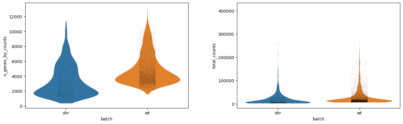
Each dot is a cell, and the x-axis has two groups showing the absolute values of for each batch (shr and wt). The y-values correspond to the actual value of each cell, but the x-vales within each group are just random jitter to help see the cells more clearly. The outline of the violin plot shows us the density of each batch, where we can see that most of the cells in the shr group have an average number of features just below 2000 genes, compared to wt which has an average number of features just below 4000 genes. If we compare the library size, however, we notice that the outlines are very similar and that the average library sizes across batches are comparable.
Filter
Most scRNA-seq datasets need to set a minimum threshold of detectability in order to ensure that the cells are of high enough quality to be used for analysis. Conversely, sometimes an upper threshold also should be set to counter the case where a cell is a cell-doublet (in the sense that two cells were captured and sequenced accidentally as a single cell).
The above violin plots suggest quite a few outliers, mostly on the upper-end of the density plots, suggesting a few cell-doublets in the data. The effect of these is not something we cannot easily regress out, and so we must filter them out instead. By looking at the plots, we can see that a good maximum library size here would be 100 000 transcripts, and a good maximum feature size would be 10 000 transcripts.
For this analysis, we will set a minimum threshold of detectability that each cell should count transcripts from at least 200 genes, and that each gene should be expressed in at least 5 cells. These lower-bound thresholds are not so easy to derive from such QC plots, but depend mostly on the type of data you are using. If the number of features and the library sizes were one order of magnitude higher, one might consider also scaling the lower-bound thresholds by one order of magnitude.
Hands On: Filtering
- Filter ( Galaxy version 1.7.1+galaxy0) with the following parameters:
- param-file “Annotated data matrix”:
anndata_out(output of Inspect and manipulate tool)- “Method used for filtering”:
Filter cell outliers based on counts and numbers of genes expressed, using 'pp.filter_cells'
- “Filter”:
Minimum number of genes expressed
- “Minimum number of genes expressed required for a cell to pass filtering”:
100- Filter ( Galaxy version 1.7.1+galaxy0) with the following parameters:
- param-file “Annotated data matrix”:
anndata_out(output of Filter tool)- “Method used for filtering”:
Filter genes based on number of cells or counts, using 'pp.filter_genes'
- “Filter”:
Minimum number of cells expressed
- “Minimum number of cells expressed required for a gene to pass filtering”:
2We now set the upper limits to the analysis.
- Manipulate AnnData ( Galaxy version 0.7.5+galaxy0) with the following parameters:
- param-file “Annotated data matrix”:
anndata_out(output of Filter tool)- “Function to manipulate the object”:
Filter observations or variables
- “What to filter?”:
Observations (obs)- “Type of filtering?”:
By key (column) values
- “Key to filter”:
n_genes_by_counts- “Type of value to filter”:
Number
- “Filter”:
less than- “Value”:
12000- Manipulate AnnData ( Galaxy version 0.7.5+galaxy0) with the following parameters:
- param-file “Annotated data matrix”:
anndata(output of Manipulate AnnData tool)- “Function to manipulate the object”:
Filter observations or variables
- “What to filter?”:
Observations (obs)- “Type of filtering?”:
By key (column) values
- “Key to filter”:
total_counts- “Type of value to filter”:
Number
- “Filter”:
less than- “Value”:
120000
If we inspect the resulting dataset, we see that the number of cells remaining is 5826 and the number of genes is 18913, which is still a good number of cells and genes. It is good practice to save the raw data in case we need to use it data, so we “freeze the raw data” into a slot for later safe keeping.
Hands On: Saving the original matrix
- Manipulate AnnData ( Galaxy version 0.7.5+galaxy0) with the following parameters:
- param-file “Annotated data matrix”:
anndata_out(output of Filter tool)- “Function to manipulate the object”:
Freeze the current state into the 'raw' attribute
Confounder Removal
Now we have a set of cells we are reasonably confident contain desirable biological variation (please view the following segment from “An introduction to scRNA-seq data analysis” as a reference for the types of wanted and unwanted variation). We wish to now regress out the library size variation, as it is not indicative of cell type. To do this, we will first ensure that all cells are of the same comparable library size by applying individual size factors to each cell.
We will also apply a log transformation to the cells, as this compresses the variation into a less extreme space, making it easier to see the relative differences between cells.
After normalising and regressing out unwanted factors, we will then scale the data to have unit variance with a zero mean, so that the mean expression of each gene is not a factor in the analysis and only the variation is, ensuring that the later clustering is driven only by the relative variation of the genes, and not neccesarily how expressive those genes are.
Those of you who are familiar with the ScanPy Tutorial might wonder why we have not reduced the number of genes by performing a highly variable gene selection. The answer is simply that it did not help with this particular dataset, and that by removing the least variable genes in the analysis, it did help us replicate the analysis in the paper. Try it for yourself as an intermediate step (after this analysis) and see!
Hands On: Normalize and Scale
- Normalize ( Galaxy version 1.7.1+galaxy0) with the following parameters:
- param-file “Annotated data matrix”:
anndata(output of Manipulate AnnData tool)- “Method used for normalization”:
Normalize counts per cell, using 'pp.normalize_total'
- “Target sum”:
10000.0- “Exclude (very) highly expressed genes for the computation of the normalization factor (size factor) for each cell”:
No- Inspect and manipulate ( Galaxy version 1.7.1+galaxy0) with the following parameters:
- param-file “Annotated data matrix”:
anndata_out(output of Normalize tool)- “Method used for inspecting”:
Logarithmize the data matrix, using 'pp.log1p'- Remove confounders ( Galaxy version 1.7.1+galaxy0) with the following parameters:
- param-file “Annotated data matrix”:
anndata_out(output of Inspect and manipulate tool)- “Method used for plotting”:
Regress out unwanted sources of variation, using 'pp.regress_out'
- “Keys for observation annotation on which to regress on”:
total_counts- Inspect and manipulate ( Galaxy version 1.7.1+galaxy0) with the following parameters:
- param-file “Annotated data matrix”:
anndata_out(output of Remove confounders tool)- “Method used for inspecting”:
Scale data to unit variance and zero mean, using 'pp.scale'
- “Maximum value”:
10.0
Dimensionality Reduction
Dimensionality reduction is the art of reducing a high dimensional dataset into a low dimensional “embedding” that humans can actually see (i.e. 2 or 3 dimensions), ideally such that the relationships or distances between data points are preserved in this embedding. In the context of single-cell datasets, this essentially means compressing > 10 000 genes into just 2 X/Y variables.
You can learn more about dimensionality reduction by consulting the following segment from “An introduction to scRNA-seq data analysis”.
This is usually a two step process:
- A Principal Component Analysis (PCA) is used to perform an optimized “rotation” of the ~ 20 000 “unit” gene axes that we have, in order to better fit the data. These new axes or “principal components” are then linear combinations of the original unit axes, with an associated score of how variable each new axis is. By sorting these principal components by most variable to least variable, we can select the top N components and discard the rest, leaving us with most of the variation still in the data. Usually we select the top 40 principal components, which from 20 000 is a huge reduction in the dimensionality of the dataset.
- We then perform a more complex kind of dimensionality reduction, one that does not assume any linearity in the axes. For scRNA-seq, this is either tSNE or UMAP, with UMAP being the main choice due to how flexible it is in incorporating new data. Though UMAP is capable of working on extremely high dimensional datasets, it is often limited by time and space constraints (read: the computer does not respond in a reasonable timeframe, or it crashes), and so therefore it is quite normal to feed UMAP the output of the PCA as input. This will then be a dimensionality reduction from 50 to 2. With these final 2 dimensions, we can plot the data.
Hands On: PCA and UMAP
- Cluster, infer trajectories and embed ( Galaxy version 1.7.1+galaxy0) with the following parameters:
- param-file “Annotated data matrix”:
anndata_out(output of Inspect and manipulate tool)- “Method used”:
Computes PCA (principal component analysis) coordinates, loadings and variance decomposition, using 'tl.pca'
- “Type of PCA?”:
Full PCA
- “SVD solver to use”:
ARPACK wrapper in SciPy- Inspect and manipulate ( Galaxy version 1.7.1+galaxy0) with the following parameters:
- param-file “Annotated data matrix”:
anndata_out(output of Cluster, infer trajectories and embed tool)- “Method used for inspecting”:
Compute a neighborhood graph of observations, using 'pp.neighbors'
- “The size of local neighborhood (in terms of number of neighboring data points) used for manifold approximation”:
10- “Number of PCs to use”:
40CommentUMAP relies on a connected graph of cells to operate. Please view the following segment from “An introduction to scRNA-seq data analysis” for more information on how this process works.
- Cluster, infer trajectories and embed ( Galaxy version 1.7.1+galaxy0) with the following parameters:
- param-file “Annotated data matrix”:
anndata_out(output of Inspect and manipulate tool)- “Method used”:
Embed the neighborhood graph using UMAP, using 'tl.umap'
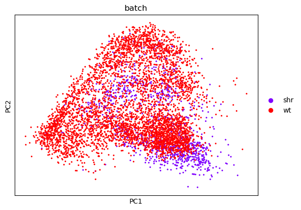
With our data now sufficiently “flat” and ready for human consumption, we can now do a naive plot of both the PCA and the UMAP and show cell assignments coloured by batch.
Hands On: Plot the PCA and UMAP by Batch
- Plot with scanpy ( Galaxy version 1.7.1+galaxy0) with the following parameters:
- param-file “Annotated data matrix”:
anndata_out(output of Cluster, infer trajectories and embed tool)- “Method used for plotting”:
Embeddings: Scatter plot in PCA coordinates, using 'pl.pca
- “Keys for annotations of observations/cells or variables/genes”:
batch- In “Plot attributes”
- “Colors to use for plotting categorical annotation groups”:
rainbow (Miscellaneous)- Plot with scanpy ( Galaxy version 1.7.1+galaxy0) with the following parameters:
- param-file “Annotated data matrix”:
anndata_out(output of Cluster, infer trajectories and embed tool)- “Method used for plotting”:
Embeddings: Scatter plot in UMAP basis, using 'pl.umap'
- “Keys for annotations of observations/cells or variables/genes”:
batch- “Show edges?”:
No- In “Plot attributes”
- “Legend font size”:
14- “Colors to use for plotting categorical annotation groups”:
rainbow (Miscellaneous)
| PCA | UMAP |
|---|---|
 |
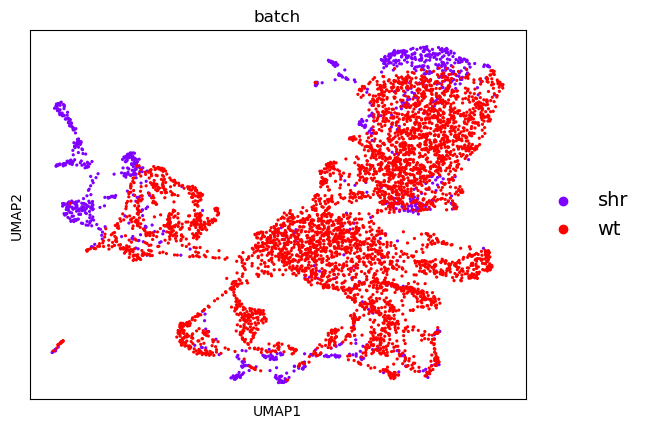 |
From this, we can see that there is a reasonable overlap in our batches shown both in the PCA and UMAP embeddings. This is good because it shows that though there is some batch effect (i.e. cells from one batch appear to cluster on a different side of the plot than the other) it is not significant enough for there not to be some commonality between the batches.
There are batch correction algorithms for cases where one batch clusters completely seperate from the other, but this is not necessary here.
Finding Cell Types
Clustering
Let us cluster the cells and see what cell types we can discover in the plots. The cell types that we wish to recover are those shown in the original paper, as highlighted by the gene markers in the DotPlot below.
| UMAP | DotPlot |
|---|---|
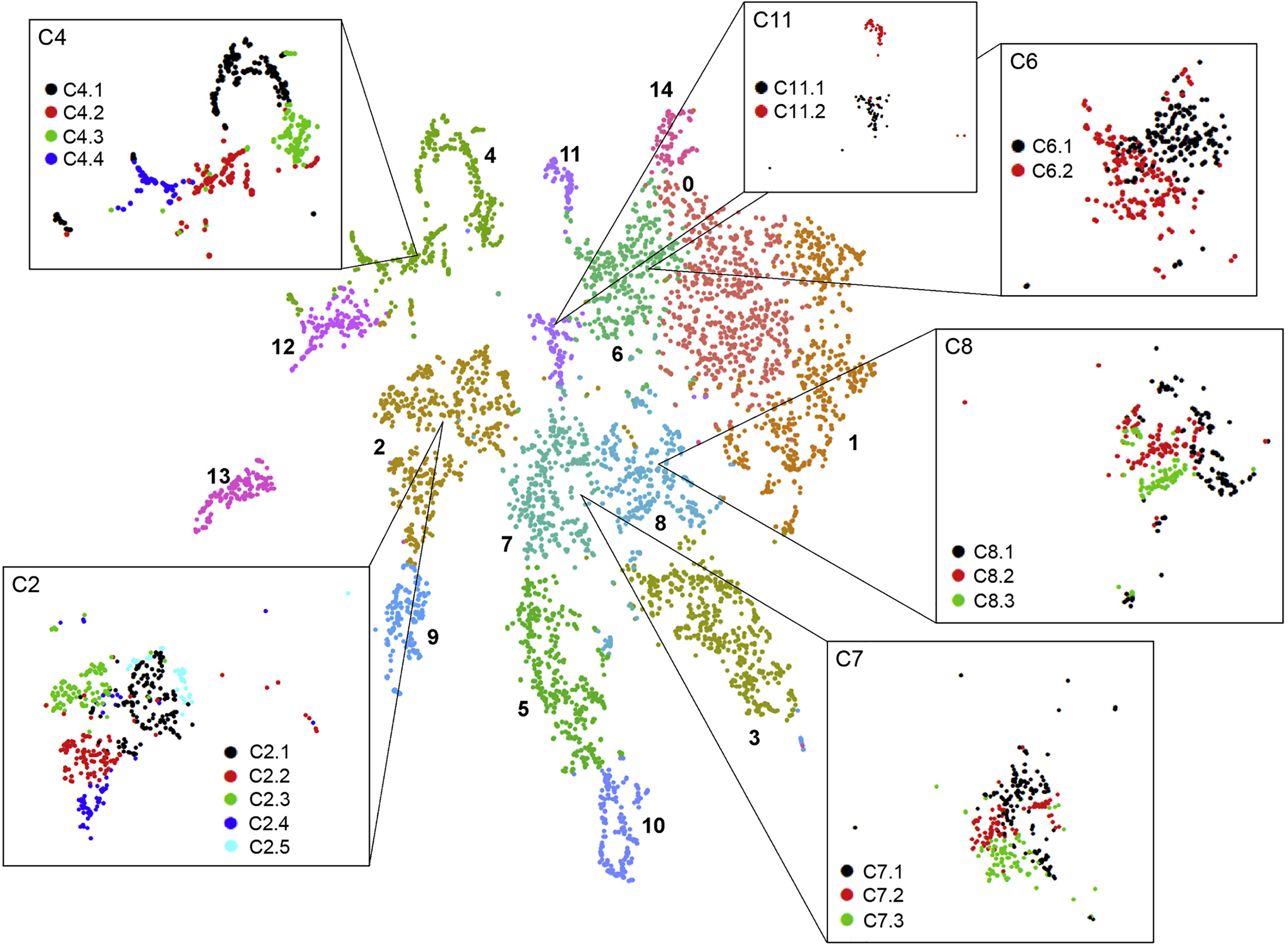 |
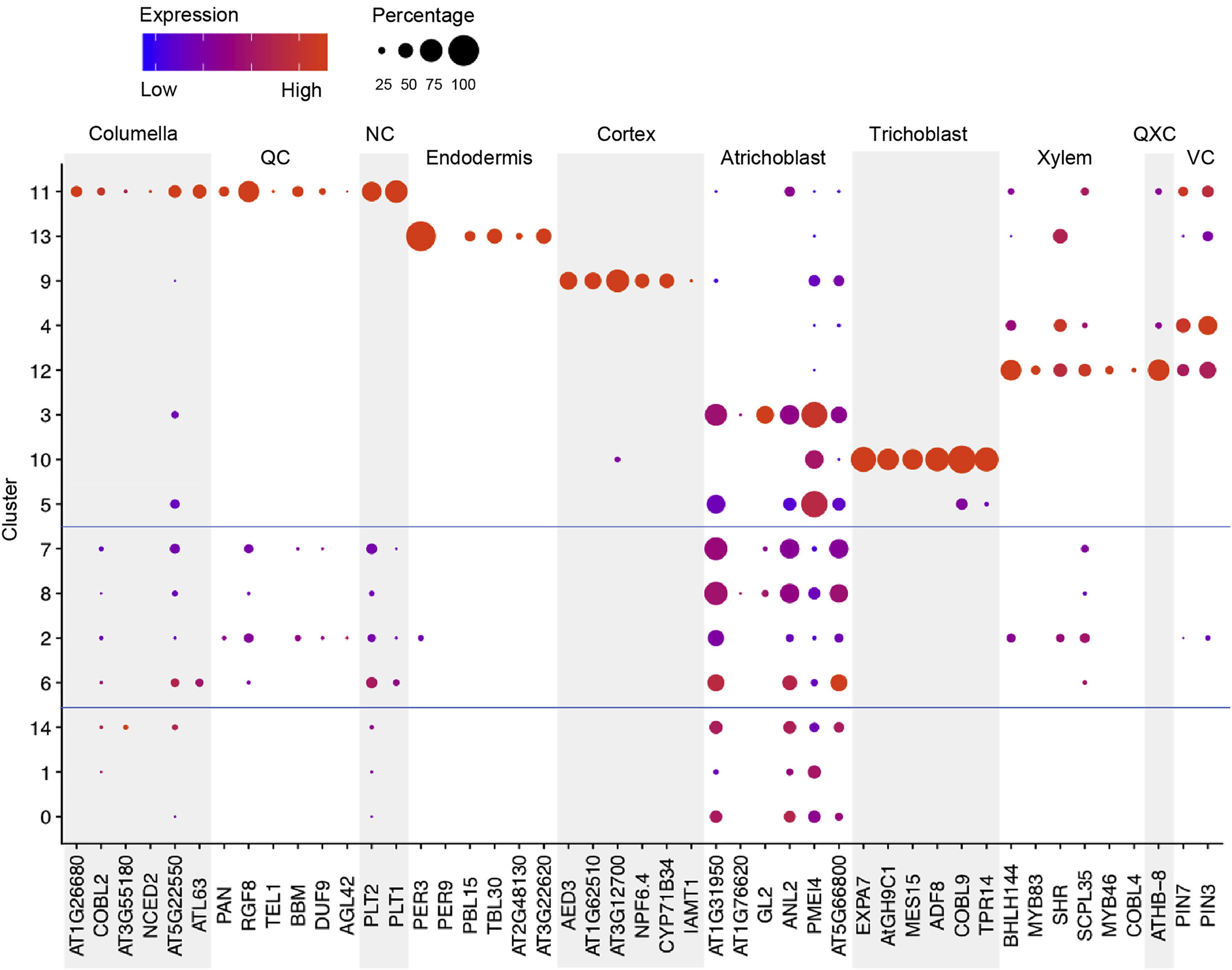 |
Hands On: Generate and Plots Clusters
- Cluster, infer trajectories and embed ( Galaxy version 1.7.1+galaxy0) with the following parameters:
- param-file “Annotated data matrix”:
anndata_out(output of Cluster, infer trajectories and embed tool)- “Method used”:
Cluster cells into subgroups, using 'tl.leiden'
- “Coarseness of the clusterin”:
0.35- Plot with scanpy ( Galaxy version 1.7.1+galaxy0) with the following parameters:
- param-file “Annotated data matrix”:
anndata_out(output of Cluster, infer trajectories and embed tool)- “Method used for plotting”:
Embeddings: Scatter plot in UMAP basis, using 'pl.umap'
- “Keys for annotations of observations/cells or variables/genes”:
leiden, batch- “Show edges?”:
No- In “Plot attributes”:
- “Location of legend”:
on data- “Legend font size”:
14- “Colors to use for plotting categorical annotation groups”:
rainbow (Miscellaneous)CommentWe print the legend on the data because it’s easier to see where the cluster labels apply.
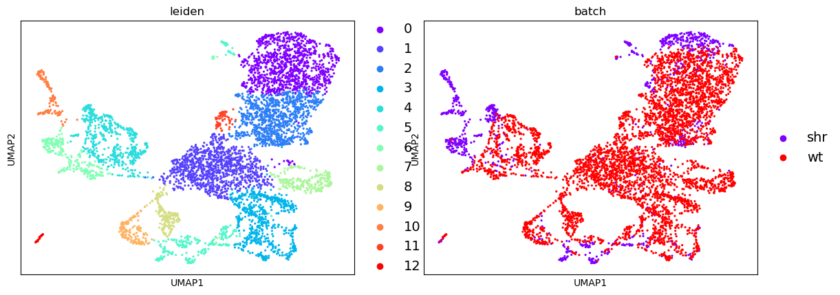
Here we have recovered 13 clusters but we don’t yet know what types they describe. If we have a list of genes that we know are indicative of a certain cell type (i.e. are marker genes) then we can use this to assign labels to our clusters.
Let us here try to recreate the DotPlot from the paper using the clusters we have discovered.
DotPlot and Validating Cell Types
Hands On: Dot Plot
- Plot with scanpy ( Galaxy version 1.7.1+galaxy0) with the following parameters:
- param-file “Annotated data matrix”:
anndata_out(output of Cluster, infer trajectories and embed tool)- “Method used for plotting”:
Generic: Makes a dot plot of the expression values, using 'pl.dotplot'
- “Variables to plot (columns of the heatmaps)”:
Subset of variables in 'adata.var_names'
- “List of variables to plot”:
AT1G26680,COBL2,AT3G55180,NCED2,AT5G22550,ATL63,RGF8,TEL1,DUF9,AGL42,PLT1,PLT2,PER3,PER9,PBL15,TBL30,AT2G48130,AT3G22620,AED3,T3P18-7,MBK21-8,NPF6-4,CYP71B34,IAMT1,AT1G31950,F14G6-22,GL2,ANL2,PMEI4,MUD21-4,EXPA7,MES15,ADF8,COBL9,TPR14,BHLH144,MYB83,SCPL35,MYB46,COBL4,PIN7,PIN3- “The key of the observation grouping to consider”:
leiden- “Number of categories”:
9- “Use ‘raw’ attribute of input if present”:
Yes- In “Group of variables to highlight”:
- param-repeat “Insert Group of variables to highlight”
- “Start”:
0- “End”:
5- “Label”:
Columella- param-repeat “Insert Group of variables to highlight”
- “Start”:
6- “End”:
9- “Label”:
QC- param-repeat “Insert Group of variables to highlight”
- “Start”:
10- “End”:
11- “Label”:
NC- param-repeat “Insert Group of variables to highlight”
- “Start”:
12- “End”:
17- “Label”:
Endodermis- param-repeat “Insert Group of variables to highlight”
- “Start”:
18- “End”:
23- “Label”:
Cortex- param-repeat “Insert Group of variables to highlight”
- “Start”:
24- “End”:
29- “Label”:
Atrichoblast- param-repeat “Insert Group of variables to highlight”
- “Start”:
30- “End”:
34- “Label”:
Trichoblast- param-repeat “Insert Group of variables to highlight”
- “Start”:
35- “End”:
39- “Label”:
Xylem- param-repeat “Insert Group of variables to highlight”
- “Start”:
40- “End”:
41- “Label”:
VC- “Custom figure size”:
No: the figure width is set based on the number of variable names and the height is set to 10.
By running the above we end up with the following DotPlot:
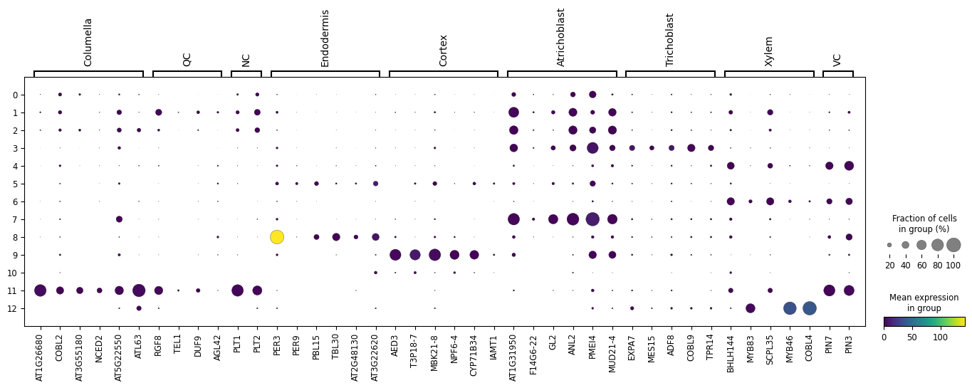
Notice how we have the Columella, QC and NC sharing the same cluster 11, that the Endodermis is localised in cluster 8, the Cortex in cluster 9, the Trichoblast cells in cluster 3, the Xylem showing strong expression in cluster 12, VC in clusters 4 and 6, and the Atrichoblasts have a mixed expression in a range of clusters. These characteristics are the same as the Dotplot in the original paper.
We can use this Dotplot as a guide to relabel our clusters and give more meaningful annotations to the plots.
Relabel clusters
Hands On: Cluster Re-labelling
- Manipulate AnnData ( Galaxy version 0.7.5+galaxy0) with the following parameters:
- param-file “Annotated data matrix”:
anndata_out(output of Cluster, infer trajectories and embed tool)- “Function to manipulate the object”:
Rename categories of annotation
- “Key for observations or variables annotation”:
leiden- “Comma-separated list of new categories”:
0, 1, 2, trichoblasts, 4, 5, 6, atrichoblasts, endodermis, cortex, 10, columella+QC+NC, xylem- Plot with scanpy ( Galaxy version 1.7.1+galaxy0) with the following parameters:
- param-file “Annotated data matrix”:
anndata(output of Manipulate AnnData tool)- “Method used for plotting”:
Embeddings: Scatter plot in UMAP basis, using 'pl.umap'
- “Keys for annotations of observations/cells or variables/genes”:
leiden, batch- “Show edges?”:
No- In “Plot attributes”:
- “Location of legend”:
on data- “Legend font size”:
14- “Colors to use for plotting categorical annotation groups”:
rainbow (Miscellaneous)
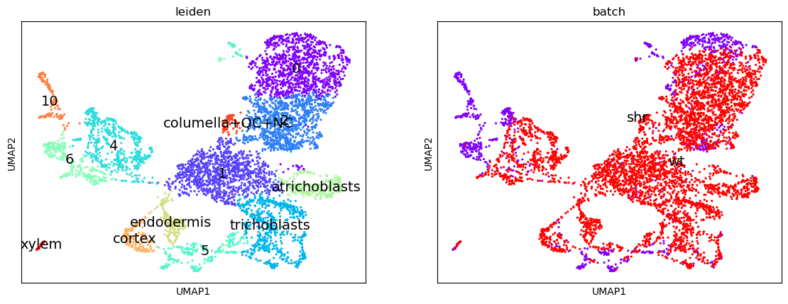
If we look at the clusters now, and compare them to the original image in the paper, we can infer that the meristematic cells are likely to be derived from cluster 1, which shares soft clustering with the trichoblasts suggesting a trajectory pathway which could be explored.
Conclusions
In this tutorial, we have recapitulated the same clustering analysis in the “Spatiotemporal Developmental Trajectories in the Arabidopsis Root Revealed Using High-Throughput Single-Cell RNA Sequencing” Denyer et al. 2019 paper, and validated them by comparing DotPlots for specific genes that were used as markers in that paper.
From this point, we can perform a lineage analysis to infer a differentiation pathway between the clusters. For ScanPy there is the PAGA option, however, this does not work so well with the current dataset, so it is encouraged that users use the original Seurat trajectory suite that was given in the paper, or to experiment with Monocle.
Both libraries are available within the RStudio and Jupyter Notebook libraries in the interactive Galaxy envronments which can be found in the “Miscellaneous Tools” section under the “Interactive Tools” subheading. An excellent follow-up tutorial to perform a trajectory analysis in Galaxy using Jupyter notebooks would be the “Trajectory Analysis using Python (Jupyter Notebook) in Galaxy”.
This entire tutorial can be invoked from the scRNA Plant Workflow shown below:
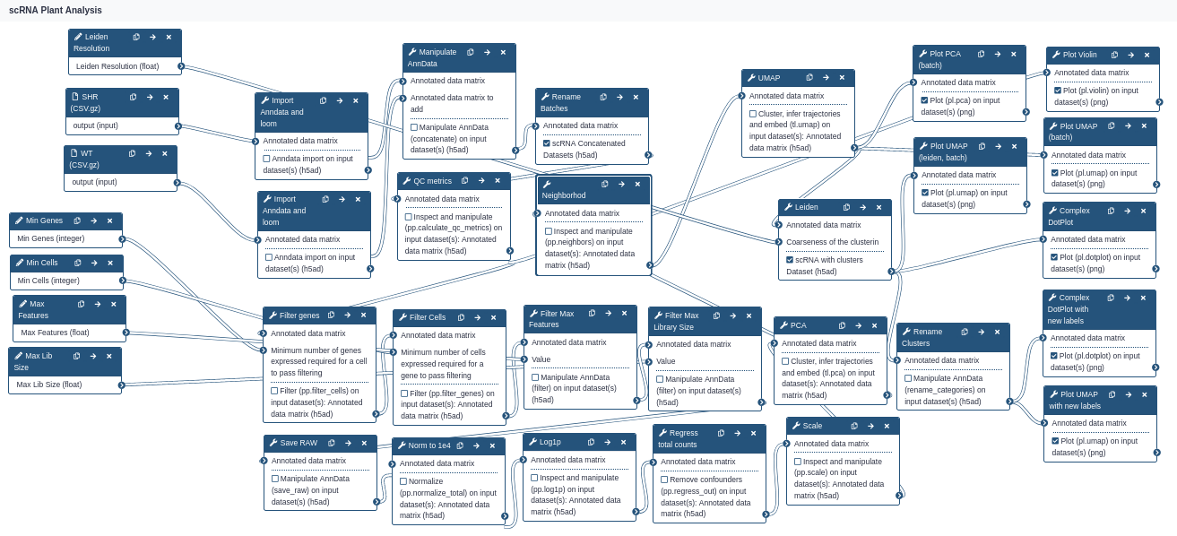
The input parameters take two datasets as input, and 5 parameters using the defaults shown in this tutorial: min cells, min genes, max features, max library size, and Leiden clustering resolution. Play with these options to see how robust the analysis really is!
You've Finished the Tutorial
Key points
Filtering parameters are dependent on the dataset, and should be explored using scatter or violin plots
A DotPlot is a fantastic way to validate clusters across different analyses
Frequently Asked Questions
Have questions about this tutorial? Have a look at the available FAQ pages and support channelsUseful literature
Further information, including links to documentation and original publications, regarding the tools, analysis techniques and the interpretation of results described in this tutorial can be found here.
References
- Satija, R., J. A. Farrell, D. Gennert, A. F. Schier, and A. Regev, 2015 Spatial reconstruction of single-cell gene expression data. Nature biotechnology 33: 495–502.
- Wolf, F. A., P. Angerer, and F. J. Theis, 2018 SCANPY: large-scale single-cell gene expression data analysis. Genome biology 19: 15. https://genomebiology.biomedcentral.com/articles/10.1186/s13059-017-1382-0
- Denyer, T., X. Ma, S. Klesen, E. Scacchi, K. Nieselt et al., 2019 Spatiotemporal developmental trajectories in the Arabidopsis root revealed using high-throughput single-cell RNA sequencing. Developmental cell 48: 840–852.
- Tekman, M., B. Batut, A. Ostrovsky, C. Antoniewski, D. Clements et al., 2020 A single-cell RNA-sequencing training and analysis suite using the Galaxy framework. GigaScience 9: giaa102. 10.1093/gigascience/giaa102 https://academic.oup.com/gigascience/article/9/10/giaa102/5931798
Feedback
Did you use this material as an instructor? Feel free to give us feedback on how it went.
Did you use this material as a learner or student? Click the form below to leave feedback.

Citing this Tutorial
- Mehmet Tekman, Beatriz Serrano-Solano, Cristóbal Gallardo, Pavankumar Videm, Analysis of plant scRNA-Seq Data with Scanpy (Galaxy Training Materials). https://training.galaxyproject.org/training-material/topics/single-cell/tutorials/scrna-plant/tutorial.html Online; accessed TODAY
- Hiltemann, Saskia, Rasche, Helena et al., 2023 Galaxy Training: A Powerful Framework for Teaching! PLOS Computational Biology 10.1371/journal.pcbi.1010752
- Batut et al., 2018 Community-Driven Data Analysis Training for Biology Cell Systems 10.1016/j.cels.2018.05.012
Congratulations on successfully completing this tutorial!@misc{single-cell-scrna-plant, author = "Mehmet Tekman and Beatriz Serrano-Solano and Cristóbal Gallardo and Pavankumar Videm", title = "Analysis of plant scRNA-Seq Data with Scanpy (Galaxy Training Materials)", year = "", month = "", day = "", url = "\url{https://training.galaxyproject.org/training-material/topics/single-cell/tutorials/scrna-plant/tutorial.html}", note = "[Online; accessed TODAY]" } @article{Hiltemann_2023, doi = {10.1371/journal.pcbi.1010752}, url = {https://doi.org/10.1371%2Fjournal.pcbi.1010752}, year = 2023, month = {jan}, publisher = {Public Library of Science ({PLoS})}, volume = {19}, number = {1}, pages = {e1010752}, author = {Saskia Hiltemann and Helena Rasche and Simon Gladman and Hans-Rudolf Hotz and Delphine Larivi{\`{e}}re and Daniel Blankenberg and Pratik D. Jagtap and Thomas Wollmann and Anthony Bretaudeau and Nadia Gou{\'{e}} and Timothy J. Griffin and Coline Royaux and Yvan Le Bras and Subina Mehta and Anna Syme and Frederik Coppens and Bert Droesbeke and Nicola Soranzo and Wendi Bacon and Fotis Psomopoulos and Crist{\'{o}}bal Gallardo-Alba and John Davis and Melanie Christine Föll and Matthias Fahrner and Maria A. Doyle and Beatriz Serrano-Solano and Anne Claire Fouilloux and Peter van Heusden and Wolfgang Maier and Dave Clements and Florian Heyl and Björn Grüning and B{\'{e}}r{\'{e}}nice Batut and}, editor = {Francis Ouellette}, title = {Galaxy Training: A powerful framework for teaching!}, journal = {PLoS Comput Biol} }
Do you want to extend your knowledge?Follow one of our recommended follow-up trainings:
You can use Ephemeris's
shed-tools installcommand to install the tools used in this tutorial.shed-tools install [-g GALAXY] [-a API_KEY] -t <(curl https://training.galaxyproject.org/training-material/api/topics/single-cell/tutorials/scrna-plant/tutorial.json | jq .admin_install_yaml -r)Alternatively you can copy and paste the following YAML
---
install_tool_dependencies: true
install_repository_dependencies: true
install_resolver_dependencies: true
tools:
- name: anndata_import
  owner: iuc
  revisions: 55e35e9203cf
  tool_panel_section_label: Single-cell
  tool_shed_url: https://toolshed.g2.bx.psu.edu/
- name: anndata_manipulate
  owner: iuc
  revisions: 9bd945a03d7b
  tool_panel_section_label: Single-cell
  tool_shed_url: https://toolshed.g2.bx.psu.edu/
- name: scanpy_cluster_reduce_dimension
  owner: iuc
  revisions: aaa5da8e73a9
  tool_panel_section_label: Single-cell
  tool_shed_url: https://toolshed.g2.bx.psu.edu/
- name: scanpy_filter
  owner: iuc
  revisions: b409c2486353
  tool_panel_section_label: Single-cell
  tool_shed_url: https://toolshed.g2.bx.psu.edu/
- name: scanpy_inspect
  owner: iuc
  revisions: c5d3684f7c4c
  tool_panel_section_label: Single-cell
  tool_shed_url: https://toolshed.g2.bx.psu.edu/
- name: scanpy_normalize
  owner: iuc
  revisions: ab55fe8030b6
  tool_panel_section_label: Single-cell
  tool_shed_url: https://toolshed.g2.bx.psu.edu/
- name: scanpy_plot
  owner: iuc
  revisions: 6adf98e782f3
  tool_panel_section_label: Single-cell
  tool_shed_url: https://toolshed.g2.bx.psu.edu/
- name: scanpy_remove_confounders
  owner: iuc
  revisions: bf2017df9837
  tool_panel_section_label: Single-cell
  tool_shed_url: https://toolshed.g2.bx.psu.edu/