The European Reference Genome Atlas (ERGA, Mazzoni et al. 2023) is a large-scale network of researchers aiming to generate high-quality reference genomes for all eukaryotic life in Europe and build capacity to allow researchers anywhere to generate reference genomes and use them to answer questions regarding species conservation and biodiversity. ERGA uses state-of-the-art sequencing technologies and advanced bioinformatics tools to produce high-quality genome assemblies.
Reference genomes provide a baseline for understanding genetic diversity within and among populations, and can be used to identify populations at risk of genetic erosion. This information is crucial for developing effective conservation strategies and management plans for threatened and endangered species (Shafer et al. 2015). Additionally, by better understanding the genetic basis of important traits, such as disease resistance and adaptation to changing environments, researchers can develop targeted interventions to mitigate the effects of environmental change and prevent the loss of genetic diversity (FRANKHAM et al. 2011). The ERGA project has the potential to greatly benefit biodiversity conservation efforts and advance our understanding of the genetic basis of biodiversity.
Genome post-assembly quality control is a crucial step for evaluating the accuracy and completeness of newly assembled genomes. This involves assessing the contiguity, completeness, accuracy, and consistency of the genome assembly using various bioinformatic tools and methods (Koren et al. 2017, Hunt et al. 2015, Mikheenko et al. 2015, Vaser et al. 2017, Zimin et al. 2017). The QC process aims to ensure that genomic data is reliable and useful for downstream analyses such as annotation, comparative genomics, and functional studies.
In this tutorial you will learn how to implement the ERGA Genome Assembly QC pipeline, and how to interpretate the potential outcomes.
In this tutorial we will evaluate three genome assemblies, belonging to three different taxonomic groups, in order to illustrate the different scenarios that can be identified. The characteristics of each of them are described briefly below.
Case 1: Chondrosia reniformis
Chondrosia reniformis is a slow-growing marine sponge cosmopolitan species which can be found in the Mediterranean Sea and the eastern Atlantic Ocean in shallow waters; it is considered to playing an important ecological role in the marine ecosystem by filtering large volumes of water and providing habitat for other species (Voultsiadou 2005). The members of this species are gonochoristic and oviparous, whose physiology and behavious seems to highly influence the presence of endosymbiosis heterotrophic bacteria (Sara Michele and Carlo 1998).
The assembly is based on 70x PacBio HiFi and Arima2 Hi-C data generated by the Aquatic Symbiosis Genomics Project. The assembly process included the following sequence of steps: initial PacBio assembly generation with Hifiasm, retained haplotig separation with purge_dups, and Hi-C based scaffolding with YaHS. The mitochondrial genome was assembled using MitoHiFi. Finally, the primary assembly was analysed and manually improved using gEVAL.
Case 2: Erythrolamprus reginae
Erythrolamprus reginae is a species of colubrid snake found in South America. This species has been reported to include triploid individuals with parthenogenic reproduction; this type of seems to be associated with higher mutation rates and more tandem duplications in the genome (Bogart 1980).
The assembly used in this tutorial correspond to the curated primary assembly generated by the VGP project, based on 34x Pacbio HiFi and Arima2 Hi-C data, by using the VGP assembly pipeline.
Case 3: Eschrichtius robustus
Eschrichtius robustus, commonly known as the gray whale, is a species of whale found primarily in the North Pacific Ocean. Adult gray whales can reach lengths of up to 14.9 meters and weights of up to 36,000 kilograms. It is a diploid species, genetically characterized by high homozygosity (Brüniche-Olsen et al. 2018).
The assembly used in this tutorial correspond to the curated primary assembly generated by the VGP project, based on 29x Pacbio HiFi data, by using the VGP assembly pipeline.
Get data
As a first step we will get the data from Zenodo.
Hands On: Upload data
Create a new history for allocating temporally all the datasets. This history can be named as Datasets history
Import the Pacbio HiFi files from Zenodo:
Open the file galaxy-uploadupload menu
Click on Rule-based tab
“Upload type”: Collections
Copy the tabular data, paste it into the textbox and press Build
From Rules menu select Add / Modify Column Definitions
Click Add Definition button and select Name: column A
Click Add Definition button and select URL: column B
Click Add Definition button and select Type: column C
Click Add Definition button and select Name Tag: column D
Click Apply and press Upload
What data have we imported?
For each species, we have uploaded the fasta file corresponding to the assembly, the raw sequencing data used to generate each assembly - in these cases PacBio HiFi longreads and Illumina Hi-C reads - and databases necessary to run the QC tools included in this tutorial. We will use the taxonomy database new_taxdump.tar.gz and the diamond database of protein sequences from the ncbi nt database to identify any sequence from contaminants or symbiont which are in our assembly using BlobToolKit.
Once we have imported all the datasets, we will move each one to its correspondent history.
Hands On: Upload data
Create three new empty histories, one for each specie.
Rename the histories as Case 1: *Chondrosia reniformis*, Case 2: *Erythrolamprus reginae* and Case 3: *Eschrichtius robustus*.
Click in History options and select Show Histories Side-by-Side
Click in Select histories, and include the histories corresponding to the three species.
Drag and drop to move the datasets to their correspondent histories.
Comment: Non-unique datasets
Both the Taxonomic_data and the Diamond_database should be included in all of them.
Click on galaxy-pencil (Edit) next to the history name (which by default is “Unnamed history”)
Type the new name
Click on Save
To cancel renaming, click the galaxy-undo “Cancel” button
If you do not have the galaxy-pencil (Edit) next to the history name (which can be the case if you are using an older version of Galaxy) do the following:
Click on Unnamed history (or the current name of the history) (Click to rename history) at the top of your history panel
Type the new name
Press Enter
Once all the datasets have been copied to their correspondent history, we should obtain something similar to this:
Figure 4: Histories corresponding to the three cases of study.
Genome assembly overview with BlobToolKit
BlobToolKit is a tool designed to assist researchers in analyzing and visualizing genome assembly data. The tool uses information from multiple data sources such as read coverage, sequence length, and taxonomic annotations to generate a comprehensive overview of genome assembly data (Challis et al. 2020). One of the key characteristics of BlobToolKit is its ability to provide with a user-friendly interactive interface for analyzing complex genome assembly data.
In this tutorial, we will use BlobToolKit in order to integrate the following data:
Read coverage data: BlobToolKit can use read coverage information to identify potential errors or gaps in the genome assembly. By comparing the depth of coverage across the genome, it can highlight regions that may be overrepresented or underrepresented, which can indicate potential issues with the assembly.
Taxonomic annotations: BlobToolKit can use taxonomic information to identify potential contaminants or foreign DNA in the genome assembly. It does this by comparing the taxonomic profile of the genome assembly to a reference database of known organisms.
Sequence similarity data: Sequence similarity data can be used to identify potential misassemblies or contaminants in the genome assembly. BlobToolKit can use BLAST/DIAMOND searches to compare the genome assembly to reference databases and identify regions that may be problematic.
BUSCO reports: BlobToolKit can use BUSCO data to provide additional information about the quality of a genome assembly. It can generate plots of the number of complete and partial BUSCO genes in the genome assembly, as well as the number of missing and fragmented genes.
Comment: Why should we evaluate contaminants?
A significant proportion of the genome sequences in both GenBank and RefSeq (0.54% and 0.34% of entries, respectively) include sequences from contaminants; the contamination primarily exists in the form of short contigs, flanking regions on longer contigs, or areas of larger scaffolds that are flanked by Ns, although a few longer sequences with contamination were also detected (Steinegger and Salzberg 2020).
In the next steps, we will generate the data required for generating the visualization plots with BlobToolKit.
Generate read coverage data with Minimap2
Read coverage is an essential metric for evaluating the quality of genome assemblies, and it provides valuable information for identifying regions of high and low quality, detecting misassemblies, and identifying potential contaminants. Thus, for example, unexpected regions of low coverage suggests potential errors, such as misassemblies, gaps, or low complexity regions (Koren et al. 2017).
In this tutorial we will use Minimap2 for generation the coverage data. Minimap2 is a multi-purpose aligner which is particularly efficient at aligning long-reads produced by sequencing machines from PacBio or Oxford Nanopore (Li 2018).
Comment: How is coverage information encoded in the BAM file?
Coverage information is encoded in the BAM file format through the number of reads that align to each position in the reference genome. Specifically, the BAM file stores each read’s start and end position in the genome, as well as the length and orientation of the read, among other information. To calculate coverage, the number of reads that overlap each position in the reference genome is counted.
Hands On: Generate BAM file with Minimap2
Collapse Collection ( Galaxy version 5.1.0) with the following parameters:
param-collection“Collection of files to collapse into single dataset”: CReniformis_Pacbio
Map with minimap2 ( Galaxy version 2.28+galaxy0) with the following parameters:
“Will you select a reference genome from your history or use a built-in index?”: Use a genome from history and build index
param-file“Select the reference genome”: CReformitis_assembly
“Single or Paired-end reads”: Single
param-file“FASTA/Q file”: output of Collapse Collectiontool
“Select a profile of preset options”: PacBio HiFi reads vs reference mapping (-k19 -w19 -U50,500 -g10k -A1 -B4 -O6,26 -E2,1 -s200 ) (map-hifi)
Repeat the prevous steps with the datasets from the two remanining species.
Generate sequence similarity data with DIAMOND
DIAMOND is a sequence alignment tool that utilizes a more efficient algorithm compared to BLAST, allowing for much faster searches of large sequence databases. Specifically, DIAMOND uses a sensitive seed-extension approach that compares a set of small segments (seeds) from the query sequence to a database, and then extends the alignments based on the highest-scoring hits. This approach allows DIAMOND to perform up to 20,000 times faster than BLAST, with comparable or improved sensitivity and accuracy (Buchfink et al. 2014).
Hands On: Task description
Diamond ( Galaxy version 2.0.15+galaxy0) with the following parameters:
“Alignment mode”: DNA query sequences (blastx)
“Allow for frameshifts?”: yes
“restrict hit culling to overlapping query ranges”: Yes
“frame shift penalty”: 15
param-file“Input query file in FASTA or FASTQ format”: CReformitis_assembly
“Will you select a reference database from your history or use a built-in index?”: Use one from the history
param-file“Select the reference database”: Diamond_db
“Restrict search taxonomically?”: No
“Sensitivity Mode”: Fast (--fast)
“Block size in billions of sequence letters to be processed at a time”: 10.0
“Method to filter?”: Maximum e-value to report alignments
“Method to restrict the number of hits?”: Maximum number of target sequences
In “Output options”:
“Format of output file”: BLAST tabular
“Tabular fields”: Query Seq-id,Subject Seq -id, Start of alignment in query, End of alignment in query, Expected value, Bit score and Unique Subject Taxonomy ID(s), separated by a ',' (in numerical order)
Repeat the prevous steps with the datasets from the two remanining species.
Generate BUSCO report
BUSCO (Benchmarking Universal Single-Copy Orthologs) is a tool used for quantitative assessment of genome assembly, gene set, and transcriptome completeness. It is based on evolutionarily informed expectations of gene content derived from near-universal single-copy orthologs (Simão et al. 2015)
Comment: Orthologs
Orthologs are genes in different species which have usually the same function and have evolved from a common ancestral gene. They are important for new genome assemblies in order to predict gene functions and help with gene annotation (Gennarelli and Cattaneo 2010).
Hands On: Estimate single copy gene representation completeness
Busco ( Galaxy version 5.7.1+galaxy0) with the following parameters:
param-file“Sequences to analyse”: CReformitis_assembly
“Lineage data source”: Use cached lineage Data
“Cached database with lineage”: Busco v5 Lineage Datasets
“Mode”: Genome assemblies (DNA)
“Select a gene predictor”: Metaeuk
“Auto-detect or select lineage?”: Auto-detect (For Erythrolamprus reginae, select Select lineage then Vertebrata in “Lineage”)
“auto-lineage group”: All taxonomic groups (--auto-lineage)
“Which outputs should be generated”: Short summary text
BUSCO sets represent 3,023 genes for vertebrates, 2,675 for arthropods, 843 for metazoans, 1,438 for fungi and 429 for eukaryotes. An intuitive metric is provided in BUSCO notation - C:complete[S:single, D:duplicated], F:fragmented, M:missing, n:number of genes used.
Repeat the prevous steps with the datasets from the two remanining species.
Question
What are the values of complete BUSCO genes for each species?
Eschrichtius robustus: 96.0%
Erythrolamprus reginae: 91.3%
Chondrosia reniformis: 82.8%
Generate interactive plots with BlobToolKit
BlobToolKit is a tool designed to assist researchers in analyzing and visualizing genome assembly data. The tool uses information from multiple data sources such as read coverage, gene expression, and taxonomic annotations to generate a comprehensive overview of genome assembly data (Challis et al. 2020). One of the key characteristics of BlobToolKit is its ability to provide with a user-friendly interactive interface for analyzing complex genome assembly data.
To work with BlobToolKit we need to create a new dataset structure called BlobDir. Therefore the minimum requirement is a fasta file which contains the sequence of our assembly. A list of sequence identifiers and some statistics like length, GC proportion and undefined bases will then be generated.
To get a more meaningful analysis and therefore more useful information about our assembly, it is better to provide as much data as we can get. In our case we will also provide a metadata file if possible, NCBI taxonomy ID and the NCBI taxdump directory (Challis et al. 2020).
Hands On: Creating the BlobDir dataset
BlobToolKit ( Galaxy version 3.4.0+galaxy0) with the following parameters:
param-file“BAM/SAM/CRAM read alignment file”: output of Minimap2tool
Interactive BlobToolKit with the following parameters:
param-file“Blobdir file”: output of BlobToolKittool
Click on the galaxy-eye (eye) icon and inspect the output of Interactive BlobToolKit.
Repeat the prevous steps with the datasets from the two remanining species.
Now, we will evaluate three of plots that we can find in the Blobtoolkit interactve interface. First, we will start with the snailplot, which provides a holistic view of the assembly.
Figure 5: Chondrosia reniformis snail plot summary. The grey line represents the assembly scaffolds, where the distance to the center of the circle indicates the length of the scaffolds. A scale line in the center of the circle helps to gauge the length. Longest contig: The red line in the plot indicates the longest contig in the assembly. N50 and N90: The dark orange and light orange lines represent the scaffolds contained in the N50 and N90 metrics, respectively. GC/AT content: The outer light and dark blue lines represent the GC and AT content, respectively. In an ideal assembly, the line between the two colors should be consistent, without much fluctuation. Gaps: Gaps in the assembly, if present, are denoted by the percent N in the bottom right of the image.
The main plot is divided into 1,000 size-ordered bins around the circumference with each bin representing 0.1% of the 117,390,217 bp assembly. The distribution of sequence lengths is shown in dark grey with the plot radius scaled to the longest sequence present in the assembly (10,413,042 bp, shown in red).
Orange and pale-orange arcs show the N50 and N90 sequence lengths (8,459,200 and 6,903,244 bp), respectively. The pale grey spiral shows the cumulative sequence count on a log scale with white scale lines showing successive orders of magnitude. The blue and pale-blue area around the outside of the plot shows the distribution of GC, AT and N percentages in the same bins as the inner plot. A summary of complete, fragmented, duplicated and missing BUSCO genes in the eukaryota_odb10 set is shown in the top right.
Question: Snailplot question
Which differences do you appreciate between the snailplots corresponding to Erythrolamprus reginae and Eschrichtius robustus?
Figure 6: Comparison between snailplots from E. reginae (A) and E. robustus (B).
(A) The snake (Erythrolamprus reginae) does have a relatively large proportion of the genome assembled into some few and long scaffolds (reflected in the high “longest scaffold” value and the high “Log10 scaffold count” value).
(B) The whale (Eschrichtius robustus) does have a relatively large proportion of the genome assembled into fragmented scaffolds (reflected in the low N90 value compared to the N50 value and the high “Log10 scaffold count” value)
Now, we are going to analyze the blob plot corresponding to Erythrolamprus reginae, which is especially useful for gaining insights into the composition of your genomic data and identify potential contaminants or endosymbionts.
Figure 7: Blob plot of base coverage in input against GC proportion for sequences in *E. reginate assembly*. Sequences are coloured by phylum. Circles are sized in proportion to sequence length . Histograms show the distribution of sequence length sum along each axis
The blob plot is a two-dimensional scatter plot that helps in visualizing and analyzing genomic data for quality control, contaminant detection, and filtering. In the circle plot, each sequence is represented by a circle, with its diameter proportional to the sequence length. Circles are colored based on their taxonomic affiliation, and their positions on the X and Y axes are determined by their GC content and coverage, respectively. GC content is the proportion of G and C bases in the sequence, which can differ substantially between genomes. Coverage, on the other hand, is a measure of the number of times a particular sequence has been read during the sequencing process. The plot also includes coverage and GC histograms for each taxonomic group, weighted by the total span (cumulative length) of sequences occupying each bin.
Comment: Pre-curated assembly evaluation
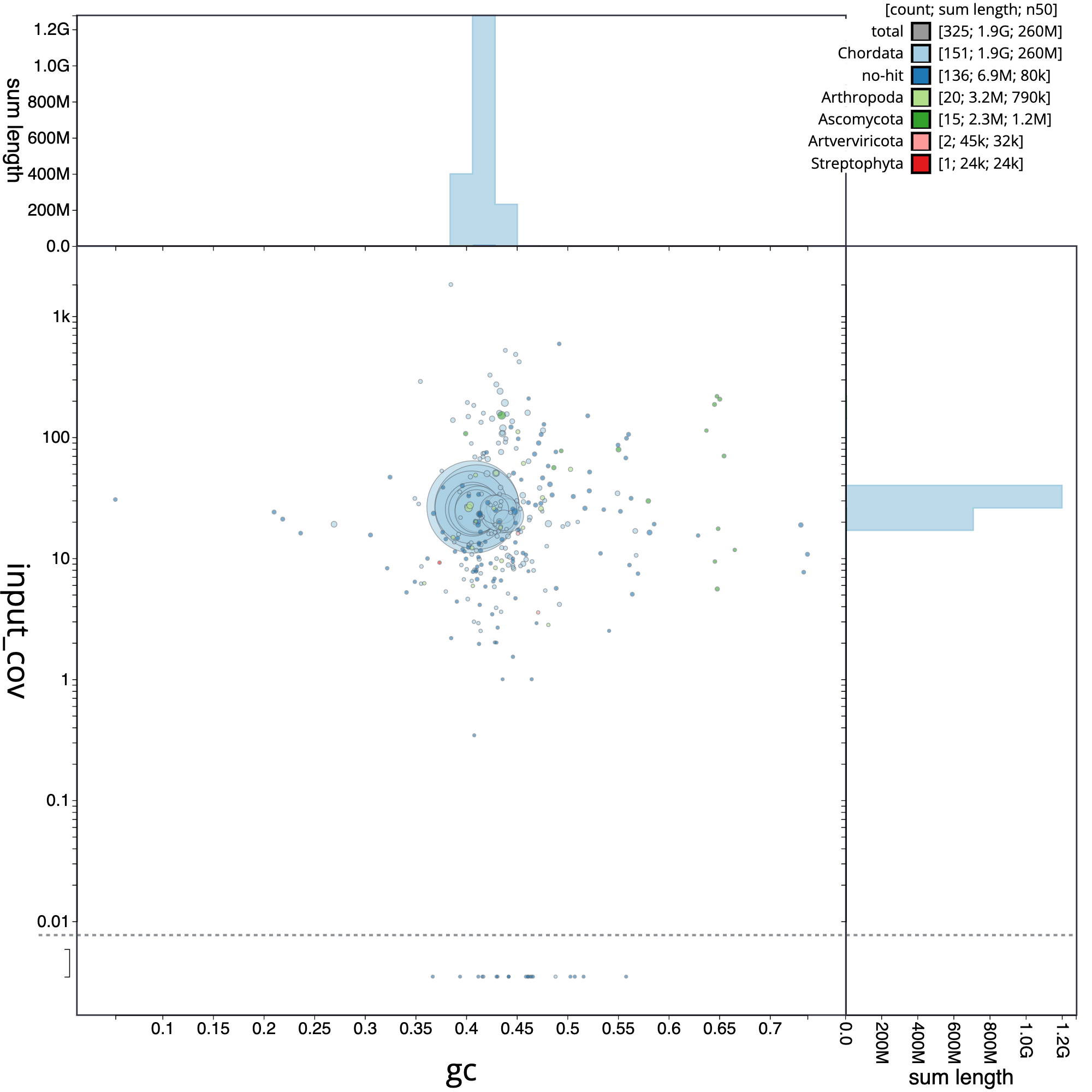
Usually, the evaluation of the pre-curated assembly yield quite different results when compared with the post-curation evaluation. A frequent difference is the abudance of contigs that belong to different organisms, as a result of contamination in the reads. It can be clearly appreciated in the next figure, which correspond to the E. reginae pre-curated assembly. A striking element is the presence of 38 contigs corresponding to the phylum Artverviricota (dark green), a group of viruses that encode a reverse transcriptase.
Figure 8: Blob plot of base coverage in input against GC proportion for sequences in pre-curated E. reginate assembly. Sequences are coloured by phylum. Circles are sized in proportion to sequence length . Histograms show the distribution of sequence length sum along each axis
In addition, as we can appreciate, the samples included contamination from fungi, arthropoda and bacteria.
Question: Blob plot question
Is there significant contamination in the Eschrichtius robustus and Chondrosia reniformis assemblies?
Figure 9: Comparison between blob plots from E. robustus (A) and C. reniformis (B).
(A) The whale (Eschrichtius robustus) does have significant contamination. Approximately half of the assembled sequences of the whale does contain contaminants or cosymbionts (total count: 703, Chordata count: 316), however as the foreign sequences are smaller, they make up a small percentage of the total assembly.
(B) The sponge (Condrosia reniformis) doesn’t contain any foreign sequences or contaminatio (total count: 15, Chordata count: 15).
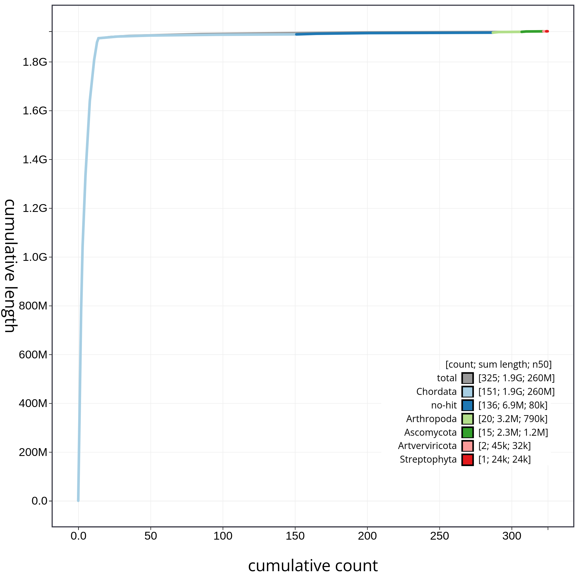
Finally, let’s have a look at the cumulative sequence length plot, which shows the curves for subsets of scaffolds assigned to each phylum relative to the overall assembly. It is useful for evaluating the contribution of the contigs from contaminated reads to the final assembly. In that case, first we will evaluate all sequences together, and then we will remove those correspoding to chordata or not classified (not-hit) in order to be able to evaluate in detail each of the contaminants. So, let’s start with the accumulative plot corresponding to all sequences (fig. 10).
In this kind of plot, the x-axis represent the number of contigs (sorted by species and length), and the y-axis correspond to the cumulative length in nucleotides. The gray line shows the cumulative length of all sequences. As we can appreciate, most sequences corespond to the taxa chordata (1.9Gb, distributed along 151 contigs). In addition, we can see that the final assembly includes 174 contigs corresponding to different taxa, or not classified at all. In order to be able to analyze the contribution of those sequences, we will filter the contigs corresponding to the chordata.
Figure 10: Cumulative sequence length for assembly Blobdir. The grey line shows cumulative length for all sequences. Coloured lines show cumulative lengths of sequences assigned to each phylum using the bestsum taxrule. Plot axes are scaled to the filtered assembly.
Comment: How do I apply filters to a dataset?
Datasets can be filtered based on any category or variable using the “Filters” menu. To filter based on a category, click the tab above any bar of the preview histogram to hide/show records assigned to this category. To filter variables, use the sliders at either end of the preview histogram to change the maximum and minimum values or enter the numbers directly into the text boxes above the histogram.
By hidding the contings corresponding to chordata, we can have a detailed view of the contributions of each contaminant (fig. 11).
Figure 11: The grey line shows cumulative length for all sequences. Coloured lines show cumulative lengths of sequences assigned to each phylum using the bestsum taxrule and are stacked by cumulative value on the x-axis to show the proportion of each phylum in the overall assembly. The assembly has been filtered to exclude sequences with phylum matches Chordata. Plot axes are scaled to the filtered assembly.
In figure 11 we can appreciate clearly the relative contribution of each contaminant with respect to the total contamination.
K-mer based genome profiling and evaluation
k-mers can be utilized to infer genome characteristics such as length and heterozygosity by analyzing their frequency distribution in raw sequencing reads (Manekar and Sathe 2018). In this tutorial we will make use of three different tools in order to perform the k-mer based genome profiling and assembly evaluation.
Comment: Genome profiling details
You can find more details about genome profiling in the VGP training.
Generating k-mer profile with Meryl
DNA is double stranded and normally only one strand is sequenced. For our assembly we want to consider the other strand as well. Therefore canonical k-mers are used in most counting tools, exactly like in Meryl. A full k-mer pair is a sequence and the reverse complement of the sequence (e.g. ATG/CAT). The canonical sequence of a k-mer pair is the lexicographically smaller of the two reverse complementary sequences. So if CAT appears it will be counted as ATG. (Clavijo)
Meryl is a powerful tool for counting k-mers in large-scale genomic datasets. It uses a sorting-based approach that sorts the k-mers in lexicographical order.
Hands On: Generating k-mer profile
Meryl ( Galaxy version 1.3+galaxy6) with the following parameters:
In general k can be computed as k=log4 (G(1-p)/p), with G as genome size and p as tolerable collision rate.
In our case we set the k-mer size to 21.
Run Meryl ( Galaxy version 1.3+galaxy6) again with the following parameters:
“Operation type selector”: Operations on sets of k-mers
“Operations on sets of k-mers”: Union-sum: return k-mers that occur in any input, set the count to the sum of the counts
param-file“Input meryldb”: previous output of Meryltool
Run Meryl ( Galaxy version 1.3+galaxy6) a third time with the following parameters:
“Operation type selector”: Generate histogram dataset
param-file“Input meryldb”: previous output of Meryltool
Rename the output as Histogram dataset
K-mer profile analysis with GenomeScope
Genomescope is used for analysing genomes with the help of k-mer profile analysis. It estimates the overall genome characteristics and the overall read characteristics. The tool will use a given k-mer profile which is calculated only from raw reads sequencing data. It then generates a plot with the calculated data giving us information about the completeness and quality of the to be assembled data. (Vurture et al. 2017)
Hands On: Generate plots for analysis
GenomeScope ( Galaxy version 2.0+galaxy2) with the following parameters:
“Ploidy for model to use”: 2 for C. reniformis and E. robustus, 3 for E. reginae.
Comment: Plots
The generated plots will have the coverage on the x-axis and the frequency on the y-axis. It shows the fitted model in the observed k-mer data as well as the k-mer peaks and other information like some estimated parameters of the assembly.
Figure 12: Genomescope 21-mer profile (k:21) of Chondrosia reniformis, diploid (p:2). The plot includes estimations about the genome length (len:124,167,659bp), unique sequences (uniq:61.5%), homozygous portion (aa: 98.7%), heterozygous portions (ab:1.32%), mean k-mer coverage for heterozygous bases (kcov:35.4), read error rate (err:0.752%) and average rate of read duplications (dup:0.378).
Figure 12 corresponds to the k-mer profile of the sponge (Chondrosia reniformis). Presumably, the large gene number in the sponge genome is due to regional gene duplication; so far evidence for a transposition in sponges has been presented. Data indicate that only 0.25 % of the total sponge genome comprises CA/TG microsatellites, and until now also no SINEs/transposable elements have been identified. The estimated genome size around 124,Mbp is relatively close to Chondrosia reniformis genome size (117,39Mbp).
Question: Genome profile question
Which differences can you appreciate between the genome profile of Erythrolamprus reginae and Eschrichtius robustus?
(A) The genome profile of the snake (Erythrolamprus reginae) suggests a high level of heterozygosity (reflected by the first peak at 11.1x coverage). 51.6% unique sequences have been estimated. In this case the low value is attributed to the parthenogenesis and the polyploidy of this snake which causes tandem duplications and higher DNA replication as a result of the triploid-diploid cycles.
(B) The genome profile of the whale (Eschrichtius robustus) suggests a high level of homozygosity (reflected by the second peak at 29x coverage). The homozygous k-mer distribution can be expected from the high grade of inbreeding.
K-mer based assembly evaluation with Merqury
Merqury is designed for evaluating the completeness and accuracy of long-read genome assemblies using short-read sequencing data. Thus the quality of assemblies which are generated by using third-generation sequencing technologies can be reviewed and assessed by the tool.
Merqury works by comparing k-mers of an assembly to those from unassembled high-accuracy reads of the raw sequencing data. K-mer-based methods are also used to identify errors and missing sequences. (Rhie et al. 2020)
Hands On: Generating stats and plots
Merqury ( Galaxy version 1.3+galaxy2) with the following parameters:
“Evaluation mode”: Default mode
param-file“K-mer counts database”: read_db (output of Meryltool)
“Number of assemblies”: One assembly (pseudo-haplotype or mixed-haplotype)
param-file“Genome assembly”: CReformitis_assembly
Comment: Output
Merqury will now generate following outputs:
stats with completeness statistics
QV stats with quality value statistics
plots
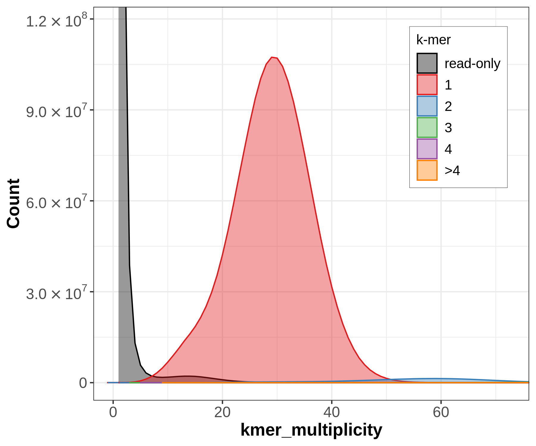
Let’s have a closer look at the copy number plots for each of the three species. Merqury will generate k-mers from the raw sequencing data (in the following called the ‘read set’) and will compare them to the assembly, in contrast to genomescope. Despite being diploid or triploid the species only got plotted with the primary assembly. This is why only one-copy k-mers get evaluated.
Figure 14: Merqury copy numbers (CN) plot of the whale (*Eschrichtius robustus*). The red area displays the k-mers of the assembly. The black area displays the k-mers only found in the read set. The black area can be indicative for sequencing error in the read set or missing sequences in the assembly.
The small black area indicates that most of the k-mers found in the read set are also found in the assembly (but not all since only the primary assembly got plotted). It reflects a highly homozygous assembly. This plot indicates a sequencing coverage at ~30x as seen before with genomescope.
Question: Genome profile question
Which differences can you appreciate between the genome profile of Chondrosia reniformis and Erythrolamprus reginae?
Figure 15: Merqury copy numbers (CN) plot of Chondrosia reniformis (A) and Erythrolamprus reginae (B). The red area displays the k-mers of the assembly. The black area displays the k-mers only found in the read set. The black area can be indicative for sequencing error in the read set or missing sequences in the assembly.
(A) The sponge (Chondrosia reniformis) does have two peaks as seen before with genomescope which is typical for a diploid species. The large black area indicates that there is a high amount of k-mers in the read set which is not used in the assembly since only the primary assembly got plotted. The secondary assembly is missing.
(B) The snake (Erythrolamprus reginae) does have three peaks as seen before with genomescope which is typical for a triploid species. The black area is even larger compared to the sponge since only the primary assembly got plotted. The secondary and third assembly are missing.
Providing assembly statistics with gfastats
gfastats is a tool for providing summary statistics and genome file manipulation. In our case it will generate genome assembly statistics in a tabular-format output. Metrics like N50/L50, GC-content and lengths of contigs, scaffolds and gaps as well as other statistical information are provided for assessing the contiguity of the assembly.
Hands On: Generate summary statistics
gfastats ( Galaxy version 1.2.0+galaxy0) with the following parameters:
Consider taking all contigs and sorting them by size. Starting with the largest and ending with the smallest. Now add up the length of each contig beginning with the largest, then the second largest and so on. When reaching 50% of the total length of all contigs it’s done. The length of the contig you stopped is the N50 value. (Videvall)
NG50 or more general NG(X) is based on the same idea as N50. The difference is that in this case the whole genome size or estimated genome size is taken into account. Through this comparisons can be made over different assemblies and genome sizes.
Comment: L50
Remember adding up the length of each contig until reaching the 50%. The L50 value is the number of the contig you have stopped.
Example: The sum of all contigs together is 2000 kbp. The contig at 50% has length 300 kbp and is the third one and thus the third largest.
Then N50 = 300 kbp and L50 = 3.
In the best case a high quality assembly should consist of just a few and large contigs to represent the genome as a whole. Therefore a good assembly should lead to a high N50 value and in contrast a low quality assembly with tiny, fragmented contigs would lead to a low N50 value. (Videvall)
The metric doesn’t only rely on measuring the 50% mark. The general case is N(X) where X ranges from 0 - 100 mostly in ten steps. However the NX metric is not suitable for comparing different species with different genome lengths.
The GC-content or guanine-cytosine ratio tells one about the occurrence of guanine and cytosine in a genome. It is stated in percent. The two nucleobases are held together by three hydrogen bonds. A high GC-content makes DNA more stable than a low GC-content. Because the ratio of most species and organisms has been found out by now, it is also a good metric to gauge completeness.(Wikipedia)
Another good metric for gauging contiguity is the CC ratio. The value is calculated by dividing contig counts by the chromosome pair number. A perfect score would be 1. Therefore the lower the value the better the contiguity of the assembly.
Hi-C scaffolding
To understand how chromosomes are arranged in their three-dimensional structure in the nucleus, high resolution and high throughput imaging techniques have been developed. Hi-C is a high throughput method to measure pairwise contacts between pairs of genomic loci.
It is based on cross-linking the DNA in the nucleus and its histones (proteins around which the DNA is wrapped). However the DNA gets cut and marked and afterwards the cut parts get ligated together. Then the DNA gets fragmented and sequenced forwards and backwards generating paired reads. The resulting information can be used to assemble the reads to the corresponding chromosome.
(Pal et al. 2018)
Pre-processing Hi-C data
The following analysis use Hi-C reads in single datasets: one for the forward reads and one for the reverse reads. If you have more than one fastq datasets, as we do for Erythrolamprus reginae you will need to merge them into single datasets.
If you have only one pair of datasets, skip this step.
Hands On: Merge Erythrolamprus reginae Hi-C data into single datasets
Create a collection with the Hi-C forward reads name EReginae Hi-C forward reads.
Do the same with the reverse reads (R) and name it EReginae Hi-C reverse reads.
For species with more than one set of Hi-C reads, verify that the datasets are ordered the same way in both collections. If not, sort both collections with the tool Sort collection
Collapse Collection ( Galaxy version 5.1.0) with the following parameters:
param-collection“Collection of files to collapse into single dataset”: EReginae Hi-C forward Reads
Rename the dataset EReginae Hi-C forward Reads
Collapse Collection ( Galaxy version 5.1.0) with the following parameters:
param-collection“Collection of files to collapse into single dataset”: EReginae Hi-C reverse reads
Rename the dataset EReginae Hi-C reverse Reads
Click on galaxy-selectorSelect Items at the top of the history panel
Check the fastq.gz containing the Hi-C forward reads (F)
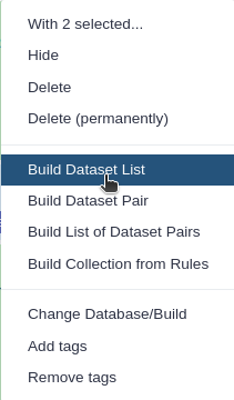
Click 1 of N selected and choose Advanced Build List
You are in collection building wizard. Choose Flat List and click ‘Next’ button at the right bottom corner.
Double clcik on the file names to edit. For example, remove file extensions or common prefix/suffixes to cleanup the names.
Enter a name for your collection to EReginae Hi-C forward Reads
Click Build to build your collection
Click on the checkmark icon at the top of your history again
Click on the galaxy-pencilpencil icon for the dataset to edit its attributes
In the central panel, change the Name field to Hi-C forward Reads
Click the Save button
Hands On: Mapping Hi-C reads against a reference genome
BWA-MEM2 ( Galaxy version 2.2.1+galaxy0) with the following parameters:
“Will you select a reference genome from your history or use a built-in index?”: Use a genome from history and build index
param-file“Use the following dataset as the reference sequence”: CReformitis_assembly
“Single or Paired-end reads”: Single
param-file“Select fastq dataset”: Hi-C forward Reads (output of Collapse Collectiontool)
“Set read groups information?”: Do not set
“Select analysis mode”: 1.Simple Illumina mode
“BAM sorting mode”: Sort by read names (i.e., the QNAME field)
Rename the bam dataset Mapped Hi-C forward Reads
BWA-MEM2 ( Galaxy version 2.2.1+galaxy0) with the following parameters:
“Will you select a reference genome from your history or use a built-in index?”: Use a genome from history and build index
param-file“Use the following dataset as the reference sequence”: CReformitis_assembly
“Single or Paired-end reads”: Single
param-file“Select fastq dataset”: Hi-C reverse Reads (output of Collapse Collectiontool)
“Set read groups information?”: Do not set
“Select analysis mode”: 1.Simple Illumina mode
“BAM sorting mode”: Sort by read names (i.e., the QNAME field)
Rename the bam dataset Mapped Hi-C reverse Reads
Filter and merge ( Galaxy version 1.0+galaxy0) with the following parameters:
param-file“First set of reads”: Mapped Hi-C forward Reads (output of BWA-MEM2tool)
param-file“Second set of reads”: Mapped Hi-C reverse Reads (output of BWA-MEM2tool)
Generate Hi-C contact map
PretextMap converts BAM/SAM files into genome contact maps. With those contact maps it is possible to analyse the 3D organisation of chromosomes. The resulting map will be used for visualisation and editing contigs/scaffolds. (Kumar et al. 2017)
Hands On: Generate a contact map with PretextMap and PretextSnapshot
PretextMap ( Galaxy version 0.1.9+galaxy1) with the following parameters:
param-file“Input dataset in SAM or BAM format”: outfile (output of Filter and mergetool)
“Sort by”: Ascending
Pretext Snapshot ( Galaxy version 0.0.3+galaxy1) with the following parameters:
param-file“Input Pretext map file”: pretext_map_out (output of PretextMaptool)
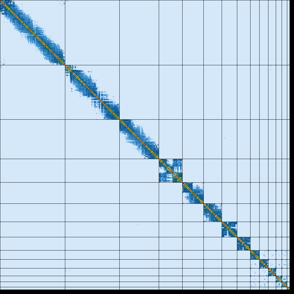
Figure 16: Hi-C contact map of Erythrolamprus reginae generated by Pretext.
The contact map of the snake (Erythrolamprus reginae) does have a clear diagonal pattern. These interactions are commonly called “cis” interactions and occur between genomic loci that are spatially close to each other. Interactions beyond the diagonal pattern are called “trans” and indicate long-range interactions.
Question: Hi-C contact map question
What can you say about the Hi-C map corresponding to Chondrosia reniformis?
Figure 17: Hi-C contact map of Chondrosia reniformis generated by Pretext.
The contact map of the sponge (Chondrosia reniformis) does contain widespread interactions all over the genome. Additionally a diagonal pattern can be observed. The widespread interactions all over the genome can be the result of experimental and technical issues or it can have a biological and functional significance - such as interactions between chromosomes in the nucleus.
Assembly graph
Bandage is a tool to visualise de novo assembly graphs with connections. (Wick et al. 2015)
Hands On: Generate assembly graph
gfastats ( Galaxy version 1.3.6+galaxy0) with the following parameters:
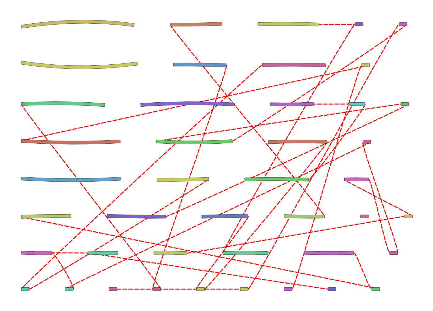
Figure 18: Assembly graph of the sponge (*Chrondrosia reniformis*). Contigs (nodes) are displayed in different colors and their connections (edges) are displayed as red dotted lines.
The Assembly graph of Chondrosia reniformis is relatively simple and doesn’t have a complex structure. The connectivity of the nodes is clear but incomplete and lacking some indicative regions of overlapping contigs. Repetitive regions can be investigated by searching for multiple paths or connections in the graph.
Question: Assembly graph question
Which differences can you appreciate between the assembly graph corresponding to Erythrolamprus reginae and Eschrichtius robustus?
Figure 19: Assembly graph of Erythrolamprus reginae (A) and Eschrichtius robustus (B). Contigs (nodes) are displayed in different colors and their connections (edges) are displayed as red dotted lines.
(A) The assembly graph of the snake (Erythrolamprus reginae) does have a confusing and complex structure. This can be an indicator for errors or misassemblies. The nodes are well-connected but relatively unclear in their path which is reflected by many small contigs and only a few large contigs. This assembly graph does contain a lot of repetitive sequences that result in multiple paths and connections between the nodes.
(B) The assembly graph of the whale (Eschrichtius robustus) is overall relatively simple and doesn’t have a too complex structure. The nodes are well-connected and most of the paths are clear which is reflected by many large contigs and only some small contigs. This assembly does also contain repetitive regions but clearly less than in the assembly of the snake.
Conclusion
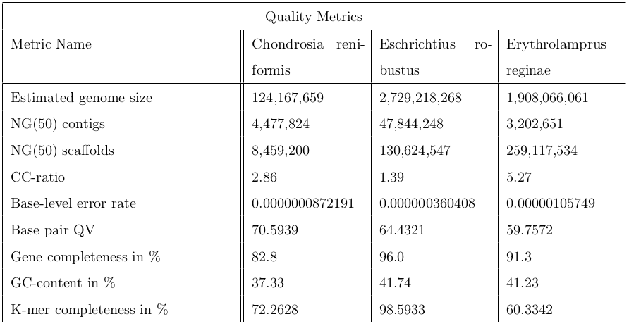
In conclusion, it’s worth to run the a post-assembly QC workflow to assess the quality of genome assemblies. The following table contains metrics to sum up the quality control.
Figure 20: This table contains 9 indicators for quality evaluation of three different organisms: Chondrosia reniformis, Eschrichtius robustus and Erythrolamprus reginae.
You've Finished the Tutorial
Please also consider filling out the Feedback Form as well!
Key points
The ERGA post-assembly pipeline allows users to assess and improve the quality of genome assemblies
The ERGA post-assembly pipeline consists of three main steps: Genome assembly decontamination and overview with BlobToolKit, providing analysis information and statistics, and Hi-C scaffolding.
Frequently Asked Questions
Have questions about this tutorial? Have a look at the available FAQ pages and support channels
Bogart, J. P., 1980 Evolutionary Implications of Polyploidy in Amphibians and Reptiles, pp. 341–378 inPolyploidy, Springer US. 10.1007/978-1-4613-3069-1_18
Voultsiadou, E., 2005 Sponge diversity in the Aegean Sea: Check list and new information. Italian Journal of Zoology 72: 53–64. 10.1080/11250000509356653
Gennarelli, M., and A. Cattaneo, 2010 Genetic Variations and Association, pp. 129–151 inInternational Review of Neurobiology, Elsevier. 10.1016/b978-0-12-384976-2.00006-x
FRANKHAM, R. I. C. H. A. R. D., J. O. N. A. T. H. A. N. D. BALLOU, M. A. R. K. D. B. ELDRIDGE, R. O. B. E. R. T. C. LACY, K. A. T. H. E. R. I. N. E. RALLS et al., 2011 Predicting the Probability of Outbreeding Depression. Conservation Biology 25: 465–475. 10.1111/j.1523-1739.2011.01662.x
Buchfink, B., C. Xie, and D. H. Huson, 2014 Fast and sensitive protein alignment using DIAMOND. Nature Methods 12: 59–60. 10.1038/nmeth.3176
Hunt, M., N. D. Silva, T. D. Otto, J. Parkhill, J. A. Keane et al., 2015 Circlator: automated circularization of genome assemblies using long sequencing reads. Genome Biology 16: 10.1186/s13059-015-0849-0
Mikheenko, A., V. Saveliev, and A. Gurevich, 2015 MetaQUAST: evaluation of metagenome assemblies. Bioinformatics 32: 1088–1090. 10.1093/bioinformatics/btv697
Shafer, A. B. A., J. B. W. Wolf, P. C. Alves, L. Bergström, M. W. Bruford et al., 2015 Genomics and the challenging translation into conservation practice. Trends in Ecology &\mathsemicolon Evolution 30: 78–87. 10.1016/j.tree.2014.11.009
Simão, F. A., R. M. Waterhouse, P. Ioannidis, E. V. Kriventseva, and E. M. Zdobnov, 2015 BUSCO: assessing genome assembly and annotation completeness with single-copy orthologs. Bioinformatics 31: 3210–3212. 10.1093/bioinformatics/btv351
Wick, R. R., M. B. Schultz, J. Zobel, and K. E. Holt, 2015 Bandage: interactive visualization of \lessi\greaterde novo\less/i\greater genome assemblies. Bioinformatics 31: 3350–3352. 10.1093/bioinformatics/btv383
Koren, S., B. P. Walenz, K. Berlin, J. R. Miller, N. H. Bergman et al., 2017 Canu: scalable and accurate long-read assembly via adaptive \lessi\greaterk\less/i\greater-mer weighting and repeat separation. Genome Research 27: 722–736. 10.1101/gr.215087.116
Kumar, R., H. Sobhy, P. Stenberg, and L. Lizana, 2017 Genome contact map explorer: a platform for the comparison, interactive visualization and analysis of genome contact maps. Nucleic Acids Research 45: e152–e152. 10.1093/nar/gkx644
Vaser, R., I. Sović, N. Nagarajan, and M. Šikić, 2017 Fast and accurate de novo genome assembly from long uncorrected reads. Genome Research 27: 737–746. 10.1101/gr.214270.116
Vurture, G. W., F. J. Sedlazeck, M. Nattestad, C. J. Underwood, H. Fang et al., 2017 GenomeScope: fast reference-free genome profiling from short reads (B. Berger, Ed.). Bioinformatics 33: 2202–2204. 10.1093/bioinformatics/btx153
Zimin, A. V., D. Puiu, R. Hall, S. Kingan, B. J. Clavijo et al., 2017 The first near-complete assembly of the hexaploid bread wheat genome, Triticum aestivum. GigaScience 6: 10.1093/gigascience/gix097
Brüniche-Olsen, A., R. Westerman, Z. Kazmierczyk, V. V. Vertyankin, C. Godard-Codding et al., 2018 The inference of gray whale (Eschrichtius robustus) historical population attributes from whole-genome sequences. BMC Evolutionary Biology 18: 10.1186/s12862-018-1204-3
Manekar, S. C., and S. R. Sathe, 2018 A benchmark study of k-mer counting methods for high-throughput sequencing. GigaScience. 10.1093/gigascience/giy125
Pal, K., M. Forcato, and F. Ferrari, 2018 Hi-C analysis: from data generation to integration. Biophysical Reviews 11: 67–78. 10.1007/s12551-018-0489-1
Challis, R., E. Richards, J. Rajan, G. Cochrane, and M. Blaxter, 2020 BlobToolKit – Interactive Quality Assessment of Genome Assemblies. G3 Genes\vertGenomes\vertGenetics 10: 1361–1374. 10.1534/g3.119.400908
Rhie, A., B. P. Walenz, S. Koren, and A. M. Phillippy, 2020 Merqury: reference-free quality, completeness, and phasing assessment for genome assemblies. Genome Biology 21: 10.1186/s13059-020-02134-9
Steinegger, M., and S. L. Salzberg, 2020 Terminating contamination: large-scale search identifies more than 2, 000, 000 contaminated entries in GenBank. Genome Biology 21: 10.1186/s13059-020-02023-1
Mazzoni, C. J., C. Ciofi, and R. M. Waterhouse, 2023 Biodiversity: an atlas of European reference genomes. Nature 619: 252–252. 10.1038/d41586-023-02229-w
Did you use this material as an instructor? Feel free to give us feedback on how it went.
Did you use this material as a learner or student? Click the form below to leave feedback.
Hiltemann, Saskia, Rasche, Helena et al., 2023 Galaxy Training: A Powerful Framework for Teaching! PLOS Computational Biology 10.1371/journal.pcbi.1010752
Batut et al., 2018 Community-Driven Data Analysis Training for Biology Cell Systems 10.1016/j.cels.2018.05.012
@misc{assembly-ERGA-post-assembly-QC,
author = "Fabian Recktenwald and Cristóbal Gallardo and Tom Brown and Delphine Lariviere",
	title = "ERGA post-assembly QC (Galaxy Training Materials)",
	year = "",
	month = "",
	day = "",
	url = "\url{https://training.galaxyproject.org/training-material/topics/assembly/tutorials/ERGA-post-assembly-QC/tutorial.html}",
	note = "[Online; accessed TODAY]"
}
@article{Hiltemann_2023,
	doi = {10.1371/journal.pcbi.1010752},
	url = {https://doi.org/10.1371%2Fjournal.pcbi.1010752},
	year = 2023,
	month = {jan},
	publisher = {Public Library of Science ({PLoS})},
	volume = {19},
	number = {1},
	pages = {e1010752},
	author = {Saskia Hiltemann and Helena Rasche and Simon Gladman and Hans-Rudolf Hotz and Delphine Larivi{\`{e}}re and Daniel Blankenberg and Pratik D. Jagtap and Thomas Wollmann and Anthony Bretaudeau and Nadia Gou{\'{e}} and Timothy J. Griffin and Coline Royaux and Yvan Le Bras and Subina Mehta and Anna Syme and Frederik Coppens and Bert Droesbeke and Nicola Soranzo and Wendi Bacon and Fotis Psomopoulos and Crist{\'{o}}bal Gallardo-Alba and John Davis and Melanie Christine Föll and Matthias Fahrner and Maria A. Doyle and Beatriz Serrano-Solano and Anne Claire Fouilloux and Peter van Heusden and Wolfgang Maier and Dave Clements and Florian Heyl and Björn Grüning and B{\'{e}}r{\'{e}}nice Batut and},
	editor = {Francis Ouellette},
	title = {Galaxy Training: A powerful framework for teaching!},
	journal = {PLoS Comput Biol}
}
Congratulations on successfully completing this tutorial!
You can use Ephemeris's shed-tools install command to install the tools used in this tutorial.
4 stars:
Liked: Genome assembly and the associated quality control is very complex but this tutorial makes it easy to understand.
Disliked: Some of the tools take too long to run so it becomes difficult to meaningfully engage with some of the contents of the tutorial.
May 2025
2 stars:
Disliked: I think less data should be used as an input unfortunately :( I had an extremely long time for the data upload (4 hours) my minimaps step never loaded and the diamond steps either had error messages produced or they did not load either. Maybe all of this was due to the main server being busier than usual today (and if so then ignore this!) but I sadly was not able to learn much from this module
1 stars:
Disliked: The data uploaded for this tutorial exceeded the maximum storage in Galaxy, because of this, certain steps had to be skipped/deleted in order to work through the process. It took my computer approximately 3 hours to upload the Zenodo data and every time I tried to use a tool, the processing time ranged from 15-30 minutes. I think that this particular tutorial would benefit from using smaller datasets in order to understand what the proper work-through would look like on Galaxy/ minimize the processing time using tools/uploading data.
April 2025
1 stars:
Liked: not much, I reach this page from blobtools
Disliked: I wanted to use blobtools, I got redirected to this page because I looked for help on how to run Blobtools. Specifically but I cannot understand what is “NCBI taxdump directory”: Taxonomy_Data, I do not understand what I have to upload exactly and how I got this Taxonomy_Data file, where do I upload it. Gallaxy is so frustrating. Lots of good things but it rarely works because of lack of info or bugs.
Questions:
 Open image in new tab
 Open image in new tab
 Open image in new tab
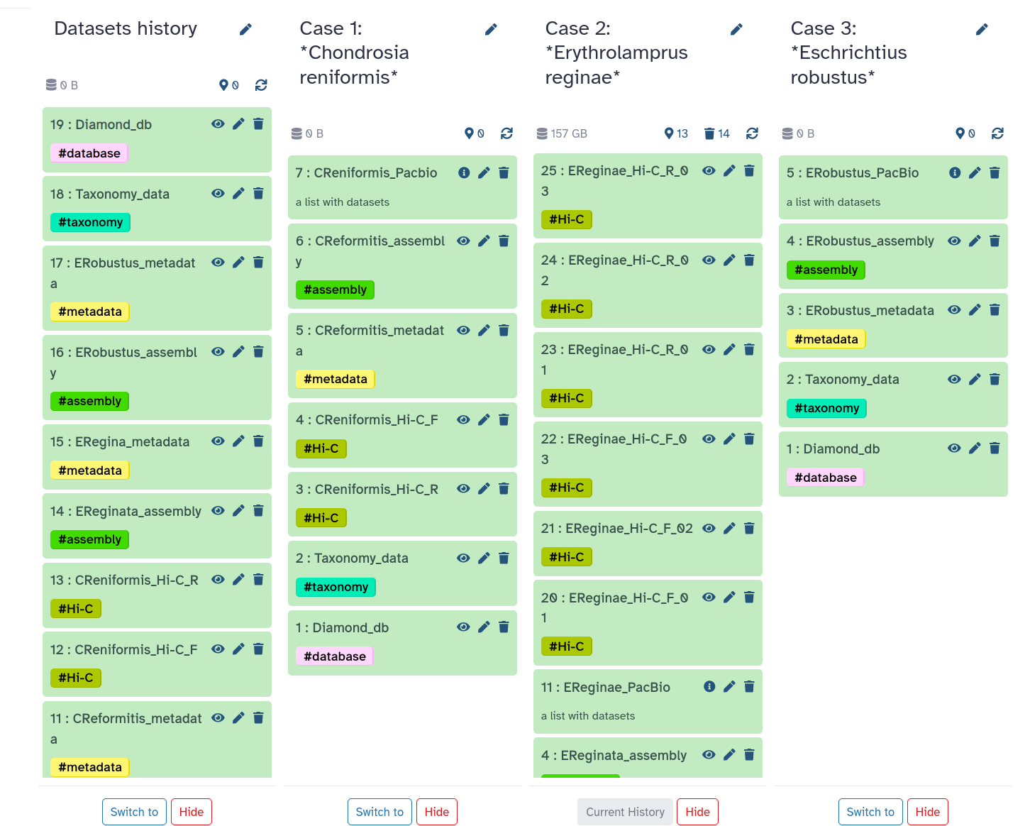 Open image in new tab
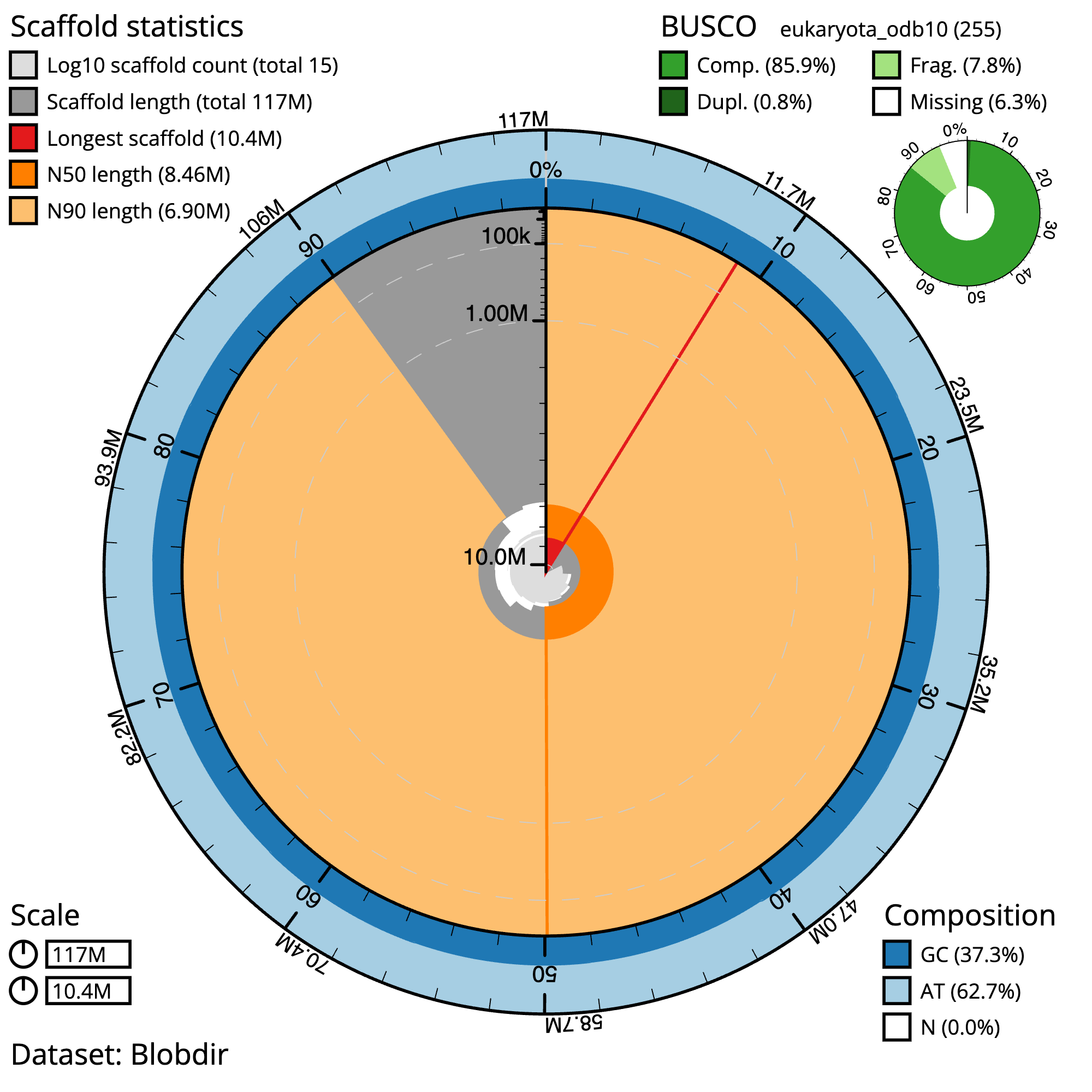 Open image in new tab
Open image in new tab
 Open image in new tab
Open image in new tab
Open image in new tab
 Open image in new tab
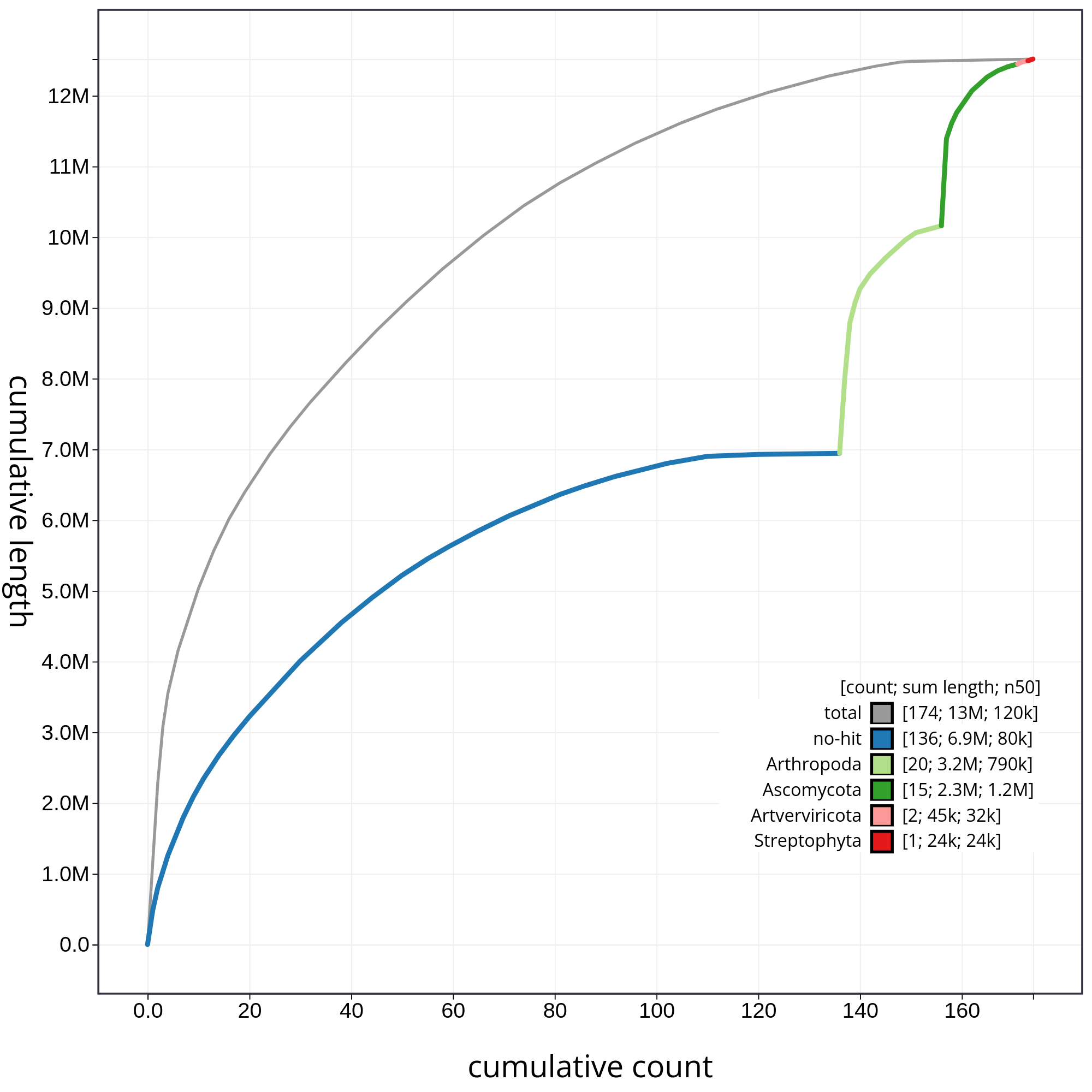 Open image in new tab
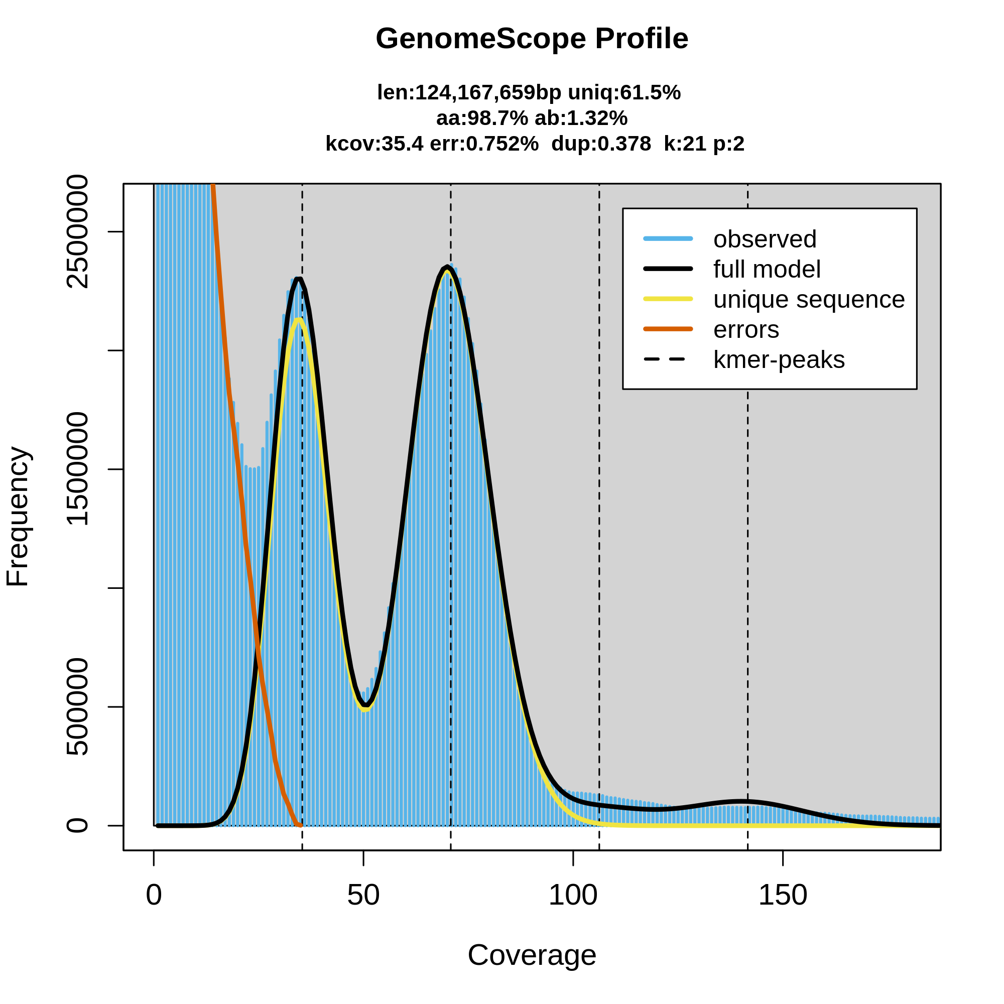 Open image in new tab
Open image in new tab
 Open image in new tab
Open image in new tab


 Open image in new tab
Open image in new tab
 Open image in new tab
Open image in new tab
 Open image in new tab