Single-cell RNA-seq analysis is a rapidly evolving field at the forefront of transcriptomic research, used in high-throughput developmental studies and rare transcript studies to examine cell heterogeneity within a populations of cells. The cellular resolution and genome wide scope make it possible to draw new conclusions that are not otherwise possible with bulk RNA-seq.
In this tutorial, we will investigate clustering of single-cell data from 10x Genomics, including preprocessing, clustering and the identification of cell types via known marker genes, using Scanpy (Wolf et al. 2018). It will be illustrated using a dataset of Peripheral Blood Mononuclear Cells (PBMC), containing 2,700 single cells.
For this tutorial, we analyze a dataset of Peripheral Blood Mononuclear Cells (PBMC) extracted from a healthy donor, freely available from 10X Genomics. The dataset contains 2,700 single cells sequenced using Illumina NextSeq 500. The raw sequences have been processed by the cellranger pipeline from 10X to extract a unique molecular identifier (UMI) count matrix, in a similar way to that as explained in “Pre-processing of 10X Single-Cell RNA Datasets” tutorial.
In this matrix, the values represent the number for each feature (i.e. gene; row) that are detected in each cell (column). Such matrices can be quite large, where here there are 2,700 columns with 32,738 lines, with mostly zero values, i.e. an extremely sparse matrix. To optimize the storage of such a table and the information about the genes and cells, cellranger creates 3 files:
genes.tsv: a tabular file with information about the 32,738 genes in 2 columns (Ensembl gene id and the gene symbol)
barcodes.tsv: a tabular file with the barcode for each of the 2,700 cells
matrix.mtx: a condensed version of the count matrix
The count matrix is therefore represented by its non-zero values. Each non-zero value is indicated by its line number (1st column), its column number (2nd column) and its value (3rd column). The first row gives indication about the number of lines, column and non-zero values. More information on the Matrix Market Exchange (mtx) format can be found in this documentation
Data upload
Hands On: Data upload
Create a new history for this tutorial
Import the genes.tsv, barcodes.tsv and matrix.mtx from Zenodo or from the shared data library
How many counts are found for the 32,706th gene in the 1st cell?
There are 2,286,884 (2.6%) non-zero values for the 88,392,600 possible counts of the 32,738 genes (rows) and 2,700 cells (columns).
10 counts are found for the 32,706th row and 1st column.
The representation of the matrix with 3 files is convenient to share the data but not to process them. Single-cell analysis packages have attempted to solve the problem of storage and analysis by inventing their own standard, which has led to the proliferation of many different “standards” in the scRNA-seq package ecosystem.
AnnData
The most common format, called AnnData, stores the matrix as well as gene and cell annotations in a concise, compressed and extremely readable manner:
Figure 1:AnnData format stores a count matrix X together with annotations of observations (i.e. cells) obs, variables (i.e. genes) var and unstructured annotations uns.
This format is used by Scanpy (Wolf et al. 2018), the tool suite for analyzing single-cell gene expression data that we will use in this tutorial. So we need first to import the matrix and annotations of genes and cells into an AnnData object.
Hands On: Transform matrix and all into AnnData object
Import Anndata ( Galaxy version 0.10.9+galaxy0) with the following parameters:
“Format for the annotated data matrix”: Matrix Market (mtx), from Cell ranger or not
param-file“Matrix”: matrix.mtx
“Use 10x Genomics formatted mtx”: Output from Cell Ranger v2 or earlier versions
param-file“2-column genes file with gene id and gene name”: genes.tsv
param-file“Barcodes (whitelist) file with one barcode per line”: barcodes.tsv
“Variables index”: gene_symbols
“Make the variable index unique by appending ‘-1’, ‘-2’?”: Yes
Rename the generated file to Input 3k PBMC
Check that the format is h5ad
Because the AnnData format is an extension of the HDF5 format, i.e. a binary format, an AnnData object can not be inspected directly in Galaxy by clicking on the galaxy-eye (View data) icon. Instead we need to use a dedicated tool from the AnnData suite.
Hands On: Inspect an AnnData object
Inspect AnnData ( Galaxy version 0.10.9+galaxy0) with the following parameters:
param-file“Annotated data matrix”: Input 3k PBMC
“What to inspect?”: General information about the object
How many observations are there? What do they represent?
How many variables are there? What do they represent?
There are 2,700 observations, representing the cells.
There are 32,738 variables, representing the genes.
Comment: Faster Method for General Information
The ScanPy toolset in Galaxy produces AnnData formats as
output, where general information is provided for each dataset:
Click on the name of the dataset in the history to expand it.
General Anndata information would be given in the expanded box:
e.g.
[n_obs x n_vars]
-    2700 x 32738
For more specific queries, Inspect AnnData ( Galaxy version 0.10.9+galaxy0) is required.
Warning: Large compute resource consumption! Please run the next step responsibly.
Extracting the complete matrix requires large compute resources and long time to finish. Use this step on matrices with less than 10k cells. To inspect
a subset of matrix contents on huge matrices, please change “What to inspect?”: Random chunk of defined size
Inspect AnnData ( Galaxy version 0.10.9+galaxy0) with the following parameters:
The file is a table with 2,700 lines (observations or cells) and 32,738 columns (variables or genes): the count matrix for each of the 32,738 genes and 2,700 cells. The 1st row contains the gene symbol as annotation of the columns and the 1st column the barcodes of the cells as annotation of the rows.
Inspect AnnData ( Galaxy version 0.10.9+galaxy0) with the following parameters:
param-file“Annotated data matrix”: Input 3k PBMC
“What to inspect?”: Key-indexed observations annotation (obs)
The file is a tabular with annotations of the observations. i.e. the cells. Here there are only the barcodes as annotation, so only one column, being also the index for the count matrix.
Inspect AnnData ( Galaxy version 0.10.9+galaxy0) with the following parameters:
param-file“Annotated data matrix”: Input 3k PBMC
“What to inspect?”: Key-indexed annotation of variables/features (var)
The file is a tabular with annotations of the variables, i.e. the genes. Here the files has 2 columns: the gene symbols (also the index in the count matrix), gene_ids or the Ensemble gene ids.
Preprocessing
The first step when we get our counts is to prepare them before we perform the clustering. This includes (Amezquita et al. 2019):
Selection and filtration of cells and genes based on quality metrics
Low-quality cells would interfere with downstream analyses. These cells may have been damaged during processing and may not have been fully captured by the sequencing protocol.
Data normalization and scaling
It will eliminate cell-specific biases (e.g., in capture efficiency), allowing us to perform explicit comparisons across cells afterwards. Some transformations, typically log, are also applied to adjust for the mean-variance relationship.
Selection of features
This selection picks a subset of interesting features for downstream analysis, by modelling the variance across cells for each gene and retaining genes that are highly variable. This step is done to reduce computational overhead and noise from uninteresting genes.
Quality control
Genes that appear in less than a few cells can be considered noise and thus removed.
Hands On: Remove genes found in less than 3 cells
Scanpy filter ( Galaxy version 1.10.2+galaxy0) with the following parameters:
param-file“Annotated data matrix”: Input 3k PBMC
“Method used for filtering”: Filter genes based on number of cells or counts, using 'pp.filter_genes'
“Filter”: Minimum number of cells expressed
“Minimum number of cells expressed required for a gene to pass filtering”: 3
How many genes have been removed because they are expressed in less than 3 expressed cells?
There are now 13,714 genes. So 19,024 (32,738 - 13,714) genes have been removed.
Low-quality cells may be due to a variety of sources such as cell damage during dissociation or failure in library preparation (e.g., inefficient reverse transcription or PCR amplification, Ilicic et al. 2016). Usually these low-quality cells have low total counts, few expressed genes and high mitochondrial or spike-in proportions. Low-quality cells are problematic for downstream analyses and may contribute to misleading results.
Formation of their own distinct cluster(s)
Increased mitochondrial proportions or enrichment for nuclear RNAs after cell damage are the most obvious causes for this phenomenon. Low-quality cells in different cell types can, in the worst case, cluster together (because of similarities in the damage-induced expression profiles) leading to artificial intermediate states or trajectories between subpopulations that should be otherwise distinct. This phenomenon makes the results difficult to interpret.
Distortion of population heterogeneity during variance estimation or principal components analysis
With low-quality cells, the main differences captured by the first few principal components will be based on quality rather than biology, reducing then the effectiveness of dimensionality reduction. Similarly, differences between low- and high-quality cells will create genes with the largest variances. For example, in low-quality cells with very low counts, the scaling normalization increases the variance of genes that happen to have a non-zero count in those cells.
Misidentification of upregulated genes
Due to aggressive scaling to normalize for small cell sizes, low-quality cells shows genes that appear to be strongly “upregulated”. For example, contaminating transcripts may be present in all cells with a low but constant levels. With the increased scaling normalization in low-quality cells, the small counts for these transcripts may become large normalized expression values, i.e. an apparent upregulation compared to other cells.
To mitigate these problems, we need to remove these low-quality cells at the start of the analysis. Several common QC metrics can be used to identify these cells based on their expression profile:
Cell size, i.e. the total sum of counts across all genes for each cells
When cells are very degraded or absent from the library preparation, the number of reads sequenced from that library will be very low. Cells with small sizes are then considered to be of low quality: the RNA has been lost during the library preparation (cell lysis, inefficient cDNA capture and amplification, etc.)
Number of expressed genes, i.e. the number of genes with non-zero counts for each cells
A low number of expressed genes may be a result of poor-quality cells (e.g. dying, degraded, damaged, etc.), followed by high PCR amplification of the remaining RNA. The diverse transcript population has not been successfully captured so the cell is considered of low quality. Cell doublets or multiplets may also exhibit an aberrantly high gene count.
Proportion of reads mapped to genes in the mitochondrial genome
High concentrations of mitochondrial genes is often a result of damaged cells (Islam et al. 2014, Ilicic et al. 2016) where the endogenous RNA escapes or degrades. As mitochondria has its own cell membranes, it is often the last DNA/RNA in damaged cells to degrade and hence occurs in high quantities during sequencing.
We will make the key assumption that these metrics are independent of the biological state of each cell. Technical factors rather than biological processes are presumed to drive poor values (e.g., low cell sizes, high mitochondrial proportions). The subsequent removal of impacted cells do not misrepresent the biology in downstream analyses.
To identify low-quality cells, the simplest approach is to apply thresholds on the QC metrics. This strategy, while simple, is required to determine appropriate thresholds that will change given the experimental protocol and the biological system.
Computation of QC metrics
To estimate the thresholds, we first need to look at the distribution of QC metrics for our dataset.
The first 2 QC metrics (cell size and number of expressed genes) can be easily estimated from the count table. For the third metric (proportion of reads mapped to genes in the mitochondrial genome), we need the information about which genes are mitochondrial or not.
Hands On: Extract gene annotation
Inspect AnnData ( Galaxy version 0.10.9+galaxy0) with the following parameters:
param-file“Annotated data matrix”: 3k PBMC
“What to inspect?”: Key-indexed annotation of variables/features (var)
Rename the generated file Gene annotation
In the gene annotation, we currently have the gene symbol the Ensembl gene ids and the number of cells in which the genes are expressed, but have no information on whether a gene is mitochondrial. This can be extracted from the gene symbol as all mitochondrial genes have a name starting with MT- and added to the var of the AnnData object using Manipulate AnnData tool.
A new annotation for var should be new column named mito on the 1st line and then True for mitochondrial gene or False for non-mitochondrial genes.
Hands On: Add mitochondrial gene annotation
Manipulate Anndata ( Galaxy version 0.10.9+galaxy0) with the following parameters:
param-file“Annotated data matrix”: 3k PBMC
“Function to manipulate the object”: Flag genes start with a pattern
Click on “Insert Flag genes that start with these names”
“Text that you expect the genes to be flagged to start with?”: MT-
“Name of the column in var.names where this boolean flag is stored”: mito
Rename the generated file 3k PBMC with mito annotation
Inspect AnnData ( Galaxy version 0.10.9+galaxy0) with the following parameters:
param-file“Annotated data matrix”: 3k PBMC with mito annotation
“What to inspect?”: Key-indexed annotation of variables/features (var)
Inspect the generated file and check if the mitochondrial annotation has been added
Question
How can I annotate genes like ribosomal protein genes or non-protein coding genes that might interfere with my downstream analysis?
What care should be taken while annotating such genes?
To annotate genes such as ribosomal protein genes or non-protein coding genes, follow these steps:
Manipulate Anndata ( Galaxy version 0.10.9+galaxy0) tool as above with
“Function to manipulate the object”: Flag genes start with a pattern
Click on “Insert Flag genes that start with these names”
- “Text that you expect the genes to be flagged to start with?”: RP for ribosomal proteins or
- “Name of the column in var.names where this boolean flag is stored”: rpgene
Click on “Insert Flag genes that start with these names”
- “Text that you expect the genes to be flagged to start with?”: LINC for long non-protein-coding RNAs
- “Name of the column in var.names where this boolean flag is stored”: lincrna
Inspect AnnData ( Galaxy version 0.10.9+galaxy0) with the following parameters:
param-file“Annotated data matrix”: 3k PBMC with mito annotation
“What to inspect?”: Key-indexed annotation of variables/features (var)
Inspect your AnnData to confirm the new gene annotations are correctly added.
Here we are annotating genes starting with a pattern. Long Non-Coding RNAs often start with “LINC” followed by a number, while Ribosomal Protein Genes typically start with “RP”. Be aware that some non-ribosomal genes also start with “RP” and are associated with conditions like Retinitis Pigmentosa. If these genes are relevant, annotate ‘RP’ genes carefully. Maybe use more precise naming like RPL and RPS. In general, make sure that your name/pattern does not annotate any genes that you did not want annotate.
We can now compute QC metrics on the AnnData object.
Hands On: Compute QC metrics
Scanpy Inspect and manipulate ( Galaxy version 1.10.2+galaxy1) with the following parameters:
param-file“Annotated data matrix”: 3k PBMC with mito annotation
“Method used for inspecting”: Calculate quality control metrics, using 'pp.calculate_qc_metrics'
“Name of kind of values in X”: counts
“The kind of thing the variables are”: genes
“Keys for boolean columns of .var which identify variables you could want to control for”: mito
Rename the generated file 3k PBMC with mito annotation and qc metrics
The tool computed several QC metrics at both cell and gene levels. These metrics are added to the annotation tables.
At gene levels (stored in var):
total_counts: sum of counts for a gene
mean_counts: mean expression for a gene over all cells
n_cells_by_counts: number of cells with non-zero counts for a gene
pct_dropout_by_counts: percentage of cells this gene does not appear in
At cell levels (stored in obs):
total_counts: total number of counts for a cell
total_counts_mito: total number of counts for the mitochondrial genes in a cell
n_genes_by_counts: number of genes with non-zero counts
pct_counts_mito: proportion of total counts for a cell which are from mitochondrial genes
pct_counts_in_top_50_genes: cumulative percentage of counts for 50 most expressed genes in a cell
pct_counts_in_top_100_genes: cumulative percentage of counts for 100 most expressed genes in a cell
pct_counts_in_top_200_genes: cumulative percentage of counts for 200 most expressed genes in a cell
pct_counts_in_top_500_genes: cumulative percentage of counts for 500 most expressed genes in a cell
We would like to visualize 3 of the more informative QC metrics:
the cell size, i.e. total_counts
the number of expressed genes, i.e. n_genes_by_counts
the proportion of reads mapped to mitochondrial genes, i.e. pct_counts_mito
Hands On: Visualize QC metrics
Scanpy plot ( Galaxy version 1.10.2+galaxy0) with the following parameters:
param-file“Annotated data matrix”: 3k PBMC with mito annotation and qc metrics
“Method used for plotting”: Generic: Violin plot, using 'pl.violin'
“Keys for accessing variables”: Subset of variables in 'adata.var_names' or fields of '.obs'
“Keys for accessing variables”: n_genes_by_counts, total_counts, pct_counts_mito
In “Violin plot attributes”:
“Display keys in multiple panels”: Yes
Inspect the generated file
Question
How do the distributions of the 3 QC metrics look?
For the cell size, i.e. total_counts, most of the values are between 1,000 reads and 4,000 reads, with some extremely high values skewing the distribution.
The numbers of expressed genes, i.e. n_genes_by_counts, are mostly between 500 genes and 1,200 genes, with also some extremely high values skewing the distribution.
The distribution of the proportions of reads mapped to mitochondrial genes, i.e. pct_counts_mito, is even more narrow with some cells having no counts from mitochondrial genes but also having some really extreme values (above 5%).
Scanpy plot ( Galaxy version 1.10.2+galaxy0) with the following parameters:
param-file“Annotated data matrix”: 3k PBMC with mito annotation and qc metrics
“Method used for plotting”: Generic: Scatter plot along observations or variables axes, using 'pl.scatter'
“Plotting tool that computed coordinates”: Using coordinates
“x coordinate”: total_counts
“y coordinate”: n_genes_by_counts
“Use the layers attribute?”: No
Inspect the generated file
Question
Is there any relationship between the cell size and the number of expressed genes?
On the plot, we can see a strong correlation between the total number of counts for a cell and the number of genes with positive counts.
Scanpy plot ( Galaxy version 1.10.2+galaxy0) with the following parameters:
param-file“Annotated data matrix”: 3k PBMC with mito annotation and qc metrics
“Method used for plotting”: Generic: Scatter plot along observations or variables axes, using 'pl.scatter'
“Plotting tool that computed coordinates”: Using coordinates
“x coordinate”: n_genes_by_counts
“y coordinate”: pct_counts_mito
“Use the layers attribute?”: No
Inspect the generated file
Question
Is there any relationship between the number of expressed genes and the proportion of reads mapped to mitochondrial genes?
What could be a good threshold to filter for cells with high concentrations of mitochondrial genes?
What could be good thresholds to filter for cells based on the number of expressed genes?
Cells with a high proportion of mitochondrial genes are not also cells that have many expressed genes. There is no visible correlation.
The cells with a percentage of mitochondrial counts above 5% have also few genes. So 5% may be a good threshold.
As discussed before, a low number of expressed genes may be a sign of poor-quality cells. Any cells with less than 200 genes is definitely out of the main distribution so this could be a good threshold to use. High gene count may also be a sign for cell multiplets. We will choose here a threshold of 2,500 genes.
Filtering of low-quality cells
As explained before, we would like now to filter for low-quality cells based on the 3 previous metrics (cell size, number of expressed genes, and proportion of reads mapped to mitochondrial genes). As the cell size is highly correlated with the number expressed genes, we can focus only on the number expressed genes and the proportion of reads mapped to mitochondrial genes.
Based on the previous plot, we would like to remove cells that have:
a number of expressed genes below 200 or above 2,500
a percentage of reads mapped to mitochondrial genes above 5%
Hands On: Remove low-quality cells
Scanpy filter ( Galaxy version 1.10.2+galaxy0) with the following parameters:
param-file“Annotated data matrix”: 3k PBMC with mito annotation and qc metrics
“Method used for filtering”: Filter cell outliers based on counts and numbers of genes expressed, using 'pp.filter_cells'
“Filter”: Minimum number of genes expressed
“Minimum number of genes expressed required for a cell to pass filtering”: 200
Inspect the dataset
Question
[n_obs × n_vars]
-    2700 × 13714
How many cells have been removed because they have less than 200 expressed genes?
There are still 2,700 cells. So no cells have been removed because they have less than 200 expressed genes.
Scanpy filter ( Galaxy version 1.10.2+galaxy0) with the following parameters:
param-file“Annotated data matrix”: output of Scanpy filtertool
“Method used for filtering”: Filter cell outliers based on counts and numbers of genes expressed, using 'pp.filter_cells'
“Filter”: Maximum number of genes expressed
“Maximum number of genes expressed required for a cell to pass filtering”: 2500
Inspect the dataset
Question
[n_obs × n_vars]
-    2695 × 13714
How many cells have been removed because they have more than 2,500 expressed genes?
There are now 2,695 cells. So 5 cells have been removed because they have more than 2,500 expressed genes.
Manipulate Anndata ( Galaxy version 0.10.9+galaxy0) with the following parameters:
param-file“Annotated data matrix”: output of Scanpy filtertool
“Function to manipulate the object”: Filter observations or variables
“What to filter?”: Observations (obs)
“Type of filtering?”: By key (column) values
“Key to filter”: pct_counts_mito
“Type of value to filter”: Number
“Filter”: less than
“Value”: 5.0
Rename the generated file 3k PBMC after QC filtering
Inspect AnnData ( Galaxy version 0.10.9+galaxy0) with the following parameters:
param-file“Annotated data matrix”: 3k PBMC after QC filtering
“What to inspect?”: General information about the object
Question
AnnData object with n_obs × n_vars = 2638 × 13714
How many cells have been removed because they have more than 5% of reads mapped to mitochondrial genes?
There are now 2,638 cells. So 57 cells have been removed because they have more than 5% of reads mapped to mitochondrial genes.
Normalization and scaling
In scRNA-seq, we can observe systematic differences in sequencing coverage between cells (Stegle et al. 2015), because of technical differences in cDNA capture or PCR amplification efficiency across cells, attributable to the difficulty of achieving consistent library preparation with minimal starting material. After removing low-quality cells, normalization of the counts removes these differences to avoid that they interfere with comparisons of the expression profiles between cells. Any observed heterogeneity or differential expression within the cell population after normalization are then driven by biology and not technical biases.
Scaling normalization is the simplest and most commonly-used class of normalization strategies. All counts for each cell are divided by a cell-specific scaling factor, often called a “size factor”. The assumption behind this process is that any technical biases tend to affect genes in a similar manner. The relative bias for each cell is represented by the size factor for that cell. Dividing the cell counts by its size factor should then remove the bias.
The simplest strategy for scaling normalization is the cell size normalization, i.e. similar total sum of counts across all genes for each cell. The “cell size factor” for each cell is computed directly for its cell size and transformed such that the mean size factor across all cells is equal to 1. The normalized expression values are then kept on the same scale as the original counts.
Here we would to normalize our count table such that each cell have 10,000 reads.
Hands On: Normalize for cell size
Scanpy normalize ( Galaxy version 1.10.2+galaxy0) with the following parameters:
param-file“Annotated data matrix”: 3k PBMC after QC filtering
“Method used for normalization”: Normalize counts per cell, using 'pp.normalize_total'
“Target sum”: 10000.0
“Exclude (very) highly expressed genes for the computation of the normalization factor (size factor) for each cell”: No
“Name of the field in ‘adata.obs’ where the normalization factor is stored”: norm
The normalized counts should be log-transformed afterwards to adjust for the mean-variance relationship.
With log-transformation, the differences in the log-values represent log-fold changes in expression. Log-transformation focuses on promoting contributions from genes with strong relative differences (e.g. a gene that is expressed at an average count of 50 in cell type A and 10 in cell type B rather than a gene that is expressed at an average count of 1100 in A and 1000 in B).
Hands On: Log-transform the counts
Scanpy Inspect and manipulate ( Galaxy version 1.10.2+galaxy1) with the following parameters:
param-file“Annotated data matrix”: output of Scanpy normalizetool
“Method used for inspecting”: Logarithmize the data matrix, using 'pp.log1p'
We will freeze the current state of the AnnData object, i.e. the logarithmized raw gene expression, in the a raw attribute. This information will be used later in differential testing and visualizations of gene expression.
Hands On: Freeze the state of the AnnData object
Manipulate Anndata ( Galaxy version 0.10.9+galaxy0) with the following parameters:
param-file“Annotated data matrix”: output of Scanpy Inspect and manipulatetool
“Function to manipulate the object”: Freeze the current state into the 'raw' attribute
Rename the generated output 3k PBMC after QC filtering and normalization
Selection of features
Data from scRNA-Seq is often used in exploratory analyses to characterize heterogeneity across cells. With clustering and dimensionality reduction, cells are compared based on their gene expression profiles. The choice of genes to use may have a major impact on the behaviour of the clustering and the dimensionality reduction. We need then to remove genes with random noise while keeping genes containing useful information about the biology of the system. This reduces the data size but still highlights any interesting biological signal without the noise that obscures that structure.
Selecting the most variable genes based on their expression across the cells (i.e. genes highly expressed in some cells, and lowly expressed in others) is the simplest approach for feature selection. With this approach, we assume that increased variation in some genes compared to other genes are genuine biological differences and not technical noise or a baseline level of “uninteresting” biological variation.
To quantify the per-gene variation, the simplest approach consists of computing the variance of the log-normalized expression values for each gene across all cells in the population. With this approach, the feature selection is based on the same log-values as the ones used in clustering, ensuring then that the quantitative definition of heterogeneity is consistent throughout the entire analysis.
Calculation of the per-gene variance is simple but feature selection requires modelling of the mean-variance relationship, as done in the Seurat procedure (Stuart et al. 2019) we will use.
Once the per-gene variation has been quantified, we need to select the subset of highly variable genes that we will use in downstream analyses. A large subset reduces the risk of discarding any interesting biological signal, but increases the noise from irrelevant genes on the signal. The optimal trade-off is difficult to determine but there are several common strategies routinely used. You can read the Chapter 8 from “Orchestrating Single-Cell Analysis with Bioconductor” for a nice presentation of the different strategies. Here, we will define the set of highly variable genes as those which, after normalization, have a normalized dispersion amount higher than 0.5.
Hands On: Identify the highly variable genes
Scanpy filter ( Galaxy version 1.10.2+galaxy0) with the following parameters:
param-file“Annotated data matrix”: 3k PBMC after QC filtering and normalization
“Method used for filtering”: Annotate (and filter) highly variable genes, using 'pp.highly_variable_genes'
“Flavor for computing normalized dispersion”: seurat
“Minimal mean cutoff”: 0.0125
“Maximal mean cutoff”: 3
“Minimal normalized dispersion cutoff”: 0.5
“Inplace subset to highly-variable genes?”: No
Scanpy plot ( Galaxy version 1.10.2+galaxy0) with the following parameters:
param-file“Annotated data matrix”: output of the last Scanpy filtertool
“Method used for plotting”: Preprocessing: Plot dispersions versus means for genes, using 'pl.highly_variable_genes'
Both highly variable genes and other genes are still in the AnnData object. We can now actually keep only the highly variable genes.
Where is the stored the information about the genes and if they are highly variable or not?
There are now 13,714 genes, as before.
Extra annotations have been added to var, whose a boolean annotation highly_variable for highly variable genes.
Manipulate Anndata ( Galaxy version 0.10.9+galaxy0) with the following parameters:
param-file“Annotated data matrix”: output of the last Filtertool
“Function to manipulate the object”: Filter observations or variables
“What to filter?”: Variables (var)
“Type of filtering?”: By key (column) values
“Key to filter”: highly_variable
“Type of value to filter”: Boolean
“Value to keep”: Yes
Rename the generated output 3k PBMC with only HVG
Inspect AnnData ( Galaxy version 0.10.9+galaxy0) with the following parameters:
param-file“Annotated data matrix”: 3k PBMC with only HVG
“What to inspect?”: General information about the object
Question
AnnData object with n_obs × n_vars = 2638 × 1838
How many genes have been removed?
Only 1,838 (over the 13,714) genes are kept.
Scaling the data
Prior to any downstream analysis like dimensional reduction, we need to apply a linear transformation or scaling to:
Regress out unwanted sources of variation in the total counts per cell and the percentage of mitochondrial genes expressed.
Scale data to unit variance and zero mean, i.e. the variance across cells is 1 and the mean expression is 0, in order to give equal weight in downstream analyses and ensure that highly-expressed genes do not dominate.
Hands On: Scale the data
Scanpy remove confounders ( Galaxy version 1.10.2+galaxy0) with the following parameters:
param-file“Annotated data matrix”: 3k PBMC with only HVG
“Method used for plotting”: Regress out unwanted sources of variation, using 'pp.regress_out'
“Keys for observation annotation on which to regress on”: total_counts, pct_counts_mito
Scanpy Inspect and manipulate ( Galaxy version 1.10.2+galaxy1)
with the following parameters:
param-file“Annotated data matrix”: output of Scanpy remove confounderstool
“Method used for inspecting”: Scale data to unit variance and zero mean, using 'pp.scale'
“Zero center?”: Yes
“Maximum value”: 10.0
It clips values exceeding a standard deviation of 10.
Rename the generated output 3k PBMC with only HVG, after scaling
Dimensionality reduction
We aim in scRNA-seq to compare cells based on their expressions across genes, e.g. to identify similar transcriptomic profiles. Each gene represents then a dimension of the data.
With a dataset of 2 genes, we could make a 2-dimensional plot where each point is a cell and each axis is the expression of one gene. For datasets with thousands of genes, the concept is the same: each cell’s expression profile defines its location in the high-dimensional expression space.
Expressions of different genes are correlated if they are affected by the same biological process. The separate information for these individual genes do not need to be stored, but can instead be compressed into a single dimension, e.g. an “eigengene”. Dimensionality reduction aims then to reduce the number of separate dimensions in the data and then:
reduces the computational work in downstream analyses to only a few dimensions
reduces noise by averaging across multiple genes to obtain a more precise representation of the patterns in the data
enables effective plotting of the data.
Principal Component Analysis
Principal Component Analysis (PCA) is a dimensionality reduction technique consisting in the identification of axes in high-dimensional space that capture the largest amount of variation. This simple, highly effective strategy is widely used in data science.
In PCA, the first axis (or Principal Component (PC)) is chosen such that it captures the greatest variance across cells. The next PC should be orthogonal to the first and capture the greatest remaining amount of variation, and so on.
By applying PCA to scRNA-Seq, we assume that multiple genes are affected by the same biological processes in a coordinated way and random technical or biological noise affects each gene independently. As more variation can be captured by considering the correlated behaviour of many genes, the top PCs are likely to represent the biological signal and the noise are concentrated into the later PCs. The dominant factors of heterogeneity are then captured by the top PCs. Restricting downstream analyses to the top PCs will then reduce the dimensionality of the data whilst focusing on the biological signal and removing the noise.
Here we perform the PCA on the log-normalized expression values and compute the first 50 PCs.
Hands On: Perform the PCA
Scanpy cluster, embed ( Galaxy version 1.10.2+galaxy0)
with the following parameters:
param-file“Annotated data matrix”: 3k PBMC with only HVG, after scaling
“Method used for plotting”: Computes PCA (principal component analysis) coordinates, loadings and variance decomposition, using 'pp.pca'
“Number of principal components to compute”: 50
“Type of PCA?”: Full PCA
“Compute standard PCA from covariance matrix?”: Yes
Rename the generated output 3k PBMC with only HVG, after scaling and PCA
PCA information are stored in the AnnData object in a quite complex way.
Hands On: Inspect the PCA inside an `AnnData` object
Inspect the 3k PBMC with only HVG, after scaling and PCA dataset
3 new objects (uns, obsm, varm) have been added to the AnnData object with information that seem related to PCA.
uns is an unstructured annotation, obsm multi-dimensional annotation of the observations (i.e. genes) and varm multi-dimensional annotation of the variables (i.e. cells).
Inspect AnnData ( Galaxy version 0.10.9+galaxy0) with the following parameters:
param-file“Annotated data matrix”: 3k PBMC with only HVG, after scaling and PCA
“What to inspect?”: Unstructured annotation (uns)
“What to inspect in uns?”: PCA
Question
What information is stored in uns regarding the PCA?
uns is storing:
the ratio of explained variance by the PCs, sorted by PC, as a one-column table
the explained variance for each PCs, equivalent to the eigenvalues of the covariance matrix, as a one-column table
Inspect AnnData ( Galaxy version 0.10.9+galaxy0) with the following parameters:
param-file“Annotated data matrix”: 3k PBMC with only HVG, after scaling and PCA
“What to inspect?”: Multi-dimensional observations annotation (obsm)
“Which annotation to inspect for the observations?”: PCA coordinates (X_pca)
Question
What are the information stored in obsm regarding the PCA?
obsm is storing the PCA coordinates for the cells as a table with the rows being the cells, the columns the PCs and the values the PCs coordinate for cell and PC.
Inspect AnnData ( Galaxy version 0.10.9+galaxy0) with the following parameters:
param-file“Annotated data matrix”: 3k PBMC with only HVG, after scaling and PCA
“What to inspect?”: Multi-dimensional variables annotation (varm)
“Which annotation to inspect for the variables?”: Principal components containing the loadings
Question
What information is stored in varm regarding the PCA?
varm is storing the PCA coordinates for the genes as a table with the rows being the genes, the columns the PCs and the values the PCs coordinate for gene and PC.
Visualization of PCA
One application of dimensionality reduction and PCA is to compress the data for plotting into 2 (sometimes 3) dimensions with the most salient features of the data.
Scanpy provides several useful ways of visualizing both cells and genes that define the PCA. The simplest approach for visualization is to plot the top 3 PCs on 2D plots (PC1 vs PC2 and PC2 vs PC3)
Hands On: Plot the top 2 PCs the PCA
Scanpy plot ( Galaxy version 1.10.2+galaxy0) with the following parameters:
param-file“Annotated data matrix”: 3k PBMC with only HVG, after scaling and PCA
“Method used for plotting”: PCA: Plot PCA results, using 'pl.pca_overview'
In “Plot attributes”
In “Component”
Click on param-repeat“Insert Component”
In “1: Component”
“X-axis”: 1
“Y-axis”: 2
Click on param-repeat“Insert Component”
In “1: Component”
“X-axis”: 2
“Y-axis”: 3
“Number of panels per row”: 2
On these plots we see the different cells projected onto the first 3 PCs. We can already see subpopulations of cells, but only 3 PCs are represented there and plot like these are not so informative. It may be more interesting to project also the values for the genes, since perhaps these are the genes most involved in the 3 PCs.
Hands On: Visualize the top genes associated with PCs
Scanpy plot ( Galaxy version 1.10.2+galaxy0) with the following parameters:
param-file“Annotated data matrix”: 3k PBMC with only HVG, after scaling and PCA
“Method used for plotting”: PCA: Rank genes according to contributions to PCs, using 'pl.pca_loadings'
“List of comma-separated components”: 1,2,3
Question
What are the top genes for each of the 3 first PCs? What do they represent?
CST3 is the gene the most associated with the 1st PC, NKG7 the one for the 2nd PC, and PF4 and PPBP for the 3rd PC (for consistency with the published scanpy and Seurat documentation, we will use PPBP).
Scanpy plot ( Galaxy version 1.10.2+galaxy0) with the following parameters:
param-file“Annotated data matrix”: 3k PBMC with only HVG, after scaling and PCA
“Method used for plotting”: PCA: Plot PCA results, using 'pl.pca_overview'
“Keys for annotations of observations/cells or variables/genes”: CST3, NKG7, PPBP
In “Plot attributes”
In “Component”
Click on param-repeat“Insert Component”
In “1: Component”
“X-axis”: 1
“Y-axis”: 2
Click on param-repeat“Insert Component”
In “1: Component”
“X-axis”: 2
“Y-axis”: 3
“Number of panels per row”: 2
Question
Where are the differences in expression for CST3, NKG7, and PPBP?
For CST3, the differences are mostly projected on PC1 (expected as CST3 is the top gene for PC1), and not visible on the PC3 vs PC2 plot.
For NKG7, the differences in expression are seen on PC2.
For PPBP, the differences in expression are seen on PC3.
Determination of the number of PCs to keep
We performed the PCA analyses using 50 PCS. They represent a robust compression of the dataset, but we may not need to keep all of them. How many components should we choose to include?
The choice of the number of PCs is a similar question to the choice of the number of highly variable genes to keep. More PCs means more noise but also more biological signal.
A simple heuristic for choosing the number of PCs generates an “Elbow plot”: a ranking of the PCs based on the percentage of variance they explain.
Hands On: Generate an Elbow plot
Scanpy plot ( Galaxy version 1.10.2+galaxy0) with the following parameters:
param-file“Annotated data matrix”: 3k PBMC with only HVG, after scaling and PCA
“Method used for plotting”: PCA: Scatter plot in PCA coordinates, using 'pl.pca_variance_ratio'
“Use the log of the values?”: Yes
To determine the elbow point, we assume that each of the PCs should explain much more variance than the remaining PCS. So after the last PCs we choose, the percentage of variance explained should not drop much.
Question
How many PCs should we keep given the previous plot?
We choose here to keep 10 PCs.
We encourage users to repeat downstream analyses with different number of PCs.
Clustering of the cells
In the PC projection, we saw some subpopulations of cells emerging. We would like now to empirically define these subpopulation of cells with similar expression profiles using unsupervised clustering.
Clustering summarizes the data and allows us to describe the population heterogeneity in terms of discrete and easily understandable labels. The subpopulations can be afterwards treated as proxies for biological objects like cell types or states.
Graph-based clustering has been popularized for clustering large scRNA-Seq datasets by its use in Seurat (Butler et al. 2018, Stuart et al. 2019). Such approaches like the K-nearest neighbor (KNN) graph works in 2 steps:
Computation of a neighborhood graph
A graph is first built with each node being a cell connected to its nearest neighbours having similar expression patterns. Edges are weighted based on the similarity between the cells: higher weight is given to cells that are more closely related, i.e. have similar expression profiles.
Clustering of the neighborhood graph
The graph is then partitioned into highly interconnected “quasi-cliques” or “communities”, i.e. cells that are more connected to cells in the same community than they are to cells of different communities. Each community represents a cluster that we can use for downstream interpretation.
Computation of a neighborhood graph
When running graph-based clustering, we need to think about:
How many neighbors are considered when constructing the graph.
What scheme is used to weight the edges.
Here, to reproduce original results, we choose 10 neighbors for a KNN graph, the Euclidian distance metrics and the UMAP method (McInnes et al. 2018) to compute the connectivities. The values will change depending on the data and can not easily predefined: testing different values is the only solution.
Hands On: Compute the neighborhood graph
Scanpy Inspect and manipulate ( Galaxy version 1.10.2+galaxy1) with the following parameters:
param-file“Annotated data matrix”: 3k PBMC with only HVG, after scaling and PCA
“Method used for inspecting”: Compute a neighborhood graph of observations, using 'pp.neighbors'
“The size of local neighborhood (in terms of number of neighboring data points) used for manifold approximation”: 10
“Number of PCs to use”: 10
“Use a hard threshold to restrict the number of neighbors to n_neighbors?”: Yes
“Method for computing connectivities”: umap (McInnes et al, 2018)
“Distance metric”: euclidean
Rename the generated output 3k PBMC with only HVG, after scaling, PCA and KNN graph
Inspect the dataset
Question
How is the neighborhood graph stored in the AnnData object?
An extra object neighbors has been added to uns with 2 mtx objects (similar format to the original count table):
Distance between each cells
Weighted adjacency matrix between cells
This information can be accessed using Inspect AnnData ( Galaxy version 0.10.9+galaxy0) with the following parameters:
param-file“Annotated data matrix”: 3k PBMC with only HVG, after scaling, PCA and KNN graph
“What to inspect?”: Unstructured annotation (uns)
“What to inspect in uns?”: Neighbors
Visualization of the neighborhood graph
To visualize and explore the neighborhood graph, we can apply an extra step of non-linear dimensional reduction techniques to learn the underlying manifold of the data in order to place similar cells together in low-dimensional space. Cells that will be in the same clusters, i.e. cells with similar local neighborhoods in high-dimensional space, should co-localize on these low-dimensional plots.
Two techniques are commonly used for the non-linear dimensional reduction: t-SNE (t-distributed stochastic neighbor embedding) and UMAP. Scanpy authors recommend to use here UMAP as it better preserves trajectories (check Becht et al. 2019 for a review) and easily accommodates new data.
Here, we will reduce the neighborhood to 2 UMAP components and then we will check to see how the cells are projected on them given the top genes
Hands On: Embed and plot the neighborhood graph
Scanpy cluster, embed ( Galaxy version 1.10.2+galaxy0) with the following parameters:
param-file“Annotated data matrix”: 3k PBMC with only HVG, after scaling, PCA and KNN graph
“Method used for plotting”: Embed the neighborhood graph using UMAP, using 'tl.umap'
Rename the generated output 3k PBMC with only HVG, after scaling, PCA, KNN graph, UMAP
Question
How is the UMAP reduction stored in the AnnData object?
An extra object X_umap has been added to obsm with the 2 UMAP coordinates for each cell, as a table of 2 columns and 2,638 lines.
This information can be accessed using:
Inspect AnnData ( Galaxy version 0.10.9+galaxy0) with the following parameters:
param-file“Annotated data matrix”: 3k PBMC with only HVG, after scaling, PCA, KNN graph, UMAP
“What to inspect?”: Generalinformation about the object
Inspect AnnData ( Galaxy version 0.10.9+galaxy0) with the following parameters:
param-file“Annotated data matrix”: 3k PBMC with only HVG, after scaling, PCA and KNN graph, UMAP
“What to inspect?”: Multi-dimensional observations annotation (obsm)
“What to inspect in for the observations?”: UMAP coordinates (X_umap)
Scanpy plot ( Galaxy version 1.10.2+galaxy0) with the following parameters:
param-file“Annotated data matrix”: 3k PBMC with only HVG, after scaling, PCA, KNN graph, UMAP
“Method used for plotting”: Embeddings: Scatter plot in UMAP basis, using 'pl.umap'
“Keys for annotations of observations/cells or variables/genes”: CST3, NKG7, PPBP
Question
Are clusters identifiable on these graphs? Might they be linked to PCs?
There seem to be at least 3 big clusters (the 3 blobs) before looking at the expression of some representative genes.
With the plot colored with NKG7 expression, we clearly see that the blob on the bottom right could be divided in 3 sub-clusters (light green, blue, purple). Given the expression of PPBP, the “arm” on the blob on the left should be a different cluster.
The static plots above give us a first overview of the data, but it can be difficult to explore all dimensions at once. Vitessce is an interactive visualization framework for single-cell data that allows you to explore multiple linked views simultaneously — for example, selecting cells in a UMAP and seeing their gene expression highlighted in a heatmap at the same time.
We can generate a Vitessce configuration file directly from Scanpy plot by enabling the “Make an interactive plot?” option.
Hands On: Explore marker genes interactively with Vitessce
Scanpy plot ( Galaxy version 1.11.5+galaxy0) with the following parameters:
param-file“Annotated data matrix”: 3k PBMC with only HVG, after scaling, PCA, KNN graph, UMAP
“Method used for plotting”: Embeddings: Scatter plot in UMAP basis, using 'pl.umap'
“Make an interactive plot?”: Yes
“Keys for annotations of observations/cells or variables/genes”: CST3, NKG7, PPBP
Rename the vitessce.json output to Vitessce config - marker genes
Click on the galaxy-eye (View data) icon of the Vitessce config - marker genes dataset to explore the marker genes interactively in Vitessce
Figure 2: Vitessce showing CST3, NKG7 and PPBP expression in UMAP space.
Question
Explore the marker genes in Vitessce. Can you see differences in expression between cells? How does this compare to the static plot above?
In Vitessce you can hover over individual cells to see their exact expression values, and select groups of cells to highlight them across views. The expression patterns of CST3, NKG7 and PPBP should match the static UMAP above, but now you can interactively explore which cells express each gene and compare them simultaneously.
Clustering of the neighborhood graph
Given the first visualization, we can now cluster the cells within a neighborhood graph.
Which community detection algorithm should we use to define the clusters? Several modularity optimization techniques such as the SLM (Blondel et al. 2008), Louvain algorithm (Levine et al. 2015) or the Leiden algorithm (Traag et al. 2019) are available to iteratively group cells together while optimizing the standard modularity function.
Currently, the Louvain graph-clustering method (community detection based on optimizing modularity) is the one recommended. We need to define a value for the resolution parameter, i.e. the ‘granularity’ of the downstream clustering. High values lead to a greater number of clusters. For single-cell datasets of around 3K cells, we recommend to use a value between 0.4 and 1.2. For larger datasets, the optimal resolution will be higher.
Hands On: Cluster the neighborhood graph
Scanpy cluster, embed ( Galaxy version 1.10.2+galaxy0) with the following parameters:
param-file“Annotated data matrix”: 3k PBMC with only HVG, after scaling, PCA, KNN graph, UMAP
“Method used for plotting”: Cluster cells into subgroups, using 'tl.louvain'
“Flavor for the clustering”: vtraag (much more powerful)
“Resolution”: 0.45
Rename the generated output 3k PBMC with only HVG, after scaling, PCA, KNN graph, UMAP, clustering
Question
How is the clustering information stored in the AnnData object?
An extra column louvain has been added to the obs object with the cluster id for each cell.
This information can be accessed using:
Inspect AnnData ( Galaxy version 0.10.9+galaxy0) with the following parameters:
param-file“Annotated data matrix”: 3k PBMC with only HVG, after scaling, PCA, KNN graph, UMAP, clustering
“What to inspect?”: Generalinformation about the object
Inspect AnnData ( Galaxy version 0.10.9+galaxy0) with the following parameters:
param-file“Annotated data matrix”: 3k PBMC with only HVG, after scaling, PCA, KNN graph, UMAP, clustering
“What to inspect?”: Key-indexed observations annotation (obs)
The cells in the same clusters should be co-localized in the UMAP coordinate plots.
Hands On: Plot the neighborhood graph and the clusters
Scanpy plot ( Galaxy version 1.10.2+galaxy0) with the following parameters:
param-file“Annotated data matrix”: 3k PBMC with only HVG, after scaling, PCA, KNN graph, UMAP, clustering
“Method used for plotting”: Embeddings: Scatter plot in UMAP basis, using 'pl.umap'
“Keys for annotations of observations/cells or variables/genes”: louvain, CST3, NKG7, PPBP
In “Plot attributes”
“Number of panels per row”: 2
Question
How many clusters have been identified? Do they fit with the ones quickly identified with UMAP plots?
In which clusters do you expected to have CST3, NKG7 and PPBP as representative?
8 clusters are identified, more or less corresponding to the ones we could see on the UMAP plots.
We expect that:
CST3 should be representative of clusters 1, 3, 4, 6
NKG7 for clusters 0, 3 and 5
PPBP for cluster 7
Finding marker genes
To give sense to the clusters, we need to identify the genes that drive separation between clusters. These marker genes can then be used to assign biological sense (e.g. cell type) to each cluster based on their functional annotation, but also to identify subtle differences between clusters (e.g., changes in activation or differentiation state) based on the behaviour of genes in the affected pathways.
Marker genes are usually detected by their differential expression between clusters, as the more strongly DE genes are more likely to have caused separate clustering of cells. To quantify the differences in expression profiles, several different statistical tests can be used.
The identification of the marker genes for each cluster is made not only on the highly variable genes, but on the whole set (currently stored in the raw attribute).
Using the t-test
The simplest and fastest method is the Welch t-test. It has good statistical properties for large numbers of cells (Soneson and Robinson 2018).
Hands On: Rank the highly differential genes using t-test
Scanpy Inspect and manipulate ( Galaxy version 1.10.2+galaxy1) with the following parameters:
param-file“Annotated data matrix”: 3k PBMC with only HVG, after scaling, PCA, KNN graph, UMAP, clustering
“Method used for inspecting”: Rank genes for characterizing groups, using 'tl.rank_genes_groups'
“The key of the observations grouping to consider”: louvain
“Use ‘raw’ attribute of input if present”: Yes
“Comparison”: Compare each group to the union of the rest of the group
“The number of genes that appear in the returned tables”: 100
“Method”: t-test
“P-value correction method”: Benjamini-Hochberg
Rename the generated output 3k PBMC with only HVG, after scaling, PCA, KNN graph, UMAP, clustering, marker genes with t-test
Question
How is the marker gene information stored in the AnnData object?
An extra object rank_genes_groups has been added to the uns object with 5 tables for the 100 top ranked genes (rows) for each cluster (column):
Names of the rank genes
Z-scores for the rank genes
Log2 Fold changes
P-values
Adjusted p-values
This information can be accessed using:
Inspect AnnData ( Galaxy version 0.10.9+galaxy0) with the following parameters:
param-file“Annotated data matrix”: 3k PBMC with only HVG, after scaling, PCA, KNN graph, UMAP, clustering, marker genes with t-test
“What to inspect?”: Generalinformation about the object
Inspect AnnData ( Galaxy version 0.10.9+galaxy0) with the following parameters:
param-file“Annotated data matrix”: 3k PBMC with only HVG, after scaling, PCA, KNN graph, UMAP, clustering, marker genes with t-test
“What to inspect?”: Unstructured annotation (uns)
“What to inspect in uns?”: Rank gene groups (rank_genes_groups)
Scanpy plot ( Galaxy version 1.10.2+galaxy0) with the following parameters:
param-file“Annotated data matrix”: 3k PBMC with only HVG, after scaling, PCA, KNN graph, UMAP, clustering, marker genes with t-test
“Method used for plotting”: Marker genes: Plot ranking of genes using dotplot plot, using 'pl.rank_genes_groups'
“Number of genes to show”: 20
“Number of panels per row”: 3
“Should the y-axis of each panels be shared?”: No
Inspect AnnData ( Galaxy version 0.10.9+galaxy0) with the following parameters:
param-file“Annotated data matrix”: 3k PBMC with only HVG, after scaling, PCA, KNN graph, UMAP, clustering, marker genes with t-test
“What to inspect?”: Unstructured annotation (uns)
“What to inspect in uns?”: Rank gene groups (rank_genes_groups)
Inspect the Names for rank genes file
We can quickly look at the 5 top ranked genes per cluster:
0
1
2
3
4
5
6
7
LDHB
LYZ
CD74
CCL5
LST1
NKG7
CD74
GPX1
CD3D
FTL
HLA-DRA
NKG7
AIF1
GZMB
HLA-DRA
PF4
RPS12
TYROBP
HLA-DPB1
B2M
FCER1G
PRF1
CST3
PPBP
RPS27
CST3
CD79A
IL32
FTL
CTSW
HLA-DPA1
CALM3
RPS25
S100A9
HLA-DRB1
CST7
FTH1
GNLY
HLA-DRB1
NRGN
Question
Are CST3, NKG7 and PPBP in the set of marker genes? If yes, are they assigned to the clusters we guessed before?
CST3 is a marker gene for clusters 1, 4, 6 (not 3 as guessed previously)
NKG7 for clusters 3 and 5 (not 0 as guessed previously)
PPBP for cluster 7, as guessed previously
Using Wilcoxon rank sum test
Another widely used method for pairwise comparisons between groups of observations is the Wilcoxon rank sum test (also known as the Wilcoxon-Mann-Whitney test). This test directly assesses separation between the expression distributions of different clusters. It is the recommended approach to use in publication (Soneson and Robinson 2018).
Hands On: Rank the highly differential genes using Wilcoxon rank sum
Scanpy Inspect and manipulate ( Galaxy version 1.10.2+galaxy1) with the following parameters:
param-file“Annotated data matrix”: 3k PBMC with only HVG, after scaling, PCA, KNN graph, UMAP, clustering
Note:Please pay attention to the dataset name.
“Method used for inspecting”: Rank genes for characterizing groups, using 'tl.rank_genes_groups'
“The key of the observations grouping to consider”: louvain
“Use ‘raw’ attribute of input if present”: Yes
“Comparison”: Compare each group to the union of the rest of the group
“The number of genes that appear in the returned tables”: 100
“Method”: Wilcoxon-Rank-Sum
“P-value correction method”: Benjamini-Hochberg
Rename the generated output 3k PBMC with only HVG, after scaling, PCA, KNN graph, UMAP, clustering, marker genes with Wilcoxon test
Scanpy plot ( Galaxy version 1.10.2+galaxy0) with the following parameters:
param-file“Annotated data matrix”: 3k PBMC with only HVG, after scaling, PCA, KNN graph, UMAP, clustering, marker genes with Wilcoxon test
“Method used for plotting”: Marker genes: Plot ranking of genes using dotplot plot, using 'pl.rank_genes_groups'
“Number of genes to show”: 20
“Number of panels per row”: 3
“Should the y-axis of each panels be shared?”: No
Inspect AnnData ( Galaxy version 0.10.9+galaxy0) with the following parameters:
param-file“Annotated data matrix”: 3k PBMC with only HVG, after scaling, PCA, KNN graph, UMAP, clustering, marker genes with Wilcoxon test
“What to inspect?”: Unstructured annotation (uns)
“What to inspect in uns?”: Rank gene groups (rank_genes_groups)
Rename the Names for rank genes file to Ranked genes with Wilcoxon test
Inspect Ranked genes with Wilcoxon test file
We can quickly look at the 5 top ranked genes per cluster:
0
1
2
3
4
5
6
7
LDHB
LYZ
CD74
CCL5
LST1
NKG7
HLA-DPA1
PF4
RPS12
S100A9
CD79A
NKG7
FCER1G
GZMB
HLA-DPB1
GNG11
RPS25
S100A8
HLA-DRA
CST7
AIF1
PRF1
HLA-DRB1
SDPR
RPS27
TYROBP
CD79B
CTSW
COTL1
GNLY
HLA-DRA
PPBP
RPS6
FTL
HLA-DPB1
B2M
FCGR3A
CTSW
CD74
NRGN
RPS3
CST3
HLA-DQA1
GZMA
IFITM2
GZMA
CST3
SPARC
CD3D
FCN1
MS4A1
HLA-C
FTH1
CST7
HLA-DQA1
GPX1
Question
Are the 5 top ranked genes different than the one for the t-test?
Are CST3, NKG7 and PPBP in the marker genes? If yes, are they assigned to the clusters we guessed before?
The 5 top ranked genes are slightly different, at least in their order.
We see that:
CST3 is a ranked genes for clusters 1, 4, 6 (not 3 as guessed previously)
NKG7 for clusters 3 and 5 (not 0 as guessed previously)
PPBP for cluster 7, as we guessed previously.
Hands On: Compare differential expression for CST3, NKG7 and PPBP in the different clusters
Scanpy plot ( Galaxy version 1.10.2+galaxy0) with the following parameters:
param-file“Annotated data matrix”: 3k PBMC with only HVG, after scaling, PCA, KNN graph, UMAP, clustering, marker genes with Wilcoxon test
“Method used for plotting”: Generic: Violin plot, using 'pl.violin'
“Keys for accessing variables”: Subset of variables in 'adata.var_names' or fields in '.obs'
“Keys for accessing variables”: CST3, NKG7, PPBP
“The key of the observation grouping to consider”: louvain
“Use ‘raw’ attribute of input if present”: Yes
Question
Are CST3, NKG7 and PPBP more expressed in the clusters for which they are marker genes?
CST3 is more expressed in clusters 1, 4, 6, the ones for which it was previously found as a marker gene, but also in cluster 7, which is unexpected.
NKG7 is more expressed in clusters 3 and 5, the ones for which it was previously found as a marker gene.
PPBP is very pronounced in cluster 7, for which it was previously found as a marker gene.
Visualization of expression of the marker genes
The marker genes should be more expressed in the clusters for which they are markers. We would like to confirm this idea using some visualization.
Expression of the top marker genes in each cluster
The assumption should be even more true for the top marker genes. The first way to visualize the expression of the top marker genes is to look at the distribution of the expression of each marker gene in cells for each cluster.
Hands On: Plot expression probability distributions across clusters of top marker genes
Scanpy plot ( Galaxy version 1.10.2+galaxy0) with the following parameters:
param-file“Annotated data matrix”: 3k PBMC with only HVG, after scaling, PCA, KNN graph, UMAP, clustering, marker genes with Wilcoxon test
“Method used for plotting”: Generic: Stacked violin plot, using 'pl.stacked_violin'
“Variables to plot (columns of the heatmaps)”: Subset of variables in 'adata.var_names'
“List of variables to plot”: LDHB, LYZ, CD74, CCL5, LST1, NKG7, HLA-DPA1, PF4
“The key of the observation grouping to consider”: louvain
“Number of categories”: 8
“Use ‘raw’ attribute of input if present”: Yes
“Custom figure size: Yes
“Swap axes?”: Yes
In “Violin plot attributes”:
“Add a stripplot on top of the violin plot”: No
“Colors to use in each of the stacked violin plots”: Accent
Question
Are the top marker genes only expressed in the cluster for which they are markers?
LDHB, LYZ and CD74, even if they are top markers genes for the cluster 0, 1, 2 respectively, are also expressed in all other clusters (and also found in the top 100 marker genes for other clusters), but with higher level in the cluster for they are markers.
CCL5, LST1, NKG7 and HLA-DPA1 are not expressed in all clusters but also not only in the one they are markers.
PF4 is only expressed in cluster 7.
Another approach consists of displaying the mean expression of the marker genes for the cells on the neighborhood graph.
Hands On: Plot top marker gene expression on an UMAP plot
Scanpy plot ( Galaxy version 1.10.2+galaxy0) with the following parameters:
param-file“Annotated data matrix”: 3k PBMC with only HVG, after scaling, PCA, KNN graph, UMAP, clustering, marker genes with Wilcoxon test
“Method used for plotting”: Embeddings: Scatter plot in UMAP basis, using 'pl.umap'
“Keys for annotations of observations/cells or variables/genes”: louvain, LDHB, LYZ, CD74, CCL5, LST1, NKG7, HLA-DPA1, PF4
“Use ‘raw’ attribute of input if present”: Yes
In “Plot attributes”
“Number of panels per row”: 2
Question
Are the top marker genes clearly associated to their clusters?
For most genes, we can clearly see for which cluster they are marker genes. But for physically close clusters, the differences are not so obvious.
Expression of the top 20 markers genes in cells for each cluster
We would like now to have a look at the expression of the top 20 marker genes in the different cells for each cluster
Hands On: Plot heatmap of the gene expression in cells
Scanpy plot ( Galaxy version 1.10.2+galaxy0) with the following parameters:
param-file“Annotated data matrix”: 3k PBMC with only HVG, after scaling, PCA, KNN graph, UMAP, clustering, marker genes with Wilcoxon test
“Method used for plotting”: Marker genes: Plot ranking of genes as heatmap plot, using 'pl.rank_genes_groups_heatmap'
“Number of genes to show”: 20
“Use ‘raw’ attribute of input if present”: Yes
“Compute and plot a dendrogram?”: Yes
Each cells is shown in a row and in columns are the marker genes for each cluster.
Question
How are clusters close to each other in terms of expression of the top 20 marker genes?
Clusters 0, 3, and 5 are similar in term of expression. This was expected as they are physically close on the neighborhood graph.
Clusters 1 and 4 are together and then 2 and 6 are together after 7. These observations are less expected given the neighborhood graph: 1 and 4 are physically close, but 2 is far from 7 and 6.
Comparison of the marker genes between clusters
Previously we identified marker genes by taking gene expression in cells for each cluster individually and comparing them to all remaining cells.
In some cases, it may also be interesting to find marker genes distinguishing one given cluster from one or several clusters. For example, the marker genes distinguishing cluster 0 from cluster 1.
Hands On: Identify the marker genes distinguishing cluster 0 from cluster 1 using Wilcoxon rank sum
Scanpy Inspect and manipulate ( Galaxy version 1.10.2+galaxy1) with the following parameters:
param-file“Annotated data matrix”: 3k PBMC with only HVG, after scaling, PCA, KNN graph, UMAP, clustering, marker genes with Wilcoxon test
“Method used for inspecting”: Rank genes for characterizing groups, using 'tl.rank_genes_groups'
“The key of the observations grouping to consider”: louvain
“Use ‘raw’ attribute of input if present”: Yes
“Subset of groups to which comparison shall be restricted”: 0
“Comparison”: Compare with respect to a specific group
“Group identifier with respect to which compare”: 1
“The number of genes that appear in the returned tables”: 100
“Method”: Wilcoxon-Rank-Sum
“P-value correction method”: Benjamini-Hochberg
Rename the generated output 3k PBMC with only HVG, after scaling, PCA, KNN graph, UMAP, clustering, marker genes for 0 vs 1 with Wilcoxon test
Scanpy plot ( Galaxy version 1.10.2+galaxy0) with the following parameters:
param-file“Annotated data matrix”: 3k PBMC with only HVG, after scaling, PCA, KNN graph, UMAP, clustering, marker genes for 0 vs 1 with Wilcoxon test
“Method used for plotting”: Marker genes: Plot ranking of genes using dotplot plot, using 'pl.rank_genes_groups'
“Number of genes to show”: 20
“Should the y-axis of each panels be shared?”: No
Question
How can we interpret this plot?
In this graph are the marker genes distinguishing cluster 0 from cluster 1, ranked based on their difference of expression of the genes between cells in both clusters. So MALAT1 is the most differentially expressed gene between cells in cluster 0 and cells in cluster 1, even though it was not in the set of top marker genes for cluster 0.
The marker genes distinguishing cluster 0 from cluster 1 are extracted based on their differences in expression, which can be easily visualized.
Hands On: Plot expression difference for the marker genes distinguishing cluster 0 from cluster 1
Scanpy plot ( Galaxy version 1.10.2+galaxy0) with the following parameters:
param-file“Annotated data matrix”: 3k PBMC with only HVG, after scaling, PCA, KNN graph, UMAP, clustering, marker genes for 0 vs 1 with Wilcoxon test
“Method used for plotting”: Marker genes: Plot ranking of genes as violin plot, using 'pl.rank_genes_groups_violin'
“Which genes to plot?”: A number of genes
“Number of genes to show”: 10
“Use ‘raw’ attribute of input if present”: Yes
Previous visualizations like the heatmap can also be used to represent the differential expression of the marker genes between both clusters.
In the next steps, we are mostly interested in the marker genes for each cluster individually by comparison one cluster to the rest, instead of a 1-to-1 comparison. So we will use again the AnnData object called 3k PBMC with only HVG, after scaling, PCA, KNN graph, UMAP, clustering, marker genes with Wilcoxon test.
Cell type annotation
Obtaining clusters of cells is quite straightforward. Determining what biological state is represented by each of those clusters is likely the most challenging task in scRNA-Seq data analysis. To do so, we need to bridge the gap between our current dataset and prior biological knowledge.
Hands-on: Choose Your Own Tutorial
This is a 'Choose Your Own Tutorial' (CYOT) section (also known as 'Choose Your Own Analysis' (CYOA)), where you can select between multiple paths. Click one of the buttons below to select how you want to follow the tutorial
There are two approaches for cell type annotation. Choose the one that suits you best!
This biological knowledge is not always available in a consistent and quantitative manner. For example, the concept of “cell type” is not clearly defined. The interpretation of scRNA-seq data is often then quite manual.
Fortunately in the case of our dataset, we can use canonical markers to known cell types:
Cell type
Marker genes
CD4+ T cells
IL7R, CCR7
CD8+ T cells
CD8A
CD14+ Monocytes
CD14, LYZ
B cells
MS4A1, CD79A
Natural killer (NK) cells
GNLY, NKG7, KLRB1
Dendritic Cells
FCER1A, CST3
Megakaryocytes
PPBP
FCGR3A+ Monocytes
FCGR3A, MS4A7
Canonical markers are usually found in the literature and are also aggregated into dedicated database like the PanglaoDBFranzén et al. 2019
Question
Is it possible to match the clusters to cell types using the previous table?
Hint: search for the marker genes in the table in the Ranked genes with Wilcoxon test dataset
By searching the marker genes in the the Ranked genes with Wilcoxon test dataset:
Marker genes
Cell type
Cluster
IL7R
CD4+ T cells
0
CCR7
CD4+ T cells
0
CD8A
CD8+ T cells
3
CD14
CD14+ Monocytes
1
LYZ
CD14+ Monocytes
1 (6)
MS4A1
B cells
2
CD79A
B cells
2
GNLY
Natural killer (NK) cells
5
NKG7
Natural killer (NK) cells
5 (3)
KLRB1
Natural killer (NK) cells
-
FCER1A
Dendritic cells
6
CST3
Dendritic cells
6 (4)
PPBP
Megakaryocytes
7
FCGR3A
FCGR3A+ Monocytes
4 (5)
We can then aggregate the results by clusters
Cell type
Marker genes
Cluster
CD4+ T cells
IL7R, CCR7
0
CD8+ T cells
CD8A
3
CD14+ Monocytes
CD14, LYZ
1
B cells
MS4A1, CD79A
2
Natural killer (NK) cells
GNLY, NKG7, KLRB1
5
Dendritic Cells
FCER1A, CST3
6
Megakaryocytes
PPBP
7
FCGR3A+ Monocytes
FCGR3A, MS4A7
4
These canonical marker genes can be easily match the clusters to known cell types:
Cluster
Cell type
0
CD4+ T cells
1
CD14+ Monocytes
2
B cells
3
CD8+ T cells
4
FCGR3A+ Monocytes
5
Natural killer (NK) cells
6
Dendritic Cells
7
Megakaryocytes
Hands On: Add the cell type as cluster names
Manipulate Anndata ( Galaxy version 0.10.9+galaxy0) with the following parameters:
param-file“Annotated data matrix”: 3k PBMC with only HVG, after scaling, PCA, KNN graph, UMAP, clustering, marker genes with Wilcoxon test
Note: Take note that this is not the “0 vs 1 Wilcoxon” dataset
“Function to manipulate the object”: Rename categories of annotation
“Key for observations or variables annotation”: louvain
“Comma-separated list of new categories”: CD4+ T, CD14+, B, CD8+ T, FCGR3A+, NK, Dendritic, Megakaryocytes
Rename the generated output 3k PBMC with only HVG, after scaling, PCA, KNN graph, UMAP, clustering, marker genes with Wilcoxon test, annotation
Question
How can we check that the cell type has been correctly added?
The cluster information is available in the obs attribute of the AnnData object. So to check, we should run Inspect AnnData ( Galaxy version 0.10.9+galaxy0) with the following parameters:
param-file“Annotated data matrix”: 3k PBMC with only HVG, after scaling, PCA and KNN graph
“What to inspect?”: Key-indexed observations annotation (obs)
In the last column (called louvain), we should now have cell type.
Scanpy plot ( Galaxy version 1.10.2+galaxy0) with the following parameters:
param-file“Annotated data matrix”: 3k PBMC with only HVG, after scaling, PCA, KNN graph, UMAP, clustering, marker genes with Wilcoxon test, annotation
“Method used for plotting”: Embeddings: Scatter plot in UMAP basis, using 'pl.umap'
“Keys for annotations of observations/cells or variables/genes”: louvain
“Use ‘raw’ attribute of input if present”: Yes
In “Plot attributes”
“Location of legend”: on data
“Draw a frame around the scatter plot?”: No
Question
How well are the cell types clustered in the neighborhood graph?
T cells (CD4+ and CD8+) are clustered together with NK cells. Monocytes cells (CD14+ and FCGR3A+) are close to each others, with Dendritic and Megakaryocytes. B cells are physically independent.
With the annotated cell types, we can also visualize the expression of their canonical marker genes.
Hands On: Plot expression of canonical marker genes for the annotated cell types
Scanpy plot ( Galaxy version 1.10.2+galaxy0) with the following parameters:
param-file“Annotated data matrix”: 3k PBMC with only HVG, after scaling, PCA, KNN graph, UMAP, clustering, marker genes with Wilcoxon test, annotation
“Method used for plotting”: Generic: Makes a dot plot of the expression values, using 'pl.dotplot'
“Variables to plot (columns of the heatmaps)”: Subset of variables in 'adata.var_names'
“List of variables to plot”: IL7R, CCR7, CD8A, CD14, LYZ, MS4A1, CD79A, GNLY, NKG7, KLRB1, FCER1A, CST3, PPBP, FCGR3A
“The key of the observation grouping to consider”: louvain
“Number of categories”: 8
“Use ‘raw’ attribute of input if present”: Yes
“Compute and plot a dendrogram?”: Yes
In “Group of variables to highlight”
Click on param-repeat“Group of variables to highlight”
In “1: Group of variables to highlight”
“Start”: 0
“End”: 1
“Label”: CD4+ T
Click on param-repeat“Group of variables to highlight”
In “2: Group of variables to highlight”
“Start”: 2
“End”: 2
“Label”: CD8+
Click on param-repeat“Group of variables to highlight”
In “3: Group of variables to highlight”
“Start”: 3
“End”: 4
“Label”: CD14+
Click on param-repeat“Group of variables to highlight”
In “4: Group of variables to highlight”
“Start”: 5
“End”: 6
“Label”: B
Click on param-repeat“Group of variables to highlight”
In “5: Group of variables to highlight”
“Start”: 7
“End”: 9
“Label”: NK
Click on param-repeat“Group of variables to highlight”
In “6: Group of variables to highlight”
“Start”: 10
“End”: 11
“Label”: Dendritic
Click on param-repeat“Group of variables to highlight”
In “7: Group of variables to highlight”
“Start”: 12
“End”: 12
“Label”: Megakaryocytes
Click on param-repeat“Group of variables to highlight”
Are the canonical marker genes only expressed in their cell type?
Are the previous physical cluster (UMAP graph) confirmed?
Some canonical marker genes like LYZ or CST3 are not only highly expressed in their cell type but also on closely related other cell types.
As seen on the UMAP graph, T cells (CD4+ and CD8+) are clustered together with NK cells, but NK cells and CD8+ closer to each other. Monocytes cells (CD14+ and FCGR3A+) are close to each others, but B cells are close to Dendritic and then Megakaryocytes despite B cells being physically independent on the neighborhood graph.
The automated approach uses CellTypist, a tool that applies pre-trained logistic classifiers to predict cell identities directly from the normalized expression data, without requiring prior knowledge of canonical marker genes.
Comment
CellTypist requires a log1p-normalized expression matrix (normalized to 10,000 counts per cell), which is already stored in the raw attribute of our AnnData object from the preprocessing steps above.
Hands On: Automated cell type annotation with CellTypist
CellTypist ( Galaxy version 1.7.1+galaxy0) with the following parameters:
param-file“Input AnnData file”: 3k PBMC with only HVG, after scaling, PCA, KNN graph, UMAP, clustering, marker genes with Wilcoxon test, annotation
“Select model from”: Cached
“Choose CellTypist model”: immune sub-populations combined from 20 tissues of 18 studies (v2)
“Refine the predicted labels by running the majority voting classifier after over-clustering”: Yes
“Annotation mode”: Choose the cell type with the largest score/probability as the final prediction
“Probability threshold”: 0.5
“Generate a dotplot of the predicted cell types”: Yes
“Reference column in AnnData.obs for dotplot”: louvain
“Prediction label in AnnData.obs for dotplot”: predicted_labels
“Dotplot format”: png
Rename the generated output 3k PBMC CellTypist annotated
Figure 3: CellTypist label transfer dotplot using the cached immune model, showing predicted cell type labels against the Louvain clusters.
If you are working with a dataset from a tissue or organism not covered by the available CellTypist models, you can train a custom model using your own annotated AnnData. To do so, select “Select model from”: History → “Train a model on an existing AnnData and use it”, and provide your AnnData file along with the column name in .obs that contains your cell type labels (e.g. louvain). This is particularly useful when studying tissues with unique or poorly characterized cell populations.
Hands On: Explore CellTypist annotations interactively with Vitessce
Scanpy plot ( Galaxy version 1.11.5+galaxy0) with the following parameters:
param-file“Annotated data matrix”: 3k PBMC CellTypist annotated
“Method used for plotting”: Embeddings: Scatter plot in UMAP basis, using 'pl.umap'
“Make an interactive plot?”: Yes
“Keys for annotations of observations/cells or variables/genes”: louvain
Rename the vitessce.json output to Vitessce config - CellTypist
Click on the galaxy-eye (View data) icon of the Vitessce config - CellTypist dataset to explore the annotations interactively
Figure 4: Vitessce showing the UMAP with CellTypist-annotated cell types and Cell Sets panel.
Question
Compare this Vitessce view with the one generated before cell type annotation. What has changed?
The Cell Sets panel now shows the annotated cell type names (B, CD14+, CD4+ T, CD8+ T, Dendritic, FCGR3A+, Megakaryocytes, NK) with their cell counts, instead of the numbered Louvain clusters. This allows you to interactively explore the biological identity of each cell population.
Conclusion
congratulations Well done, you’ve made it to the end! In this tutorial, we investigated clustering and annotation of single-cell data from 10x Genomics using Scanpy. This workflow used here was typical for scRNA-seq data analysis:
Preprocessing with
Selection and filtration of cells and genes based on quality metrics
Data normalization and scaling
Selection of features, i.e. marker genes
Reduction of the dimensionality via a Principal Component Analysis
Clustering of the cells by
Computation of a neighborhood graph
Clustering of the neighborhood graph into 8 clusters of cells
Identification of marker genes for the clusters
Annotation of the clusters with cell types
This tutorial is part of the https://singlecell.usegalaxy.eu portal (Tekman et al. 2020).
You've Finished the Tutorial
Please also consider filling out the Feedback Form as well!
Key points
scRNA-seq data analysis is complex and exploratory process, still in development
Different tools and parameters should be tested for each step of the process
Frequently Asked Questions
Have questions about this tutorial? Have a look at the available FAQ pages and support channels
Further information, including links to documentation and original publications, regarding the tools, analysis techniques and the interpretation of results described in this tutorial can be found here.
Levine, J. H., E. F. Simonds, S. C. Bendall, K. L. Davis, D. A. El-ad et al., 2015 Data-driven phenotypic dissection of AML reveals progenitor-like cells that correlate with prognosis. Cell 162: 184–197. https://www.sciencedirect.com/science/article/pii/S0092867415006376
Stegle, O., S. A. Teichmann, and J. C. Marioni, 2015 Computational and analytical challenges in single-cell transcriptomics. Nature Reviews Genetics 16: 133–145. https://www.nature.com/articles/nrg3833
Ilicic, T., J. K. Kim, A. A. Kolodziejczyk, F. O. Bagger, D. J. McCarthy et al., 2016 Classification of low quality cells from single-cell RNA-seq data. Genome biology 17: 29.
Butler, A., P. Hoffman, P. Smibert, E. Papalexi, and R. Satija, 2018 Integrating single-cell transcriptomic data across different conditions, technologies, and species. Nature biotechnology 36: 411. https://www.nature.com/articles/nbt.4096?draft=journal
McInnes, L., J. Healy, and J. Melville, 2018 Umap: Uniform manifold approximation and projection for dimension reduction. arXiv preprint arXiv:1802.03426. https://arxiv.org/abs/1802.03426
Amezquita, R. A., V. J. Carey, L. N. Carpp, L. Geistlinger, A. T. L. Lun et al., 2019 Orchestrating Single-Cell Analysis with Bioconductor. bioRxiv 590562. https://www.biorxiv.org/content/10.1101/590562v1
Becht, E., L. McInnes, J. Healy, C.-A. Dutertre, I. W. H. Kwok et al., 2019 Dimensionality reduction for visualizing single-cell data using UMAP. Nature biotechnology 37: 38. https://www.nature.com/articles/nbt.4314
Did you use this material as an instructor? Feel free to give us feedback on how it went.
Did you use this material as a learner or student? Click the form below to leave feedback.
Hiltemann, Saskia, Rasche, Helena et al., 2023 Galaxy Training: A Powerful Framework for Teaching! PLOS Computational Biology 10.1371/journal.pcbi.1010752
Batut et al., 2018 Community-Driven Data Analysis Training for Biology Cell Systems 10.1016/j.cels.2018.05.012
@misc{single-cell-scrna-scanpy-pbmc3k,
author = "Bérénice Batut and Hans-Rudolf Hotz and Mehmet Tekman and Pavankumar Videm and Diana Chiang Jurado",
	title = "Clustering 3K PBMCs with Scanpy (Galaxy Training Materials)",
	year = "",
	month = "",
	day = "",
	url = "\url{https://training.galaxyproject.org/training-material/topics/single-cell/tutorials/scrna-scanpy-pbmc3k/tutorial.html}",
	note = "[Online; accessed TODAY]"
}
@article{Hiltemann_2023,
	doi = {10.1371/journal.pcbi.1010752},
	url = {https://doi.org/10.1371%2Fjournal.pcbi.1010752},
	year = 2023,
	month = {jan},
	publisher = {Public Library of Science ({PLoS})},
	volume = {19},
	number = {1},
	pages = {e1010752},
	author = {Saskia Hiltemann and Helena Rasche and Simon Gladman and Hans-Rudolf Hotz and Delphine Larivi{\`{e}}re and Daniel Blankenberg and Pratik D. Jagtap and Thomas Wollmann and Anthony Bretaudeau and Nadia Gou{\'{e}} and Timothy J. Griffin and Coline Royaux and Yvan Le Bras and Subina Mehta and Anna Syme and Frederik Coppens and Bert Droesbeke and Nicola Soranzo and Wendi Bacon and Fotis Psomopoulos and Crist{\'{o}}bal Gallardo-Alba and John Davis and Melanie Christine Föll and Matthias Fahrner and Maria A. Doyle and Beatriz Serrano-Solano and Anne Claire Fouilloux and Peter van Heusden and Wolfgang Maier and Dave Clements and Florian Heyl and Björn Grüning and B{\'{e}}r{\'{e}}nice Batut and},
	editor = {Francis Ouellette},
	title = {Galaxy Training: A powerful framework for teaching!},
	journal = {PLoS Comput Biol}
}
Congratulations on successfully completing this tutorial!
Do you want to extend your knowledge?
Follow one of our recommended follow-up trainings:
5 stars:
Liked: Complete tutorial which is beginner friendly
Disliked: Some tools not working at moments
October 2024
3 stars:
Liked: Following the instructions.
Disliked: There should more reminder on the type of version to be use.
July 2024
4 stars:
Liked: The step-by-step guide and questions
May 2023
5 stars:
Liked: The module scRNA analysis is really complete and very well explained !!!
Disliked: - In this step: Plot expression difference for the marker genes distinguishing cluster 0 from cluster 1 - There is no the suggested option (even using the same version from Galaxy Training Materials ): “Method used for plotting”: Marker genes: Plot ranking of genes as violin plot, using 'pl.rank_genes_groups_violin' - The option available is: pl.rank_genes_groups_stacked_violin - So I don't know if there is another way to plot.
July 2021
1 stars:
Disliked: There is no code. For instance, how do you search your clusters for the marker genes?
April 2021
0 stars:
Liked: clearly described, can be followed step by step, super tutorial for new users.
March 2021
0 stars:
Liked: clearly described, can be followed step by step, idea for new-users.
0 stars:
Disliked: I wanted to follow "Hands-on: Remove genes found in less than 3 cells" with tool "filter with scanpy", had given the every parameter correctly, but could not be successful every time.
February 2021
5 stars:
Liked: Easy to follow tutorial. I learnt about so many tools used for data analysis.
July 2020
0 stars:
Disliked: Theres a copy-paste error in Cell type annotations in the first hands-on in the solution to the question. The "Annotated data matrix" should be another file.
4 stars:
Disliked: The workflow for download has 4 imports (barcodes.tsv, genes.tsv, matrix.mtx and Pasted Entry) but ONLY Pasted Entry connects to the remainder of the workflow. This doesn't seem to match up to Import Data and the remainder of the workflow. Or, there is no obvious place when one would execute the workflow.
5 stars:
Liked: Independent self-paced learning. Assistance through the gitter chat (Galaxy Training Network/galaxy-single-cell) was appreciated twice.
Disliked: Two steps that I could not make work because of an incompatible newer version of a "plot with scanpy tool" and one step with a collection output (from Method used for plotting”: Marker genes: Plot ranking of genes as violin plot, using 'pl.rank_genes_groups_violin') that was unclear .
Questions:
 Open image in new tab
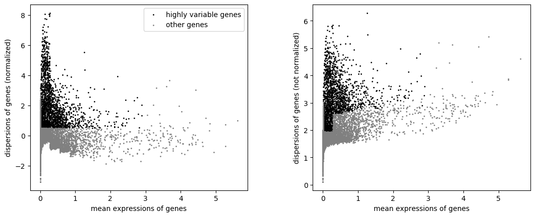
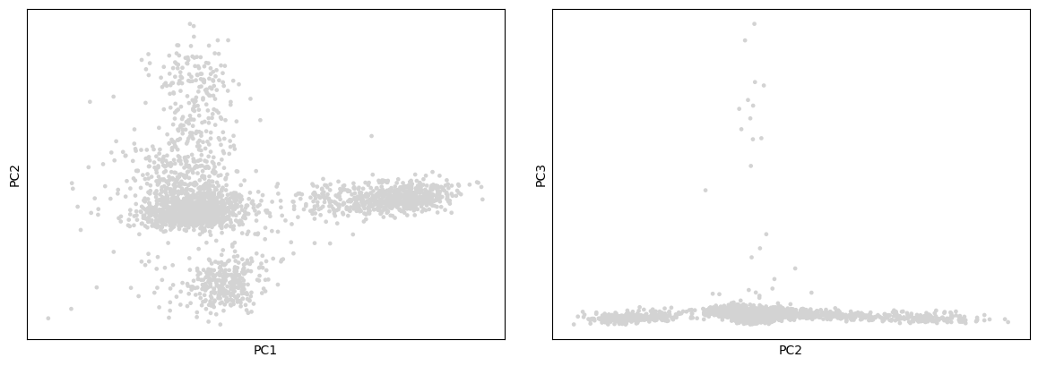
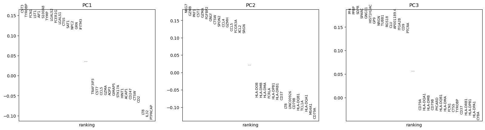
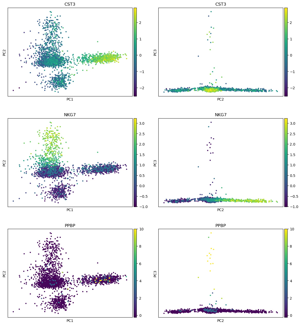
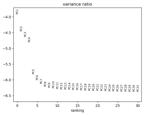
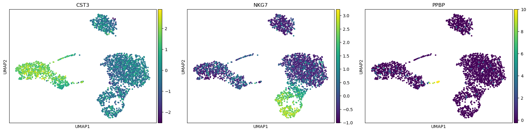
Open image in new tab
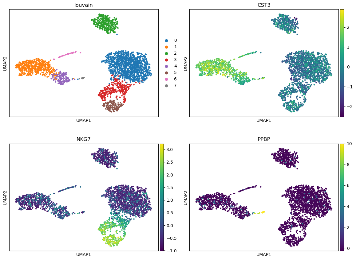
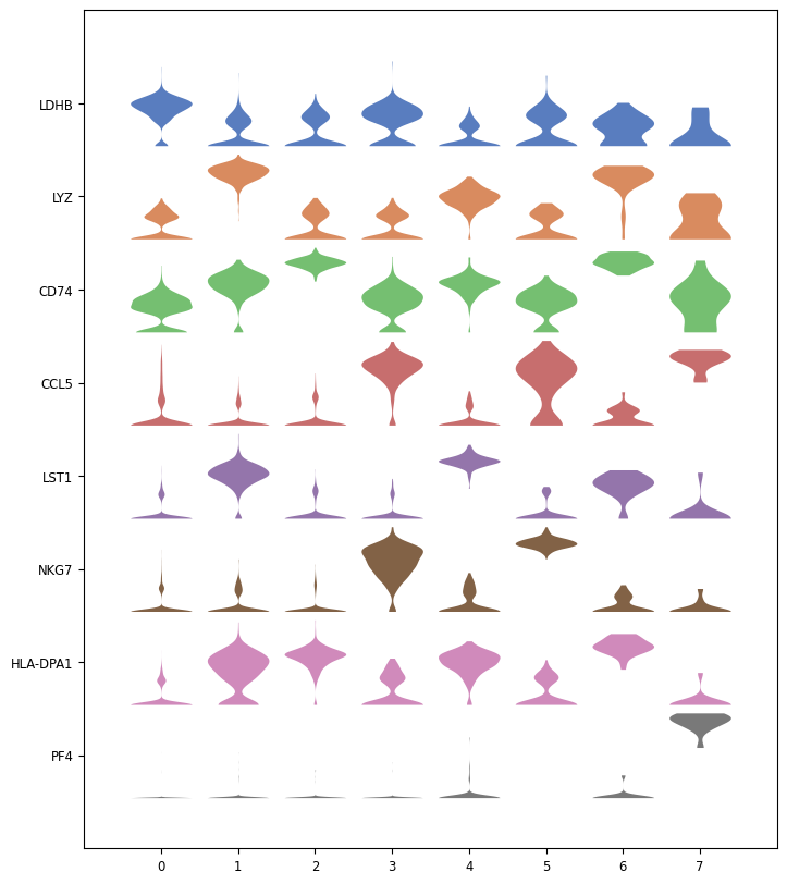
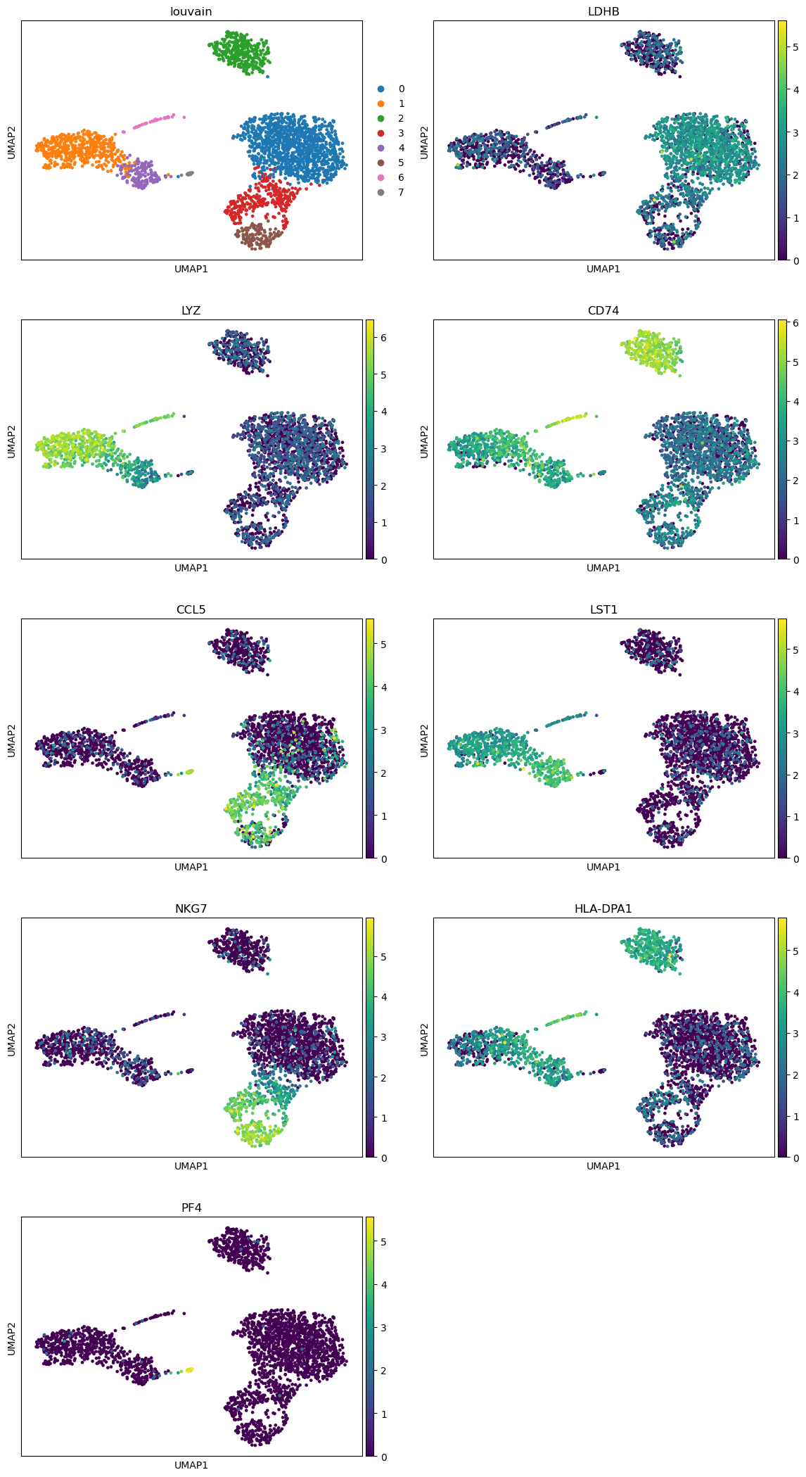
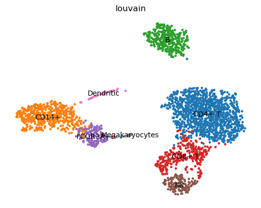
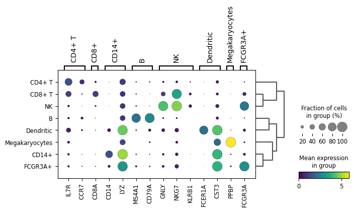
Open image in new tab
Open image in new tab
