Taxonomic Profiling and Visualization of Metagenomic Data
| Author(s) |
|
| Editor(s) |
|
| Reviewers |
|
OverviewQuestions:
Objectives:
Which species (or genera, families, …) are present in my sample?
What are the different approaches and tools to get the community profile of my sample?
How can we visualize and compare community profiles?
Requirements:
Explain what taxonomic assignment is
Explain how taxonomic assignment works
Apply Kraken and MetaPhlAn to assign taxonomic labels
Apply Krona and Pavian to visualize results of assignment and understand the output
Identify taxonomic classification tool that fits best depending on their data
Time estimation: 2 hoursLevel: Introductory IntroductorySupporting Materials:
- Datasets
- Workflows
- galaxy-history-answer Answer Histories
- video Recordings
- instances Available on these Galaxies
Published: May 3, 2023Last modification: May 11, 2026License: Tutorial Content is licensed under Creative Commons Attribution 4.0 International License. The GTN Framework is licensed under MITpurl PURL: https://gxy.io/GTN:T00395rating Rating: 4.3 (4 recent ratings, 16 all time)version Revision: 8
The term “microbiome” describes “a characteristic microbial community occupying a reasonably well-defined habitat which has distinct physio-chemical properties. The term thus not only refers to the microorganisms involved but also encompasses their theatre of activity” (Whipps et al. 1988).
Microbiome data can be gathered from different environments such as soil, water or the human gut. The biological interest lies in general in the question how the microbiome present at a specific site influences this environment. To study a microbiome, we need to use indirect methods like metagenomics or metatranscriptomics.
Metagenomic samples contain DNA from different organisms at a specific site, where the sample was collected. Metagenomic data can be used to find out which organisms coexist in that niche and which genes are present in the different organisms. Metatranscriptomic samples include the transcribed gene products, thus RNA, that therefore allow to not only study the presence of genes but additionally their expression in the given environment. The following tutorial will focus on metagenomics data, but the principle is the same for metatranscriptomics data.
The investigation of microorganisms present at a specific site and their relative abundance is also called “microbial community profiling”. The main objective is to identify the microorganisms that are present within the given sample. This can be achieved for all known microbes, where the DNA sequence specific for a certain species is known.
For that we try to identify the taxon to which each individual read belongs.
Taxonomy is the method used to naming, defining (circumscribing) and classifying groups of biological organisms based on shared characteristics such as morphological characteristics, phylogenetic characteristics, DNA data, etc. It is founded on the concept that the similarities descend from a common evolutionary ancestor.
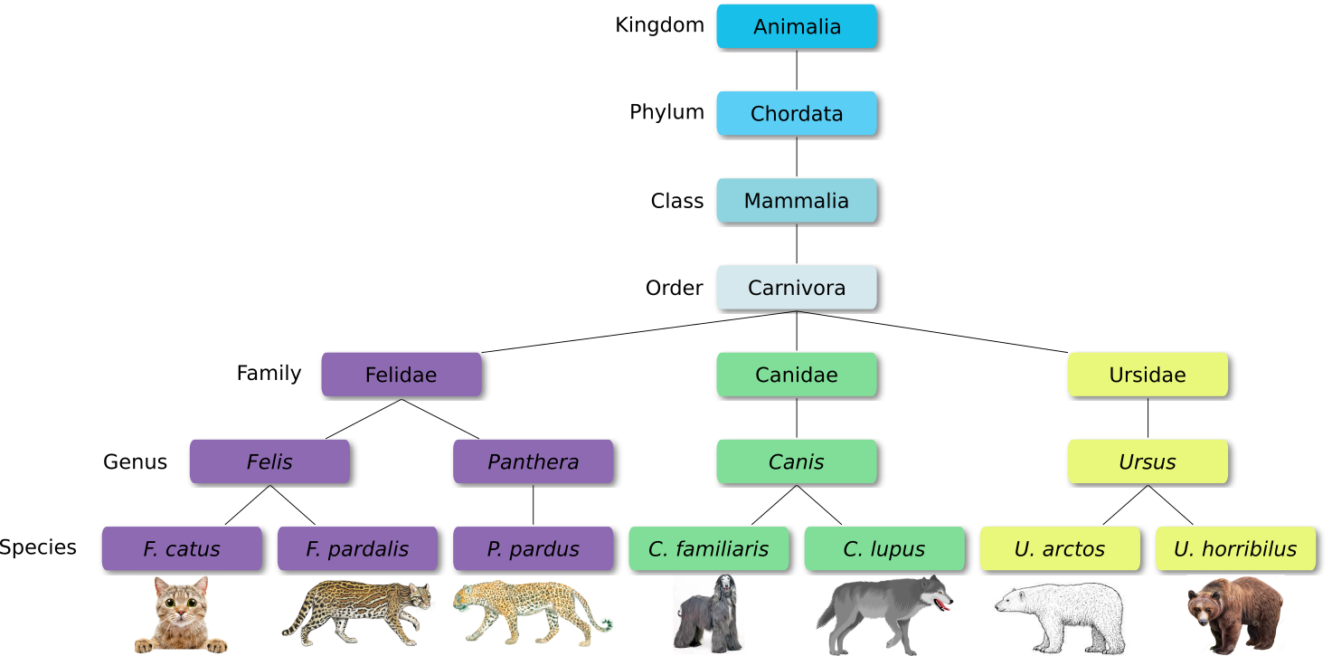
Defined groups of organisms are known as taxa. Taxa are given a taxonomic rank and are aggregated into super groups of higher rank to create a taxonomic hierarchy. The taxonomic hierarchy includes eight levels: Domain, Kingdom, Phylum, Class, Order, Family, Genus and Species.
The classification system begins with 3 domains that encompass all living and extinct forms of life
- The Bacteria and Archae are mostly microscopic, but quite widespread.
- Domain Eukarya contains more complex organisms
When new species are found, they are assigned into taxa in the taxonomic hierarchy. For example for the cat:
Level Classification Domain Eukaryota Kingdom Animalia Phylum Chordata Class Mammalia Order Carnivora Family Felidae Genus Felis Species F. catus From this classification, one can generate a tree of life, also known as a phylogenetic tree. It is a rooted tree that describes the relationship of all life on earth. At the root sits the “last universal common ancestor” and the three main branches (in taxonomy also called domains) are bacteria, archaea and eukaryotes. Most important for this is the idea that all life on earth is derived from a common ancestor and therefore when comparing two species, you will -sooner or later- find a common ancestor for all of them.
Let’s explore taxonomy in the Tree of Life, using Lifemap
For metagenomic data analysis we start with sequences derived from DNA fragments that are isolated from the sample of interest. Ideally, the sequences from all microbes in the sample are present. The underlying idea of taxonomic assignment is to compare the DNA sequences found in the sample (reads) to DNA sequences of a database. When a read matches a database DNA sequence of a known microbe, we can derive a list with microbes present in the sample.
When talking about taxonomic assignment or taxonomic classification, most of the time we actually talk about two methods, that in practice are often used interchangeably:
- taxonomic binning: the clustering of individual sequence reads based on similarities criteria and assignation of clusters to reference taxa
- taxonomic profiling: classification of individual reads to reference taxa to extract the relative abundances of the different taxa
The reads can be obtained from amplicon sequencing (e.g. 16S, 18S, ITS), where only specific gene or gene fragments are targeted (using specific primers) or shotgun metagenomic sequencing, where all the accessible DNA of a mixed community is amplified (using random primers). This tutorial focuses on reads obtained from shotgun metagenomic sequencing.
Taxonomic profiling
Tools for taxonomic profiling can be divided into three groups. Nevertheless, all of them require a pre-computed database based on previously sequenced microbial DNA or protein sequences.
- DNA-to-DNA: comparison of sequencing reads with genomic databases of DNA sequences with tools like Kraken (Wood and Salzberg 2014)
- DNA-to-Protein : comparison of sequencing reads with protein databases (more computationally intensive because all six frames of potential DNA-to amino acid translations need to be analyzed) with tools like DIAMOND)
- Marker based: searching for marker genes (e.g. 16S rRNA sequence) in reads, which is quick, but introduces bias, with tools like MetaPhlAn (Blanco-Mı́guez Aitor et al. 2023)
The comparison of reads to database sequences can be done in different ways, leading to three different types of taxonomic assignment:
-
Genome based approach
Reads are aligned to reference genomes. Considering the coverage and breadth, genomes are used to measure genome abundance. Furthermore, genes can be analyzed in genomic context. Advantages of this method are the high detection accuracy, that the unclassified percentage is known, that all SNVs can be detected and that high-resolution genomic comparisons are possible. This method takes medium compute cost.
-
Gene based approach
Reads are aligned to reference genes. Next, marker genes are used to estimate species abundance. Furthermore, genes can be analyzed in isolation for presence or absence in a specific condition. The major advantage is the detection of the pangenome (entire set of genes within a species). Major disadvantages are the high compute cost, low detection accuracy and that the unclassified percentage is unknown. At least intragenic SNVs can be detected and low-resolution genomic comparison is possible.
-
k-mer based approach
Databases as well as the samples DNA are broken into strings of length \(k\) for comparison. From all the genomes in the database, where a specific k-mer is found, a lowest common ancestor (LCA) tree is derived and the abundance of k-mers within the tree is counted. This is the basis for a root-to-leaf path calculation, where the path with the highest score is used for classification of the sample. By counting the abundance of k-mers, also an estimation of relative abundance of taxa is possible. The major advantage of k-mer based analysis is the low compute cost. Major disadvantages are the low detection accuracy, that the unclassified percentage is unknown and that there is no gene detection, no SNVs detection and no genomic comparison possible. An example for a k-mer based analysis tool is Kraken, which will be used in this tutorial.
After this theoretical introduction, let’s now get hands on analyzing an actual dataset!
Background on data
The dataset we will use for this tutorial comes from an oasis in the Mexican desert called Cuatro Ciénegas (Okie et al. 2020). The researchers were interested in genomic traits that affect the rates and costs of biochemical information processing within cells. They performed a whole-ecosystem experiment, thus fertilizing the pond to achieve nutrient enriched conditions.
Here we will use 2 datasets:
JP4D: a microbiome sample collected from the Lagunita Fertilized PondJC1A: a control samples from a control mesocosm.
The datasets differ in size, but according to the authors this doesn’t matter for their analysis of genomic traits. Also, they underline that differences between the two samples reflect trait-mediated ecological dynamics instead of microevolutionary changes as the duration of the experiment was only 32 days. This means that depending on available nutrients, specific lineages within the pond grow more successfully than others because of their genomic traits.
The datafiles are named according to the first four characters of the filenames. It is a collection of paired-end data with R1 being the forward reads and R2 being the reverse reads. Additionally, the reads have been trimmed using cutadapt as explained in the Quality control tutorial.
AgendaIn this tutorial, we will cover:
Prepare Galaxy and data
Any analysis should get its own Galaxy history. So let’s start by creating a new one:
Hands On: Data upload
Create a new history for this analysis
To create a new history simply click the new-history icon at the top of the history panel:
Rename the history
- Click on galaxy-pencil (Edit) next to the history name (which by default is “Unnamed history”)
- Type the new name
- Click on Save
- To cancel renaming, click the galaxy-undo “Cancel” button
If you do not have the galaxy-pencil (Edit) next to the history name (which can be the case if you are using an older version of Galaxy) do the following:
- Click on Unnamed history (or the current name of the history) (Click to rename history) at the top of your history panel
- Type the new name
- Press Enter

Now, we need to import the data
Hands On: Import datasets
Import the following samples via link from Zenodo or Galaxy shared data libraries:
https://zenodo.org/record/7871630/files/JC1A_R1.fastqsanger.gz
https://zenodo.org/record/7871630/files/JC1A_R2.fastqsanger.gz
https://zenodo.org/record/7871630/files/JP4D_R1.fastqsanger.gz
https://zenodo.org/record/7871630/files/JP4D_R2.fastqsanger.gz
- Copy the link location
Click galaxy-upload Upload at the top of the activity panel
- Select galaxy-wf-edit Paste/Fetch Data
Paste the link(s) into the text field
Press Start
- Close the window
As an alternative to uploading the data from a URL or your computer, the files may also have been made available from a shared data library:
- Go into Libraries (left panel)
- Navigate to the correct folder as indicated by your instructor.
- On most Galaxies tutorial data will be provided in a folder named GTN - Material –> Topic Name -> Tutorial Name.
- Select the desired files
- Click on Add to History galaxy-dropdown near the top and select as Datasets from the dropdown menu
In the pop-up window, choose
- “Select history”: the history you want to import the data to (or create a new one)
- Click on Import
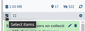
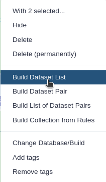
Create a paired collection.
- Click on galaxy-selector Select Items at the top of the history panel
- Check all the datasets in your history you would like to include
Click n of N selected and choose Advanced Build List
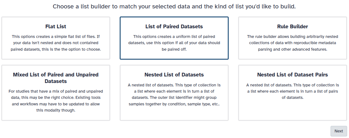
You are in the collection building wizard. Choose List of Paired Datasets and click ‘Next’ button at the right bottom corner.
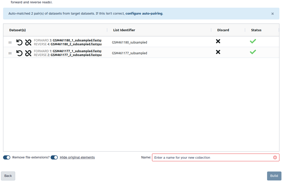
Check and configure auto-pairing. Commonly matepairs have suffix
_1and_2or_R1and_R2. Click on ‘Next’ at the bottom.
- Edit the List Identifier as required.
- Enter a name for your collection
- Click Build to build your collection
- Click on the checkmark icon at the top of your history again
k-mer based taxonomic assignment with Kraken2
Our input data is the DNA reads of microbes present at Cuatro Ciénegas.
To find out which microorganisms are present, we will compare the reads of the sample to a reference database, i.e. sequences of known microorganisms stored in a database, using Kraken2 (Wood et al. 2019).
In the \(k\)-mer approach for taxonomy classification, we use a database containing DNA sequences of genomes whose taxonomy we already know. On a computer, the genome sequences are broken into short pieces of length \(k\) (called \(k\)-mers), usually 30bp.
Kraken examines the \(k\)-mers within the query sequence, searches for them in the database, looks for where these are placed within the taxonomy tree inside the database, makes the classification with the most probable position, then maps \(k\)-mers to the lowest common ancestor (LCA) of all genomes known to contain the given \(k\)-mer.
Kraken2 uses a compact hash table, a probabilistic data structure that allows for faster queries and lower memory requirements. It applies a spaced seed mask of s spaces to the minimizer and calculates a compact hash code, which is then used as a search query in its compact hash table; the lowest common ancestor (LCA) taxon associated with the compact hash code is then assigned to the k-mer.
You can find more information about the Kraken2 algorithm in the paper Improved metagenomic analysis with Kraken 2.
 of the genomes that contain that k-mer in the database. The taxa associated with the sequence's k-mers, as well as the taxa's ancestors, form a pruned subtree of the general taxonomy tree, which is used for classification. In the classification tree, each node has a weight equal to the number of k-mers in the sequence associated with the node's taxon. Each root-to-leaf (RTL) path in the classification tree is scored by adding all weights in the path, and the maximal RTL path in the classification tree is the classification path (nodes highlighted in yellow). The leaf of this classification path (the orange, leftmost leaf in the classification tree) is the classification used for the query sequence. Source: <span class=\"citation\"><a href=\"#Wood2014\">Wood and Salzberg 2014</a></span>")
For this tutorial, we will use the PlusPF database which contains the Standard (archaea, bacteria, viral, plasmid, human, UniVec_Core), protozoa and fungi data.
Database Origin Archaea RefSeq complete archaeal genomes/proteins Bacteria RefSeq complete bacterial genomes/proteins Plasmid RefSeq plasmid nucleotide/protein sequences Viral RefSeq complete viral genomes/proteins Human GRCh38 human genome/proteins Fungi RefSeq complete fungal genomes/proteins Plant RefSeq complete plant genomes/proteins Protozoa RefSeq complete protozoan genomes/proteins UniVec_Core A subset of UniVec, NCBI-supplied database of vector, adapter, linker, and primer sequences that may be contaminating sequencing projects and/or assemblies, chosen to minimize false positive hits to the vector database The databases have been prepared for Kraken2 by Ben Leagmead and details can found on his page.
Hands On: Assign taxonomic labels with Kraken2
- Kraken2 ( Galaxy version 2.1.3+galaxy1) with the following parameters:
- “Single or paired reads”:
Paired
- param-collection “Collection of paired reads”: Input paired collection
“Confidence”:
0.1A confidence score of 0.1 means that at least 10% of the k-mers should match entries in the database. This value can be reduced if a less restrictive taxonomic assignation is desired.
- In “Create Report”:
- “Print a report with aggregrate counts/clade to file”:
Yes- “Select a Kraken2 database”: most recent
Prebuilt Refseq indexes: PlusPF
Kraken2 will create two outputs for each dataset
-
Classification: tabular files with one line for each sequence classified by Kraken and 5 columns:
C/U: a one letter indicating if the sequence classified or unclassified- Sequence ID as in the input file
- NCBI taxonomy ID assigned to the sequence, or 0 if unclassified
- Length of sequence in bp (
read1|read2for paired reads) -
A space-delimited list indicating the lowest common ancestor (LCA) mapping of each k-mer in the sequence
For example,
562:13 561:4 A:31 0:1 562:3would indicate that:- The first 13 k-mers mapped to taxonomy ID #562
- The next 4 k-mers mapped to taxonomy ID #561
- The next 31 k-mers contained an ambiguous nucleotide
- The next k-mer was not in the database
- The last 3 k-mers mapped to taxonomy ID #562
|:|indicates end of first read, start of second read for paired reads
For JC1A:
Column 1 Column 2 Column 3 Column 4 Column 5 U MISEQ-LAB244-W7:91:000000000-A5C7L:1:1101:13417:1998 0 151|190 A:17 0:15 2055:5 0:1 2220095:5 0:74 |:| 0:3 A:53 2:2 0:32 204455:1 2823043:5 0:60 U MISEQ-LAB244-W7:91:000000000-A5C7L:1:1101:15782:2187 0 169|173 0:101 37329:1 0:33 |:| 0:10 2751189:5 0:30 1883:2 0:39 2609255:5 0:48 U MISEQ-LAB244-W7:91:000000000-A5C7L:1:1101:11745:2196 0 235|214 0:173 2282523:5 2746321:2 0:21 |:| 0:65 2746321:2 2282523:5 0:108 U MISEQ-LAB244-W7:91:000000000-A5C7L:1:1101:18358:2213 0 251|251 0:35 281093:5 0:3 651822:5 0:145 106591:3 0:21 |:| 0:64 106591:3 0:145 651822:5 U MISEQ-LAB244-W7:91:000000000-A5C7L:1:1101:14892:2226 0 68|59 0:34 |:| 0:25 U MISEQ-LAB244-W7:91:000000000-A5C7L:1:1101:18764:2247 0 146|146 0:112 |:| 0:112 C MISEQ-LAB244-W7:91:000000000-A5C7L:1:1101:12147:2252 9606 220|220 9606:148 0:19 9606:19 |:| 9606:19 0:19 9606:148QuestionFor JC1A sample
- Is the first sequence in the file classified or unclassified?
- What is the taxonomy ID assigned to the first classified sequence?
- What is the corresponding taxon?
- unclassified
- 9606, for the line 7
- 9606 corresponds to Homo sapiens when looking at NCBI.
-
Report: tabular files with one line per taxon and 6 columns or fields
- Percentage of fragments covered by the clade rooted at this taxon
- Number of fragments covered by the clade rooted at this taxon
- Number of fragments assigned directly to this taxon
- A rank code, indicating
- (U)nclassified
- (R)oot
- (D)omain
- (K)ingdom
- (P)hylum
- (C)lass
- (O)rder
- (F)amily
- (G)enus, or
- (S)pecies
Taxa that are not at any of these 10 ranks have a rank code that is formed by using the rank code of the closest ancestor rank with a number indicating the distance from that rank. E.g.,
G2is a rank code indicating a taxon is between genus and species and the grandparent taxon is at the genus rank. - NCBI taxonomic ID number
- Indented scientific name
Column 1 Column 2 Column 3 Column 4 Column 5 Column 6 76.85 105397 105397 U 0 unclassified 23.15 31742 1197 R 1 root 22.20 30450 312 R1 131567 cellular organisms 12.58 17256 3768 D 2 Bacteria 8.77 12028 2868 P 1224 Proteobacteria 4.94 6779 3494 C 28211 Alphaproteobacteria 1.30 1782 1085 O 204455 Rhodobacterales 0.43 593 461 F 31989 Rhodobacteraceae 0.05 74 53 G 265 ParacoccusQuestion- What are the percentage on unclassified for JC1A and JP4D?
- What are the kindgoms found for JC1A and JP4D?
- Where might the eukaryotic DNA come from?
- How is the diversity of Proteobacteria in JC1A and JP4D?
- 77% for JC1A and 90% for JP4D
- Kindgoms:
- JC1A: 13% Bacteria, 9% Eukaryota, 0.03% Virus
- JP4D: 9% Bacteria, 0.7% Eukaryota
- It seems to be human contamination
- JC1A seems to have a big diversity of classes and species of Proteobacteria. JP4D seems more dominated by Aphaproteobacteria.
Getting an overview of the assignation is not straightforward with the Kraken2 outputs directly. We can use visualisation tools for that.
A “simple and worthwile addition to Kraken for better abundance estimates” (Ye et al. 2019) is called Bracken (Bayesian Reestimation of Abundance after Classification with Kraken). Instead of only using proportions of classified reads, it takes a probabilistic approach to generate final abundance profiles. It works by re-distributing reads in the taxonomic tree: “Reads assigned to nodes above the species level are distributed down to the species nodes, while reads assigned at the strain level are re-distributed upward to their parent species” (Lu et al. 2017).
Hands On: Estimate species abundance with Bracken
- Bracken ( Galaxy version 3.1+galaxy0) with the following parameters:
- param-collection “Kraken report file”: Report output of Kraken
“Select a kmer distribution”:
PlusPF, same as for KrakenIt is important to choose the same database that you also chose for Kraken2
- “Level”:
Species- “Produce Kraken-Style Bracken report”:
yes
Visualization of taxonomic assignment
Once we have assigned the corresponding taxa to each sequence, the next step is to properly visualize the data. There are several tools for that:
- Krona (Ondov et al. 2011)
- Phinch (Bik 2014)
- Pavian (Breitwieser and Salzberg 2020)
Visualisation using Krona
Krona creates an interactive HTML file allowing hierarchical data to be explored with zooming, multi-layered pie charts. With this tool, we can easily visualize the composition of the bacterial communities and compare how the populations of microorganisms are modified according to the conditions of the environment.
Kraken outputs can not be given directly to Krona, they first need to be converted.
Krakentools (Lu et al. 2017) is a suite of tools to work on Kraken outputs. It include a tool designed to translate results of the Kraken metagenomic classifier to the full representation of NCBI taxonomy. The output of this tool can be directly visualized by the Krona tool.
Hands On: Convert Kraken report file
- Krakentools: Convert kraken report file ( Galaxy version 1.2+galaxy2) with the following parameters:
- param-collection “Kraken report file”: Report collection of Kraken
- Inspect the generated output for JC1A
Question3869 k__Bacteria 2868 k__Bacteria p__Proteobacteria 3494 k__Bacteria p__Proteobacteria c__Alphaproteobacteria 1085 k__Bacteria p__Proteobacteria c__Alphaproteobacteria o__Rhodobacterales 461 k__Bacteria p__Proteobacteria c__Alphaproteobacteria o__Rhodobacterales f__Rhodobacteraceae 53 k__Bacteria p__Proteobacteria c__Alphaproteobacteria o__Rhodobacterales f__Rhodobacteraceae g__Paracoccus 10 k__Bacteria p__Proteobacteria c__Alphaproteobacteria o__Rhodobacterales f__Rhodobacteraceae g__Paracoccus s__Paracoccus_pantotrophus 6 k__Bacteria p__Proteobacteria c__Alphaproteobacteria o__Rhodobacterales f__Rhodobacteraceae g__Paracoccus s__Paracoccus_sanguinis 4 k__Bacteria p__Proteobacteria c__Alphaproteobacteria o__Rhodobacterales f__Rhodobacteraceae g__Paracoccus s__Paracoccus_sp._AK26 1 k__Bacteria p__Proteobacteria c__Alphaproteobacteria o__Rhodobacterales f__Rhodobacteraceae g__Paracoccus s__Paracoccus_sp._MA
- What are the different columns?
- What are the lines?
- Column 1 seems to correspond to the number of fragments covered by a taxon, the columns after represent the different taxonomic level (from kingdom to species)
- A line is a taxon with its hierarchy and the number of reads assigned to it
Let’s now run Krona
Hands On: Generate Krona visualisation
- Krona pie chart ( Galaxy version 2.7.1+galaxy0) with the following parameters:
- “Type of input data”:
Tabular- param-collection “Input file”: output of Krakentools
- Inspect the generated file
Question
- What are the percentage on unclassified for JC1A and JP4D?
- What are the kindgoms found for JC1A and JP4D?
- Where might the eukaryotic DNA come from?
- How is the diversity of Proteobacteria in JC1A and JP4D?
- 78% for JC1A and 90% for JP4D
- Kindgoms:
- JC1A: 13% Bacteria, 10% Eukaryota, 0.03% Virus
- JP4D: 10% Bacteria, 0.7% Eukaryota
- It seems to be human contamination
- JC1A seems to have a big diversity of classes and species of Proteobacteria. JP4D seems more dominated by Aphaproteobacteria.
Visualization using Pavian
Pavian (pathogen visualization and more) (Breitwieser and Salzberg 2020) is an interactive visualization tool for metagenomic data. It was developed for the clinical metagenomic problem to find a disease-causing pathogen in a patient sample, but it is useful to analyze and visualize any kind of metagenomics data.
Hands On: Launch Pavian
- Pavian with the following paramters:
- param-collection “Kraken and MetaPhlAn-style reports”: Report collection of Kraken
Pavian runs a Galaxy Interactive tool. You can access it when it become orange.
Hands On: Interact with Pavian
Open Pavian
- Go to Interactive Tools on the Activity Bar on the left
- Wait for your interactive tool to be in the running state (Job Info)
- Click on the tool name
- Clicking on the external-link icon will open it in a new tab
- Import data
- Click on
Use data on server- Select both samples
- Click on
Read selected directoriesCheck you have a table in
Available sample setslooks like
X FormatOK Include Name ReportFile ReportFilePath 1 X X JP4AD JP4AD /home/shiny//JP4AD 2 X X JC1A JC1A /home/shiny//JC1A - Click on
Save table- Click on
Results Overviewin the left panel
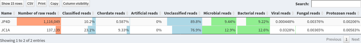
This page shows the summary of the classifications in the selected sample set:
Question
- Does both sample have same size?
- What are the percentage of classified reads for JC1A and JP4D?
- Are the percentage of bacterial reads similar?
- JP4D has much more reads than JC1A
- 10.2% for JP4D and 23.1% for JC1A
- 12.6% for JC1A and 9.22% for JP4D. So similar magnitude orders
Let’s now inspect assignements to reads per sample.
Hands On: Inspect samples with Pavian
- Click on
Samplein the left panelSelect
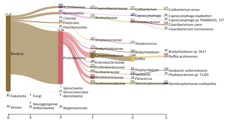
JC1Ain theSelect sampledrop-down on the topThe first view gives a Sankey diagram for one sample:
Question
- What is a Sankey diagram?
- What are the different set of values represented as the horizontal axis?
- A sankey diagram is a visualization used to depict a flow from one set of values to another
- The taxonomy hierarchy from domain on the left to species on the right
- Click on
Proteobacteriain the Sankey plotInspect the created graph on the right
Question
- Are the number of reads assigned to Proteobacteria similar for both samples?
- Why?
- JP4A has many more reads assigned to Proteobacteria than JC1A
- JP4A has many more reads initialls
We would like now to compare both samples.
Hands On: Inspect samples with Pavian
- Click on
Comparisonin the left panel- Select
%and unclickReadsin the blue area drop-down on the topClick on
Domaingreen button
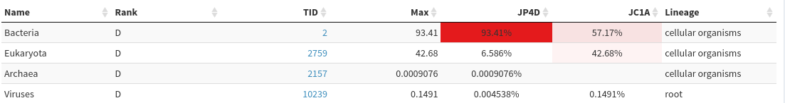
QuestionIs there similar proportion of Bacteria in both samples?
JP4D has much higher proportion of Bacteria (> 93%>) than JC1A (57%), which contains quite a lot of Eukaryote
Select
Homo sapiensin theFilter taxabox below the green buttonsQuestionIs there similar proportion of Bacteria in both samples?
After human filtering, both samples have similar proportion of Bacteria
Click on
Classgreen buttonQuestion
- How are the diversities of classes in both samples?
- What could it biologically mean given that JC1A is a control and JP4D a sample from fertilized pond?
- JP4D seems highly dominated by a Alphaproteobacteria class. JC1A has also a majority of Alphaproteobacteria, but also significant proportions of Betaproteobacteria, Gammaproteobacteria, Flavobacteria, Actinomycetia
- Alphaproteobacteria seems to have a survival advantage in the new environment. According to the authors this correlates with specific genomic traits that enable them to cope better with high nutrient availability.
Once you are done with Pavian, you should delete it in your history so the corresponding job is killed.
Phinch (Bik 2014) is another tools to visualize large biological datasets like our taxonomic classification. Taxonomy Bar Charts, Bubble Charts, Sankey Diagrams, Donut Partitions and Attributes Column Chart can be generated using this tool.
As a first step, we need to convert the Kraken output file into a kraken-biom file to make it accessible for Phinch. For this, we need to add a metadata file, provided on Zenodo. When generating a metadata file for your own data, you can take this as an example and apply the general guidelines.
Hands On: Phinch
Import the metadata tabular from Zenodo or Galaxy shared data libraries:
https://zenodo.org/record/7871630/files/metadata.tabular- Use Kraken-biom ( Galaxy version 1.2.0+galaxy1) to convert Kraken2 report into the correct format for phinch with the following parameters.
- param-collection “Input”: Report output of Kraken2
- param-file “Sample Metadata file”: Metadata tabular
- “Output format”:
JSON- Phinch Visualisation with the following paramters:
- “Input”:
Kraken-biom output filePhinch runs a Galaxy Interactive tool. You can access it when it become orange.
Hands On: Interact with Phinch
Open Phinch
- Go to Interactive Tools on the Activity Bar on the left
- Wait for your interactive tool to be in the running state (Job Info)
- Click on the tool name
- Clicking on the external-link icon will open it in a new tab
The first pages shows an overview of your samples. Here, you have the possibility to further filter your data, for example by date or location, depending on which information you provided in your metadata file.
Question
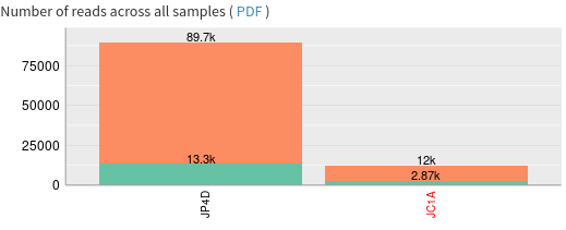
- How many sequence reads do the samples contain?
- JC1A (Phinch name: 0) contains 56008 reads, while JP4D (Phinch name: 1) contains 242438 reads
Click on
Proceed to galleryto see an overview of all visualization options.Let’s have a look at the taxonomy bar chart. Here, you can see the abundance of different taxa depicted in different colors in your samples. On top of the chart you can select which rank is supposed to be shown in the chart. You can also change the display options to for example switch between value und percentage.
Question
- What information can you get from hovering over a sample?
- How many percent of the sample reads are bacteria and how many are eukaryota?
- the taxon’s name and the taxonomy occurrence in the sample
- choose kingdom and hover over the bars to find “taxonomy occurence in this sample”:
- Sample 0: 75,65 % bacteria; 24,51 % eukaryota
- Sample 1: 92,70 % bacteria; 6,87 % eukaryota
Let’s go back to the gallery and choose the bubble chart. Here, you can find the distribution of taxa across the whole dataset at the rank that you can choose above the chart. When hovering over the bubbles, you get additional information concerning the taxon.
Question
- Which is the most abundant Class?
- How many reads are found in both samples?
To order the bubbles according to their size you can choose the
listoption shown right next to the taxonomy level. Clicking on one bubble gives you the direct comparison of the distribution of this taxon in the different samples.
- The most abundant Class is Alphaproteobacteria
- With 18.114 reads in Sample 0 and 153.230 reads in sample 1
Another displaying option is the Sankey diagram, that is depicting the abundance of taxonomies as a flow chart. Again, you can choose the taxonomy level that you want to show in your diagram. When clicking on one bar of the diagram, this part is enlarged for better view.
The donut partition summarizes the microbial community according to non-numerical attributes. In the drop-down menu at the top right corner, you can switch between the different attributes provided in the metadata file. In our case, you can for example choose the ‘environmental medium’ to see the difference between sediment and water (It doesn’t really make a lot of sense in our very simple dataset, as this will show the same result as sorting them by sample 0 and 1, but if attributes change across different samples this might be an interesting visualization option). When clicking on one part of the donut you will also find the distribution of the taxon across the samples. On the right hand side you can additionally choose if you’d like to have dynamic y axis or prefer standard y axis to compare different donuts with each other.
The attributes column chart summarizes the microbial community according to numerical attributes. In the drop-down menu at the top right corner, you can switch between the different attributes provided in the metadata file. In our case, you can for example choose the ‘geographic location’ to (again, it doesn’t really make a lot of sense in our very simple dataset, as this will show the same result as sorting them by sample 0 and 1, but if attributes change across different samples this might be an interesting visualization option).
Once you are done with Phinch, you should delete it in your history so the corresponding job is killed.
Choosing the right tool
When it comes to taxonomic assignment while analyzing metagenomic data, Kraken2 is not the only tool available. Several papers do benchmarking of different tools (Meyer et al. 2022,Sczyrba et al. 2017,Ye et al. 2019).
The benchmarking papers present different methods for comparing the available tools:
- The CAMI challenge is based on results of different labs that each used the CAMI dataset to perform their analysis on and send it back to the authors.
- Ye et al. 2019 performed all the analysis themselves.
Additionally, the datasets used for both benchmarking approaches differ:
- CAMI: only ~30%-40% of reads are simulated from known taxa while the rest of the reads are from novel taxa, plasmids or simulated evolved strains.
- Ye et al. 2019 used International Metagenomics and Microbiome Standards Alliance (IMMSA) datasets, wherein the taxa are described better.
When benchmarking different classification tools, several metrics are used to compare their performance:
- Precision: proportion of true positive species identified in the sample divided by number of total species identified by the method.
- Recall: proportion of true positive species divided by the number of distinct species actually in the sample.
- Precision-recall curve: each point represents the precision and recall scores at a specific abundance threshold, the area under the precision-recall curve (AUPR)
- L2 distance: representation of abundance profiles → how accurately the abundance of each species or genera in the resulting classification reflects the abundance of each species in the original biological sample (“ground truth”)
When it comes to taxonomic profiling, thus investigating the abundance of specific taxa, the biggest problem is the abundance bias. It is introduced during isolation of DNA (which might work for some organisms better then for others) and by PCR duplicates during PCR amplification.
Profilers, which are tools that investigate relative abundances of taxa within a dataset, fall into three groups depending on their performance:
- Profilers, that correctly predict relative abundances
- Precise profilers (suitable, when many false positives would increase cost and effort in downstream analysis)
- Profilers with high recall (suitable for pathogen detection, when the failure of detecting an organism can have severe negative consequences)
However, some characteristics are common to all profilers:
- Most profilers only perform well until the family level
- Drastic decrease in performance between family and genus level, while little change between order and family level
- Poorer performance of all profilers on CAMI datasets compared to International Metagenomics and Microbiome Standards Alliance (IMMSA)
- Fidelity of abundance estimates decreases notably when viruses and plasmids were present
- High numbers of false positive calls at low abundance
- Taxonomic profilers vs profiles from taxonomic binning: Precision and recall of the taxonomic binners were comparable to that of the profilers; abundance estimation at higher ranks was more problematic for the binners
| Tool | Approach | Available in Galaxy | CAMI challenge | Ye et al. 2019 |
|---|---|---|---|---|
| mOTUs | No | Most memory efficient | ||
| MetaPhlAn | Marker genes | Yes | Recommended for low computational requirements (< 2 Gb of memory) | |
| DUDes | No | |||
| FOCUS | No | Fast, most memory efficient | ||
| Bracken | k-mer | Yes | Fast | |
| Kraken | k-mer | Yes | Fastest; most memory efficient | Good performance metrics; very fast on large numbers of samples; allow custom databases when high amounts of memory (>100 Gb) are available |
Marker gene based approach using MetaPhlAn
In this tutorial, we follow second approach using MetaPhlAn (Truong et al. 2015). MetaPhlAn is a computational tool for profiling the composition of microbial communities (Bacteria, Archaea and Eukaryotes) from metagenomic shotgun sequencing data (i.e. not 16S) at species-level. MetaPhlAn 4 relies on ~5.1M unique clade-specific marker genes identified from ~1M microbial genomes (~236,600 references (bacterial, archeal, viral and eukaryotic) and 771,500 metagenomic assembled genomes) spanning 26,970 species-level genome bins.
It allows:
- unambiguous taxonomic assignments;
- accurate estimation of organismal relative abundance;
- species-level resolution for bacteria, archaea, eukaryotes and viruses;
- strain identification and tracking
- orders of magnitude speedups compared to existing methods.
- microbiota strain-level population genomics
- MetaPhlAn clade-abundance estimation
The basic usage of MetaPhlAn consists in the identification of the clades (from phyla to species and strains in particular cases) present in the microbiota obtained from a microbiome sample and their relative abundance.
MetaPhlAn in Galaxy can not directly take as input a paired collection but expect 2 collections: 1 with forward data and 1 with reverse. Before launching MetaPhlAn, we need to split our input paired collection.
Hands On: Assign taxonomic labels with MetaPhlAn
- Unzip collection with the following parameters:
- param-collection “Paired input to unzip”: Input paired collection
- MetaPhlAn ( Galaxy version 4.1.1+galaxy4) with the following parameters:
- In “Inputs”
- “Input(s)”:
Fasta/FastQ file(s) with microbiota reads
- “Fasta/FastQ file(s) with microbiota reads”:
Paired-end files
- param-collection “Forward paired-end Fasta/FastQ file with microbiota reads”: output of Unzip collection with forward in the name
- param-collection “Reverse paired-end Fasta/FastQ file with microbiota reads”: output of Unzip collection with reverse in the name
- In “Outputs”:
- “Output for Krona?”:
Yes
5 files and a collection are generated by MetaPhlAn tool:
-
Predicted taxon relative abundances: tabular files with the community profile#SampleID Metaphlan_Analysis #clade_name NCBI_tax_id relative_abundance additional_species k__Bacteria 2 100.0 k__Bacteria|p__Bacteroidetes 2|976 94.38814 k__Bacteria|p__Proteobacteria 2|1224 5.61186 k__Bacteria|p__Bacteroidetes|c__CFGB45935 2|976| 94.38814 k__Bacteria|p__Proteobacteria|c__Alphaproteobacteria 2|1224|28211 5.61186 k__Bacteria|p__Bacteroidetes|c__CFGB45935|o__OFGB45935 2|976|| 94.38814 k__Bacteria|p__Proteobacteria|c__Alphaproteobacteria|o__Rhodobacterales 2|1224|28211|204455 5.61186 k__Bacteria|p__Bacteroidetes|c__CFGB45935|o__OFGB45935|f__FGB45935 2|976||| 94.38814 k__Bacteria|p__Proteobacteria|c__Alphaproteobacteria|o__Rhodobacterales|f__Rhodobacteraceae 2|1224|28211|> 204455| 31989 5.61186 k__Bacteria|p__Bacteroidetes|c__CFGB45935|o__OFGB45935|f__FGB45935|g__GGB56609 2|976|||| 94.38814 k__Bacteria|p__Proteobacteria|c__Alphaproteobacteria|o__Rhodobacterales|f__Rhodobacteraceae|g__Phycocomes 2| 1224| 28211|204455|31989|2873978 5.61186 k__Bacteria|p__Bacteroidetes|c__CFGB45935|o__OFGB45935|f__FGB45935|g__GGB56609|s__GGB56609_SGB78025 2| 976||||| 94. 38814 k__Bacteria|p__Proteobacteria|c__Alphaproteobacteria|o__Rhodobacterales|f__Rhodobacteraceae|g__Phycocomes| s__Phycocomes_zhengii 2|1224|28211|204455|31989|2873978|2056810 5.61186 k__Bacteria|p__Bacteroidetes|c__CFGB45935|o__OFGB45935|f__FGB45935|g__GGB56609|s__GGB56609_SGB78025| t__SGB78025 2| 976|||||| 94.38814 k__Bacteria|p__Proteobacteria|c__Alphaproteobacteria|o__Rhodobacterales|f__Rhodobacteraceae|g__Phycocomes| s__Phycocomes_zhengii|t__SGB31485 2|1224|28211|204455|31989|2873978|2056810| 5.61186Each line contains 4 columns:
- the lineage with different taxonomic levels, from high level taxa (kingdom:
k__) to more precise taxa - the NCBI taxon ids of the lineage taxonomic level
- the relative abundance found for our sample for the lineage
- any additional species
Question- Which kindgoms have been identified for JC1A?
- For JP4D?
- How is the diversity for JP4D compared to Kraken results?
- All reads have been unclassified so no kindgom identified
- Bacteria, no eukaryotes
- Diversity is really reduced for JP4D using MetaPhlAn, compared to the one identified with Kraken
- the lineage with different taxonomic levels, from high level taxa (kingdom:
-
Predicted taxon relative abundances for Krona: same information as the previous files but formatted for > visualization using KronaColumn 1 Column 2 Column 3 Column 4 Column 5 Column 6 Column 7 Column 8 Column 9 Column 10 94.38814 Bacteria Bacteroidetes CFGB45935 OFGB45935 FGB45935 GGB56609 GGB56609 SGB78025 5.61186 Bacteria Proteobacteria Alphaproteobacteria Rhodobacterales Rhodobacteraceae Phycocomes Phycocomes zhengii 94.38814 Bacteria Bacteroidetes CFGB45935 OFGB45935 FGB45935 GGB56609 GGB56609 SGB78025 SGB78025 5.61186 Bacteria Proteobacteria Alphaproteobacteria Rhodobacterales Rhodobacteraceae Phycocomes Phycocomes zhengii SGB31485Each line represent an identified taxons with 9 columns:
- Column 1: The percentage of reads assigned the taxon
- Column 2-9: The taxon description at the different taxonomic levels from Kindgom to more precise taxa
- A collection with the same information as in the tabular file but splitted into different files, one per taxonomic level
-
BIOM filewith community profile in BIOM format, a common and standard format in microbiomics and used as the input for tools like mothur or Qiime. Bowtie2 outputandSAM filewith the results of the sequence mapping on the reference database
Let’s now run Krona to visualize the communities
Hands On: Generate Krona visualisation
- Krona pie chart ( Galaxy version 2.7.1) with the following parameters:
- “Type of input data”:
tabular- param-collection “Input file”: Krona output of Metaphlan
- Inspect the generated file
As pointed before, the community looks a lot less diverse than with Kraken. This is probably due to the reference database, which is potentially not complete enough yet to identify all taxons. Or there are too few reads in the input data to cover enough marker genes. Indeed, no taxon has been identified for JC1A, which contains much less reads than JP4D. However, Kraken is also known to have high number of false positive. A benchmark dataset or mock community where the community DNA content is known would be required to correctly judge which tool provides the better taxonomic classification.
Conclusion
In this tutorial, we look how to get the community profile from microbiome data. We apply Kraken2 or MetaPhlAn to assign taxonomic labels to two microbiome sample datasets. We then visualize the results using Krona, Pavian and Phinch to analyze and compare the datasets. Finally, we discuss important facts when it comes to choosing the right tool for taxonomic assignment.å
You've Finished the Tutorial
Key points
There are 3 different types of taxonomic assignment (genome, gene or k-mer based)
Kraken or MetaPhlAn can be used in Galaxy for taxonomic assignment
Visualization of community profiles can be done using Krona or Pavian
The taxonomic classification tool to use depends on the data
Frequently Asked Questions
Have questions about this tutorial? Have a look at the available FAQ pages and support channelsUseful literature
Further information, including links to documentation and original publications, regarding the tools, analysis techniques and the interpretation of results described in this tutorial can be found here.
References
- Whipps, J. M., K. Lewis, and R. C. Cooke, 1988 Mycoparasitism and plant disease control. Fungi in biological control systems 1988: 161–187. https://www.jstor.org/stable/2434885
- Ondov, B. D., N. H. Bergman, and A. M. Phillippy, 2011 Interactive metagenomic visualization in a Web browser. BMC Bioinformatics 12: 385. 10.1186/1471-2105-12-385
- Bik, H. M., 2014 Phinch: An interactive, exploratory data visualization framework for –Omic datasets. 10.1101/009944
- Wood, D. E., and S. L. Salzberg, 2014 Kraken: ultrafast metagenomic sequence classification using exact alignments. Genome Biology 15: R46. 10.1186/gb-2014-15-3-r46
- Truong, D. T., E. A. Franzosa, T. L. Tickle, M. Scholz, G. Weingart et al., 2015 MetaPhlAn2 for enhanced metagenomic taxonomic profiling. Nature methods 12: 902. 10.1038/nmeth.3589
- Lu, J., F. P. Breitwieser, P. Thielen, and S. L. Salzberg, 2017 Bracken: estimating species abundance in metagenomics data. PeerJ Computer Science 3: e104. 10.7717/peerj-cs.104
- Sczyrba, A., P. Hofmann, P. Belmann, D. Koslicki, S. Janssen et al., 2017 Critical Assessment of Metagenome Interpretation-a benchmark of metagenomics software. Nature methods 14: 1063–1071. 10.1038/nmeth.4458
- Wood, D. E., J. Lu, and B. Langmead, 2019 Improved metagenomic analysis with Kraken 2. Genome biology 20: 1–13. 10.1186/s13059-019-1891-0
- Ye, S. H., K. J. Siddle, D. J. Park, and P. C. Sabeti, 2019 Benchmarking Metagenomics Tools for Taxonomic Classification. Cell 178: 779–794. 10.1016/j.cell.2019.07.010
- Breitwieser, F. P., and S. L. Salzberg, 2020 Pavian: interactive analysis of metagenomics data for microbiome studies and pathogen identification. Bioinformatics (Oxford, England) 36: 1303–1304. 10.1093/bioinformatics/btz715
- Okie, J. G., A. T. Poret-Peterson, Z. M. Lee, A. Richter, L. D. Alcaraz et al., 2020 Genomic adaptations in information processing underpin trophic strategy in a whole-ecosystem nutrient enrichment experiment. eLife 9: 10.7554/eLife.49816
- Meyer, F., A. Fritz, Z.-L. Deng, D. Koslicki, T. R. Lesker et al., 2022 Critical Assessment of Metagenome Interpretation: the second round of challenges. Nature methods 19: 429–440. 10.1038/s41592-022-01431-4
- Blanco-Mı́guez Aitor, F. Beghini, F. Cumbo, L. J. McIver, K. N. Thompson et al., 2023 Extending and improving metagenomic taxonomic profiling with uncharacterized species using MetaPhlAn 4. Nature Biotechnology 1–12. 10.1038/s41587-023-01688-w
Feedback
Did you use this material as an instructor? Feel free to give us feedback on how it went.
Did you use this material as a learner or student? Click the form below to leave feedback.

Citing this Tutorial
- Sophia Hampe, Bérénice Batut, Paul Zierep, Taxonomic Profiling and Visualization of Metagenomic Data (Galaxy Training Materials). https://training.galaxyproject.org/training-material/topics/microbiome/tutorials/taxonomic-profiling/tutorial.html Online; accessed TODAY
- Hiltemann, Saskia, Rasche, Helena et al., 2023 Galaxy Training: A Powerful Framework for Teaching! PLOS Computational Biology 10.1371/journal.pcbi.1010752
- Batut et al., 2018 Community-Driven Data Analysis Training for Biology Cell Systems 10.1016/j.cels.2018.05.012
@misc{microbiome-taxonomic-profiling,
author = "Sophia Hampe and Bérénice Batut and Paul Zierep",
	title = "Taxonomic Profiling and Visualization of Metagenomic Data (Galaxy Training Materials)",
	year = "",
	month = "",
	day = "",
	url = "\url{https://training.galaxyproject.org/training-material/topics/microbiome/tutorials/taxonomic-profiling/tutorial.html}",
	note = "[Online; accessed TODAY]"
}
@article{Hiltemann_2023,
	doi = {10.1371/journal.pcbi.1010752},
	url = {https://doi.org/10.1371%2Fjournal.pcbi.1010752},
	year = 2023,
	month = {jan},
	publisher = {Public Library of Science ({PLoS})},
	volume = {19},
	number = {1},
	pages = {e1010752},
	author = {Saskia Hiltemann and Helena Rasche and Simon Gladman and Hans-Rudolf Hotz and Delphine Larivi{\`{e}}re and Daniel Blankenberg and Pratik D. Jagtap and Thomas Wollmann and Anthony Bretaudeau and Nadia Gou{\'{e}} and Timothy J. Griffin and Coline Royaux and Yvan Le Bras and Subina Mehta and Anna Syme and Frederik Coppens and Bert Droesbeke and Nicola Soranzo and Wendi Bacon and Fotis Psomopoulos and Crist{\'{o}}bal Gallardo-Alba and John Davis and Melanie Christine Föll and Matthias Fahrner and Maria A. Doyle and Beatriz Serrano-Solano and Anne Claire Fouilloux and Peter van Heusden and Wolfgang Maier and Dave Clements and Florian Heyl and Björn Grüning and B{\'{e}}r{\'{e}}nice Batut and},
	editor = {Francis Ouellette},
	title = {Galaxy Training: A powerful framework for teaching!},
	journal = {PLoS Comput Biol}
}
Funding
These individuals or organisations provided funding support for the development of this resource

You can use Ephemeris's
shed-tools installcommand to install the tools used in this tutorial.shed-tools install [-g GALAXY] [-a API_KEY] -t <(curl https://training.galaxyproject.org/training-material/api/topics/microbiome/tutorials/taxonomic-profiling/tutorial.json | jq .admin_install_yaml -r)Alternatively you can copy and paste the following YAML
---
install_tool_dependencies: true
install_repository_dependencies: true
install_resolver_dependencies: true
tools:
- name: taxonomy_krona_chart
  owner: crs4
  revisions: 1334cb4c6b68
  tool_panel_section_label: Metagenomic Analysis
  tool_shed_url: https://toolshed.g2.bx.psu.edu/
- name: taxonomy_krona_chart
  owner: crs4
  revisions: e9005d1f3cfd
  tool_panel_section_label: Metagenomic Analysis
  tool_shed_url: https://toolshed.g2.bx.psu.edu/
- name: bracken
  owner: iuc
  revisions: 4d350ac5148e
  tool_panel_section_label: Metagenomic Analysis
  tool_shed_url: https://toolshed.g2.bx.psu.edu/
- name: kraken2
  owner: iuc
  revisions: 241a78eb2935
  tool_panel_section_label: Metagenomic Analysis
  tool_shed_url: https://toolshed.g2.bx.psu.edu/
- name: kraken2
  owner: iuc
  revisions: e150ae930235
  tool_panel_section_label: Metagenomic Analysis
  tool_shed_url: https://toolshed.g2.bx.psu.edu/
- name: kraken_biom
  owner: iuc
  revisions: a6f820992693
  tool_panel_section_label: Metagenomic Analysis
  tool_shed_url: https://toolshed.g2.bx.psu.edu/
- name: krakentools_kreport2krona
  owner: iuc
  revisions: 02bbace216f2
  tool_panel_section_label: Metagenomic Analysis
  tool_shed_url: https://toolshed.g2.bx.psu.edu/
- name: metaphlan
  owner: iuc
  revisions: eca2e2e20436
  tool_panel_section_label: Metagenomic Analysis
  tool_shed_url: https://toolshed.g2.bx.psu.edu/